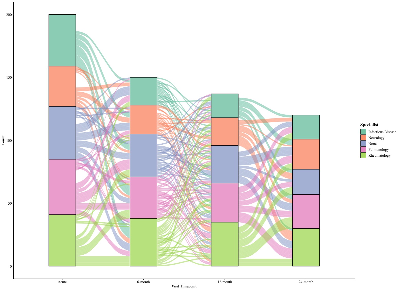
This is a short tutorial for creating alluvium plots in R with ggplot2. An alluvium plot is used to show the change/trend/development of subjects regarding single/multiple variables over time flow. Beside ggplot2, we require to use ggalluvial package in our plots and will provide two examples of alluvium plots.
1. Example: Counts of specialists in different timepoints
The first dataset we used is a follow-up study with a cohort of 200 patients. They reported what types of specialists they sought for at 4 different timepoints of visits (repeated measure). Hence the dataset has three columns:
-
PTID: unique identification for each patient (200 participants, string);
-
Time: this covariate provides different timepoints of visits and has four levels [Acute, 6-month, 12-month, 24-month] (string);
-
Specialist: this covariate provides different types of specialists and has five levels [None, Neurology, Rheumatology, Infectious Disease, Pulmonology] (numerical).

There are some new functions we are going to use for creating a alluvium plot beside the ggplot(). In ggplot(), we first set up the X-axis as x = Time and fill out stratum with its color as stratum = Specialist, fill = Specialist. Since each participant’s choice of specialist are changed and recorded over Time, the alluvium in the plot should each unique participant and we will set alluvium = PTID. Eventually, we set the legend label as label = Specialist.
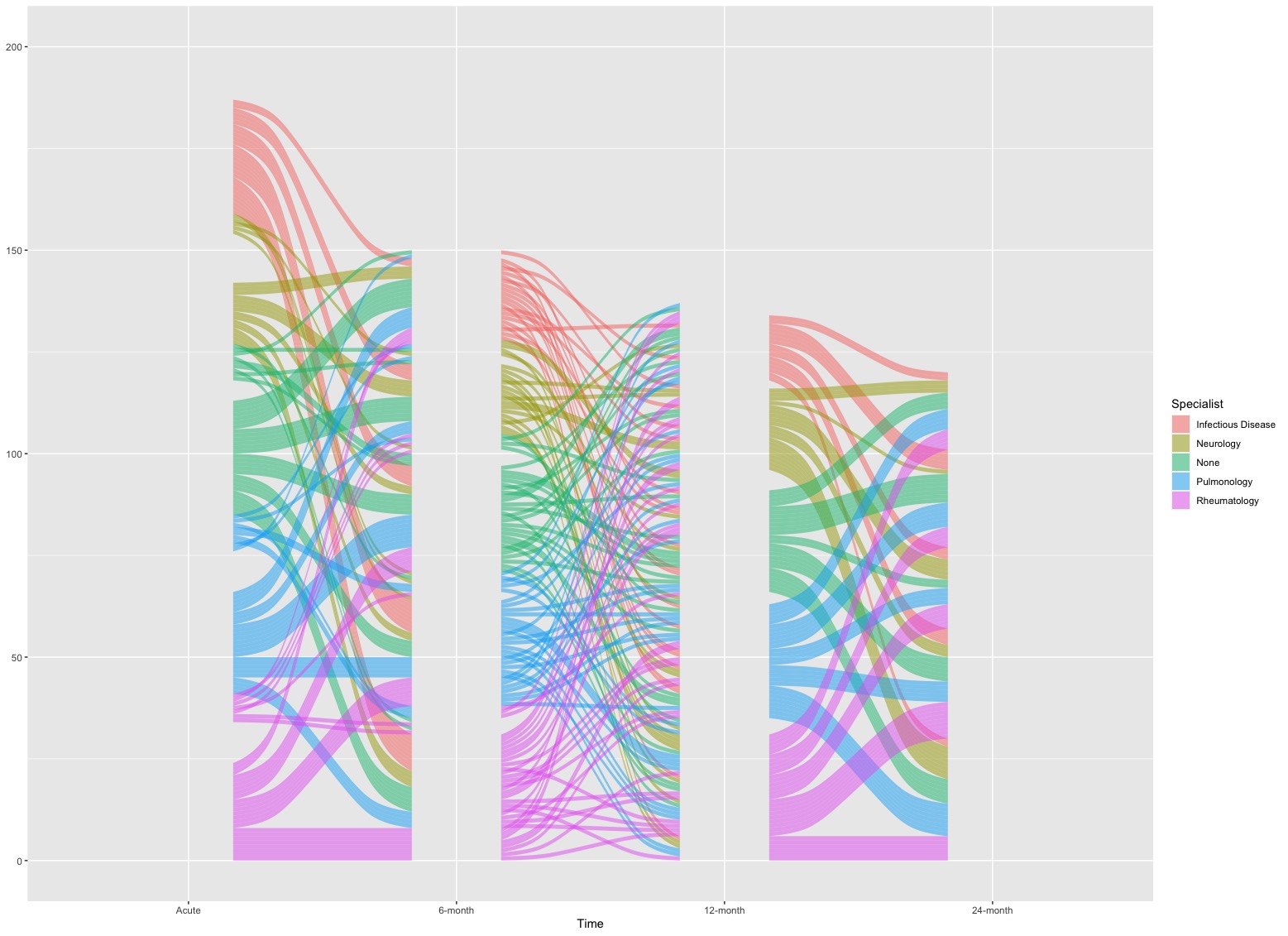
geom_flow(): this function is used to create lodes of an alluvial plot.
- In this example, lodes are just flow curves in the plot. If we just single call this function, it looks like below
# Set time as a factor
Dt$Time <- factor(Dt$Time, levels = c('Acute', '6-month', '12-month', '24-month'))
# Plot
ggplot(Dt, aes(x = Time, stratum = Specialist, alluvium = PTID, fill = Specialist, label = Specialist)) +
  geom_flow(stat = "alluvium")
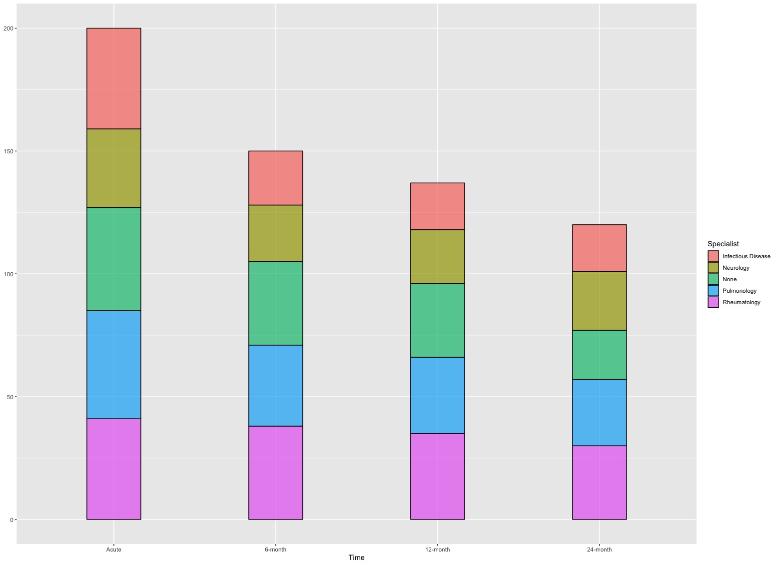
geom_stratum(): this function is used to create strata of an alluvial plot.
- In this example, each stratum represents the amount of participants seeking for a type of specialists.
ggplot(Dt, aes(x = Time, stratum = Specialist, alluvium = PTID, fill = Specialist, label = Specialist)) +
  geom_stratum(alpha = 0.7) # "alpha = 0.7" is used to control the transparency of color filled in strata
scale_fill_brewer(): this function is used to provide sequential (‘seq’), diverging (‘div’) and qualitative (‘qual’) color schemes in ggplot2.
type = 'div' means we want diverging color scheme (colors are different from each other apparently) and palette = "Set2" means we want to use the “Set2” palette.
We can combine together to see what we can get! This time we are going to remove the background and grid and use “Times New Roman” font for every text/label in the plot (element_text(family = 'Times')).
# Version 1.0
ggplot(Dt, aes(x = Time,
               stratum = Specialist,
               alluvium = PTID,
               fill = Specialist,
               label = Specialist)) +
  geom_flow(stat = "alluvium") +
  geom_stratum(alpha = 0.7) +
  xlab('Visit Timepoint') + ylab('Count') +
  scale_fill_brewer(type = "div", palette = "Set2") +
  theme_bw() +
  theme(panel.border = element_blank(),
        panel.background = element_blank(),
        panel.grid.major = element_blank(),
        panel.grid.minor = element_blank(),
        axis.line.x = element_line(),
        axis.line.y = element_line(),
        axis.text.x = element_text(colour = "black", size = 11, family = "Times"),
        axis.text.y = element_text(colour = "black", size = 11, family = "Times"),
        axis.ticks.x = element_line(),
        axis.ticks.y = element_line(),
        axis.title.x = element_text(colour = "black", face = "bold",size = 11, family = "Times"),
        axis.title.y = element_text(colour = "black", face = "bold",size = 11, family = "Times"),
        legend.text = element_text(size = 11, color = 'black',family = "Times"),
        legend.title = element_text(size = 13, face = "bold", color = 'black', family = "Times"),
        plot.title = element_text(face = "bold", family = "Times"))

The height of each stratum is the number of participants at a given timepoint of visit with a type of specialist and flow curves between two timepoints show the longitudinal changes in specialists for participants. The acute state is the baseline and we have 200 participants. In subsequent follow-ups, we lost some participants and this is reflected by the height of bars in following timepoints.
2. Example 2: Counts of viruses in different timepoints
The second dataset is a 2-year record of counts for different respiratory viruses in a given region. Counts of different viruses are collected quarterly from 2019 to 2020. It has three columns:
-
Virus: types of respiratory viruses [5 viruses: Rhinovirus, Seasonal Coronavirus, Adenovirus, Human Metapneumovirus, Parainfluenza] (string);
-
Time: calendar times in the format Year-Month [6 timepoints: 2019-3, 2019-6, 2019-9, 2019-12, 2020-3, 2020-6, 2020-9, 2020-12] (string);
-
Count: the number of viruses (numerical).

Differed from the example one which has stratum inside a bar for each timepoint, this example will only have alluvium and flow. Therefore, we will use new functions.
geom_alluvium(): this function is used to combine lodes from geom_flow() and strata from geom_stratum() and output them together as ribbon curves.
- Since we want to show longitudinal changes of viral counts, we need to pass
aes(fill = Virus, colour = Virus) where fill and colour will be specific to each viruses.
alpha = 0.7 is used to control the transparency of colors and decreasing = FALSE means that a virus with more counts will be always placed at the top position regarding a given timepoint.
scale_fill_brewer(): this is the same as scale_color_brewer()
Meanwhile, we will pass aes(x = Time, y = Count, alluvium = Virus) into ggplot() so we set Time in X-axis and Count in Y-axis and the alluvium will be Virus. Let us put all together to see what we can get!
# Set the Time as a factor
Dt2$Time <- factor(Dt2$Time, levels = c(paste0(2019, '-', c(3,6,9,12)), paste0(2020, '-', c(3,6,9,12))))
# Version 2.0
ggplot(data = Dt2,
       aes(x = Time,
           y = Count,
           alluvium = Virus)) +
  geom_alluvium(aes(fill = Virus, colour = Virus),
                alpha = 0.7, decreasing = FALSE) +
  scale_fill_brewer(type = "qual", palette = "Set3") +
  scale_color_brewer(type = "qual", palette = "Set3") +
  theme_bw() +
  theme(panel.border = element_blank(),
        panel.background = element_blank(),
        panel.grid.major = element_blank(),
        panel.grid.minor = element_blank(),
        axis.line.x = element_line(),
        axis.line.y = element_line(),
        axis.text.x = element_text(colour = "black", size = 11, family = "Times", angle = -45),
        axis.text.y = element_text(colour = "black", size = 11, family = "Times"),
        axis.ticks.x = element_line(),
        axis.ticks.y = element_line(),
        axis.title.x = element_text(colour = "black", face = "bold", size = 11, family = "Times", vjust = -2),
        axis.title.y = element_text(colour = "black", face = "bold",size = 11, family = "Times"),
        legend.text = element_text(size = 11, color = 'black', family = "Times"),
        legend.title = element_text(size = 13, face = "bold", color = 'black', family = "Times"),
        plot.title = element_text(face = "bold", family = "Times"))
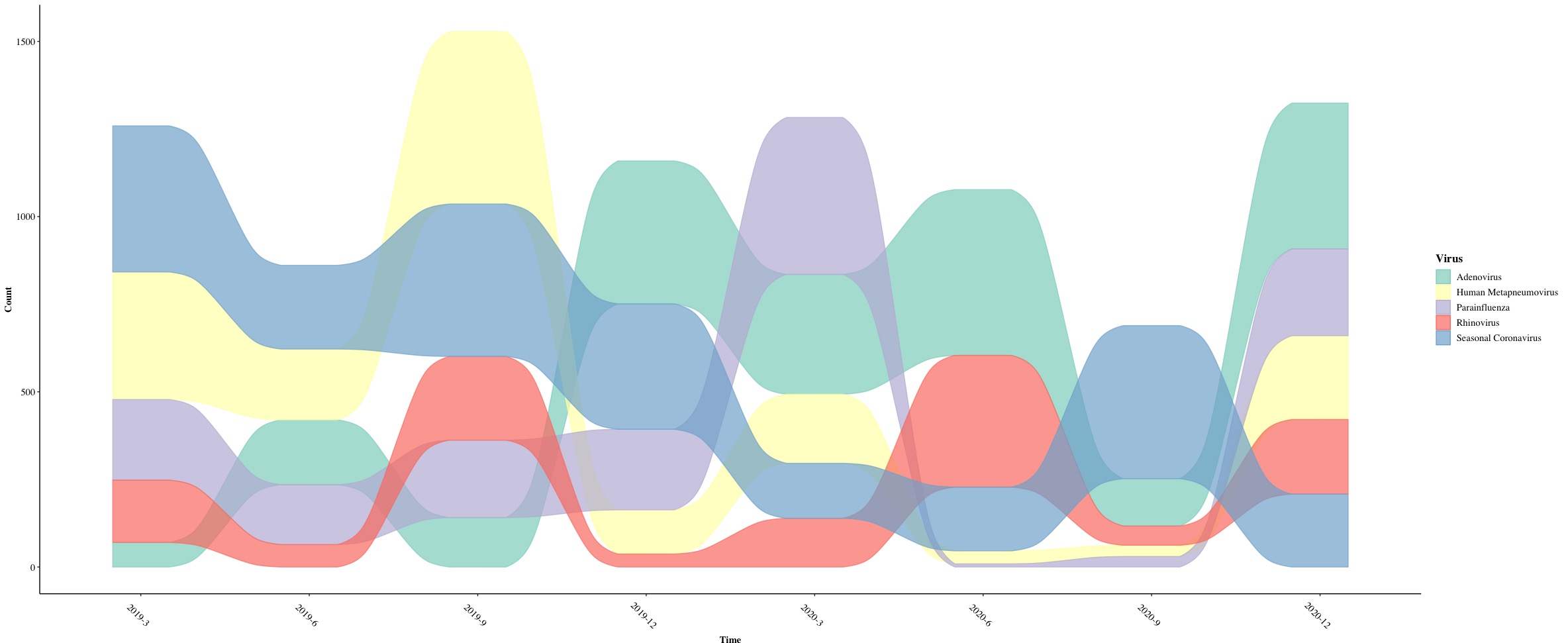
We eventually get a alluvium plot with colorful ribbons!