This is a short tutorial for how to change a plain box plot to be more advanced versions (e.g. box plot with p-value, violin plot, etc.).
The dataset is a record of the level of biomarker for a disease and patients in the dataset are categorized into different groups based on their severity levels. Hence, this dataset has three columns:
-
PTID: unique identifications for participants and there are 400 unique participants (string);
-
Illness: severity levels of the disease [4 levels: Healthy Control, Moderate, Mild, Severe] (string);
-
Biomarker: a numerical measurement of the biomarker (numerical);
-
Sex: a variable for sex of participants (string).

A box plot is often used to show the empirical distribution of a numerical covariate regarding different groups. Usually, there are two main methods to visualize the empirical distribution of the data:
-
Histogram/density: it approximates the “shape” of an empirical distribution;
-
Box plot: it provides more descriptive statistics of an empirical distribution in a graphical way. Typically, it has five elements: min, max, median, 1st & 3rd quartile.
Compared to a histogram/density, a box plot is more often to use when people want to compare the same numerical covariate through all groups and this process is typically involved in performing hypothesis testing.
2. Version 0.0: basic
The first step in here we are going to draw a simple box plot to visualize empirical distribution of Biomarker through different groups in Illness. In this version, we will remove the background and grid for the box plot. We make titles in axes in bold type. The main function for box plot is geom_boxplot() and we will set Illness in X-axis and Biomarker in Y-axis.
# Set Illness and Sex as factors
Dt$Illness <- factor(Dt$Illness, levels = c("Healthy Control", "Mild", "Moderate", "Severe"))
Dt$Sex <- factor(Dt$Sex, levels = c('Male', 'Female'))

# Version 0.0
ggplot(Dt, aes(x = Illness, y = Biomarker)) +
  geom_boxplot(alpha = 0.5) +
  xlab('Illness Severity') + ylab('Biomarker Level') +
  theme_bw() +                                                      # dark-on-light theme
  theme(panel.border = element_blank(),                             # these four are for the background and grid
        panel.background = element_blank(),
        panel.grid.major = element_blank(),
        panel.grid.minor = element_blank(),
        axis.line.x = element_line(),                               # these two are for the axis line
        axis.line.y = element_line(),
        axis.text.x = element_text(colour = "black", size = 11),    # there two are for texts in axes
        axis.text.y = element_text(colour = "black", size = 11),
        axis.ticks.x = element_line(),                              # these two are for ticks in axes
        axis.ticks.y = element_line(),
        axis.title.x = element_text(colour = "black", size = 11, face = 'bold', vjust = -1),
        axis.title.y = element_text(colour = "black", size = 11, face = 'bold'),
        legend.title = element_text(colour = "black", size = 11, face = 'bold'))
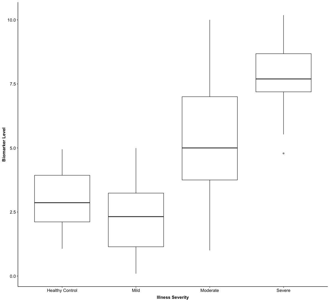
In Version 0.0, we just show boxes for Illness groups and do not stratified them into Sex, which provides a general visualization of numerical biomarker levels regarding different Illness groups.
3. Version 1.0: grouped
Based on the setting of Version 0.0, the boxplot can be stratified by Sex and this only required we pass fill = Sex into aes() for main ggplot function ggplot(). In this version, we will use preselected colors for Sex.
# we can preselect color for each box
Col <- c("#FF0000", "#80FF00")
# Version 1.0
ggplot(Dt, aes(x = Illness, y = Biomarker, fill = Sex)) +
  geom_boxplot(alpha = 0.5) +                                       # 'alpha = 0.5' control the transparency of colors
  scale_fill_manual(values = Col) +                                 # use preselected color
  xlab('Illness Severity') + ylab('Biomarker Level') +
  theme_bw() +                                                      # dark-on-light theme
  theme(panel.border = element_blank(),                             # these four are for the background and grid
        panel.background = element_blank(),
        panel.grid.major = element_blank(),
        panel.grid.minor = element_blank(),
        axis.line.x = element_line(),                               # these two are for the axis line
        axis.line.y = element_line(),
        axis.text.x = element_text(colour = "black", size = 11),    # there two are for texts in axes
        axis.text.y = element_text(colour = "black", size = 11),
        axis.ticks.x = element_line(),                              # these two are for ticks in axes
        axis.ticks.y = element_line(),
        axis.title.x = element_text(colour = "black", size = 11, face = 'bold', vjust = -1),
        axis.title.y = element_text(colour = "black", size = 11, face = 'bold'),
        legend.title = element_text(colour = "black", size = 11, face = 'bold'))

This is the grouped version of a box plot based on Version 0.0. The above two versions are the most basic type of box plots and if you want to show the box horizontally, you just need to shift X-axis and Y-axis. In the next example, we will integrate a box plot with hypothesis testing together.
4. Version 2.0: hypothesis testing
To integrate a box plot with hypothesis testing together, we need to use ggpubr package. We need to use a new function:
# Version 2.0
ggplot(Dt, aes(x = Illness, y = Biomarker, fill = Sex)) +
  geom_boxplot(alpha = 0.5) +                                       # 'alpha = 0.5' control the transparency of colors
  stat_compare_means(aes(group = Sex),                              # 'group = Sex' choose groups for comparison
                     method = 'wilcox.test',                        # we use wilcox test for comparison
                     label = 'p.format',
                     vjust = -0.65) +
  scale_fill_manual(values = Col) +                                 # use preselected color
  xlab('Illness Severity') + ylab('Biomarker Level') +
  theme_bw() +                                                      # dark-on-light theme
  theme(panel.border = element_blank(),                             # these four are for the background and grid
        panel.background = element_blank(),
        panel.grid.major = element_blank(),
        panel.grid.minor = element_blank(),
        axis.line.x = element_line(),                               # these two are for the axis line
        axis.line.y = element_line(),
        axis.text.x = element_text(colour = "black", size = 11),    # there two are for texts in axes
        axis.text.y = element_text(colour = "black", size = 11),
        axis.ticks.x = element_line(),                              # these two are for ticks in axes
        axis.ticks.y = element_line(),
        axis.title.x = element_text(colour = "black", size = 11, face = 'bold', vjust = -1),
        axis.title.y = element_text(colour = "black", size = 11, face = 'bold'),
        legend.title = element_text(colour = "black", size = 11, face = 'bold'))
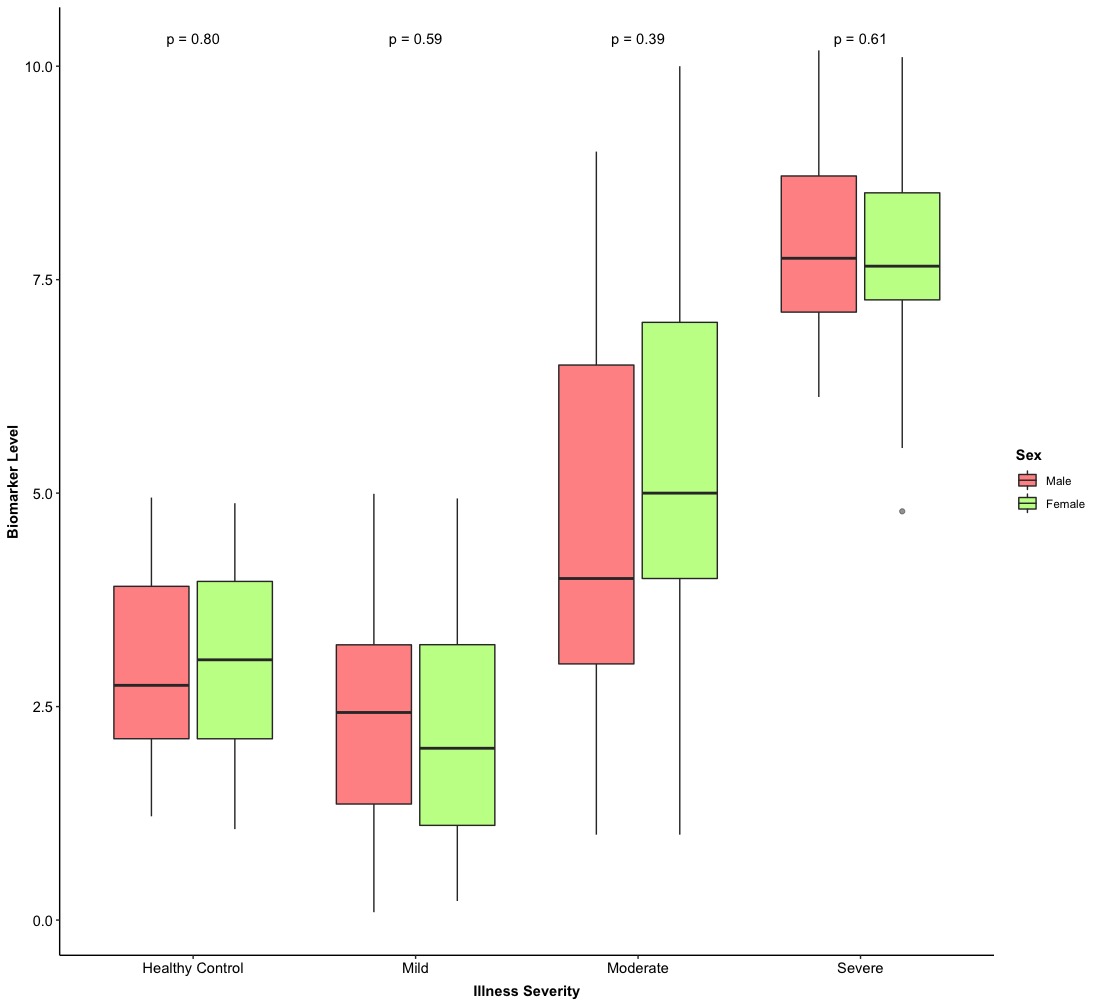
Therefore, it is very easy to integrate a box plot with hypothesis testing! Then, we are going to the final stage of box plot.
5. Version 3.0: violin plot
As we mentioned above, there are two main methods to visualize the empirical distribution of the data–histogram/density and box plot. If we blend them together, that is a violin plot. Actually, it is very easy to create a violin plot based on a box plot and the main function we are going to use is
geom_violin(): this is the main function for creating a violin plot. If we use this function based on our Version 0.0/1.0/2.0, we just need to adjust the size of “violin” and “box” with the command width = .
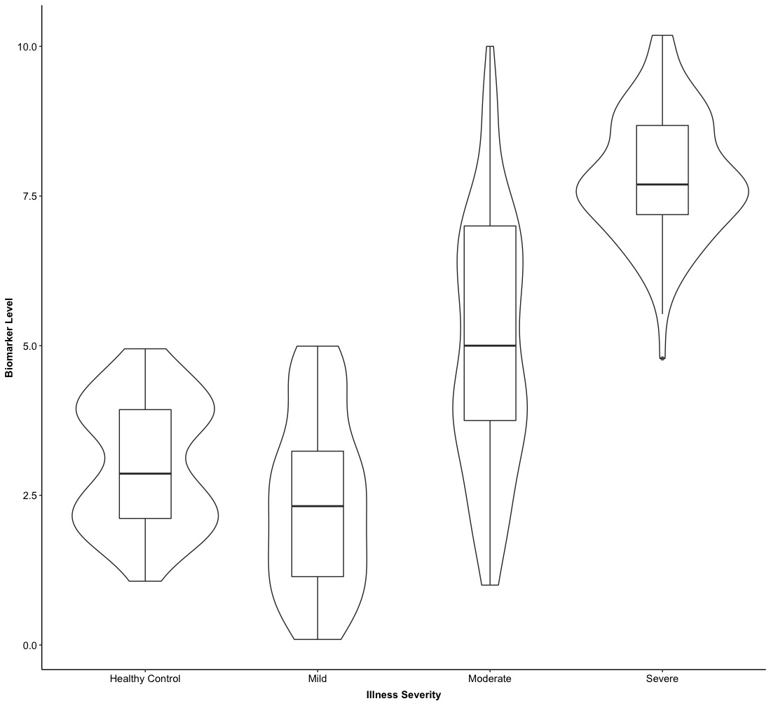
The first example of a violin plot is based on Version 0.0.
-
The basic logic of creating a violin plot over existed box plot is to put geom_violin() at first and then call geom_boxplot().
-
Meanwhile, since the box plot is above the violin plot, we hope violins can cover boxes. It is necessary to adjust the size of violins and boxes to make sure each violin can cover each box entirely.
# Version 3.0
ggplot(Dt, aes(x = Illness, y = Biomarker)) +
  geom_violin(width = 1,
              position = position_dodge(0.7)) +                     # each violin has larger size
  geom_boxplot(alpha = 0.7, width = 0.3,
               position = position_dodge(0.7)) +                    # this size of each box is smaller than a violin
  xlab('Illness Severity') + ylab('Biomarker Level') +
  theme_bw() +                                                      # dark-on-light theme
  theme(panel.border = element_blank(),                             # these four are for the background and grid
        panel.background = element_blank(),
        panel.grid.major = element_blank(),
        panel.grid.minor = element_blank(),
        axis.line.x = element_line(),                               # these two are for the axis line
        axis.line.y = element_line(),
        axis.text.x = element_text(colour = "black", size = 11),    # there two are for texts in axes
        axis.text.y = element_text(colour = "black", size = 11),
        axis.ticks.x = element_line(),                              # these two are for ticks in axes
        axis.ticks.y = element_line(),
        axis.title.x = element_text(colour = "black", size = 11, face = 'bold', vjust = -1),
        axis.title.y = element_text(colour = "black", size = 11, face = 'bold'),
        legend.title = element_text(colour = "black", size = 11, face = 'bold'))
The second example of a violin plot is based on Version 2.0. Due to the overlapped of violins and boxes, we need to adjust their overlapped position and we will use one more arguments in both geom_violin() and geom_boxplot()–position. We will set position = position_dodge() and pass any some numerical values into position_dodge(). position_dodge() is used to control the horizontal distance between two groups. Finally, we need to make sure geom_violin() and geom_boxplot() share the same position.
# Version 4.0
ggplot(Dt, aes(x = Illness, y = Biomarker, fill = Sex)) +
  geom_violin(aes(fill = Sex), width = 1, alpha = 0.5,
              position = position_dodge(1)) +
  geom_boxplot(aes(fill = Sex), alpha = 0.5, width = 0.1,
               position = position_dodge(1)) +
  stat_compare_means(aes(group = Sex),                              # 'group = Sex' choose groups for comparison
                     method = 'wilcox.test',                        # we use wilcox test for comparison
                     label = 'p.format',
                     vjust = -0.65) +
  scale_fill_manual(values = Col) +                                 # use preselected color
  xlab('Illness Severity') + ylab('Biomarker Level') +
  theme_bw() +                                                      # dark-on-light theme
  theme(panel.border = element_blank(),                             # these four are for the background and grid
        panel.background = element_blank(),
        panel.grid.major = element_blank(),
        panel.grid.minor = element_blank(),
        axis.line.x = element_line(),                               # these two are for the axis line
        axis.line.y = element_line(),
        axis.text.x = element_text(colour = "black", size = 11),    # there two are for texts in axes
        axis.text.y = element_text(colour = "black", size = 11),
        axis.ticks.x = element_line(),                              # these two are for ticks in axes
        axis.ticks.y = element_line(),
        axis.title.x = element_text(colour = "black", size = 11, face = 'bold', vjust = -1),
        axis.title.y = element_text(colour = "black", size = 11, face = 'bold'),
        legend.title = element_text(colour = "black", size = 11, face = 'bold'))

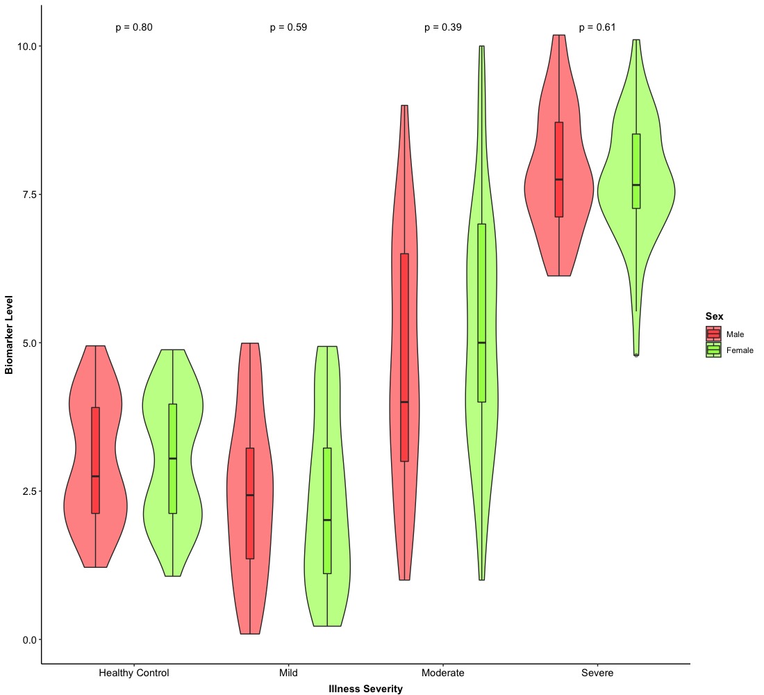
Eventually, we can get a fancy violin plot with a plain box plot and hypothesis testing! We can also make them horizontally and this just need to exchange a variable in X-axis with a variable in Y-axis as well.
In here, we just provide two types of combination of plots so it is very possible that people can combine box/violin plots with other plots (e.g. points, bars, etc.).