In this tutorial, I aim to demonstrate how to effectively visualize the changes in ranks over time using a bump chart created with ggplot2 and ggbump package. A bump chart is a specialized type of line plot specifically designed to display the relative ranks or orders of subjects as they evolve over time. Unlike an alluvium plot, which showcases the actual values or metrics for each subject over time, a bump chart focuses solely on the ranking aspect. To accomplish this, I will utilize the publicly available dataset for Covid-19 surveillance provided by the Seattle Flu Study. This dataset comprises the recorded number of specimens received in various collection channels in Seattle, WA, for each month. Consequently, it offers both the actual values and the corresponding ranks of specimens within each channel.
Dataset
After data preprocessing, we first look at the dataset, which comprises 4 columns:-
-
collection_channel: it indicated the channel of specimen collection [7 levels: Childcare, City testing sites, Clinical residuals, Other, Public space, Shelter, Swab-n-send] (string);
-
Year: it indicated the calendar year (numerical);
-
Total: it indicated the total number of collected specimens in a given year (numerical);
-
Rank: it indicated the rank of Total (numerical).

We basically need to use collection_channel, Year, and Rank variables for creating bump charts.
Version 1
To generate a bump chart, we primarily utilize the geom_bump() function from the ggbump package. This function creates a smooth line based on the rank of subjects over time and it mainly requires two arguments:
-
linewidth: it is used to indicate the width of the smooth line, with a larger number indicating a wider line.;
-
smooth: it is used to determine the degree of smoothness for the curve, with a higher value indicating a steeper smooth curve.
To complete the chart, we should assign the Year variable to the x-axis and the Rank variable to the y-axis. Additionally, it is important to assign a distinct color to each type of collection_channel.
p <-
ggplot(Dt,
       aes(x = Year,                      # x axis: Year
           y = Rank,                      # y axis: Rank
           col = collection_channel)) +   # Each collection channel has a distinct color
  geom_bump(linewidth = 2,                # Set line width as 2
            smooth = 8)                   # Set smoothness as 8
p
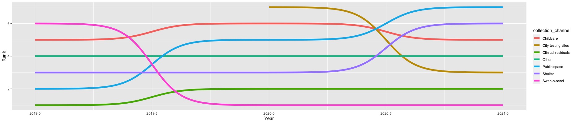
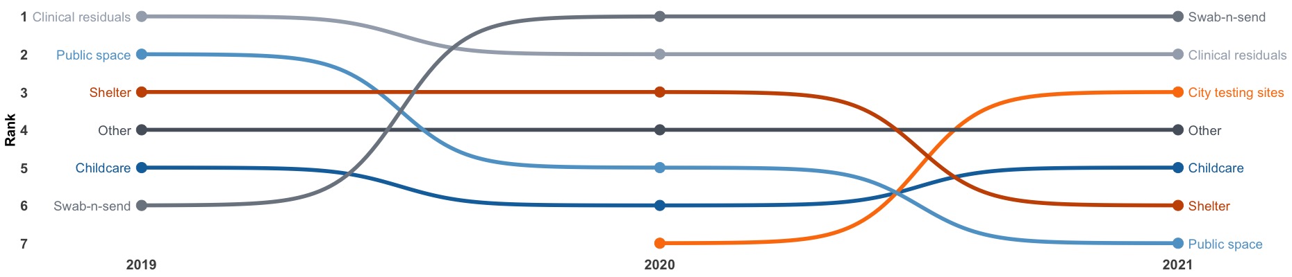
In this preliminary bump chart, it is obvious that the first rank, representing the highest count of collected specimens, is positioned at the bottom of the y-axis. However, some people may prefer to have the first rank at the top of the chart. To accommodate this preference, we need to reverse the order of the y-axis scale.
Version 2
In addition to that, we would like to make a few more modifications to enhance the figure. Firstly, we want to display only rounded values for the Year on the x-axis. Secondly, we aim to replace the legend for collect_channel by placing the corresponding label on the left and right sides of the chart. To achieve a cleaner appearance, we intend to remove the background, border, and grid lines in the bump chart. Finally, we would like to utilize a different color palette, distinct from the default one, by employing the scale_color_tableau() function from the ggthemes package.
p <-
ggplot(Dt, aes(x = Year,
               y = Rank,
               col = collection_channel)) +
  geom_bump(linewidth = 2,
            smooth = 8) +
  geom_point(size = 5) +                            # Add points
  geom_text(data = Dt[which(Dt$Year == 2019), ],    # Left: label of collection_channel
            aes(x = Year - 0.02,                    # Move label to left a little bit
                y = Rank,
                label = collection_channel),        # Label names
            size = 5,                               # Size of label
            hjust = 1) +                            # Adjust horizontal location
  geom_text(data = Dt[which(Dt$Year == 2021), ],    # Right: label of collection_channel
            aes(x = Year + 0.02,                    # Move label to right a little bit
                y = Rank,
                label = collection_channel),
            size = 5,
            hjust = 0) +                            # Adjust horizontal location
  scale_y_reverse(limits = c(7, 1),                 # Reverse the y scale
                  breaks = rev(seq(1, 7, 1))) +
  scale_x_continuous(limits = c(2018.9, 2021.1),    # Round x scale
                     breaks = seq(2019, 2021, 1)) +
  scale_color_tableau(palette = 'Color Blind') +     # Use Tableau color palette
  labs(x = NULL,                                    # Remove title for x axis
       y = 'Rank') +
  theme_bw() +
  theme(axis.ticks = element_blank(),               # Remove ticks in axes
        panel.border = element_blank(),             # Remove border
        panel.grid = element_blank(),               # Remove grid lines
        panel.background = element_blank(),         # Remove background
        plot.background = element_blank(),
        legend.position = "none",
        axis.text = element_text(size = 15, face = 'bold'),
        axis.title.y = element_text(size = 15, face = 'bold'))
p
Here we go!