In this tutorial, we will explore how to create plots for the cumulative incidence function in R using ggplot2, survminer, and tidycmprsk. The cumulative incidence function (CIF) is frequently used in survival analysis when competing risks are present in the dataset. In traditional survival data, the survival label $\delta$ only has two classes: 0 or 1 (often referred to as alive or deceased). However, in the presence of competing risks, the survival outcome may involve more than two states, such as 0, 1, or 2 (often referred to as healthy, progressing, or deceased).
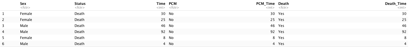
We will be using the monoclonal gammopathy data from the survival package, which consists of the natural history of 1341 sequential patients with monoclonal gammopathy of undetermined significance (MGUS). This dataset involves survival outcomes with three possible states: censored, progression to plasma cell malignancy disease (PCM), and death due to MGUS. After data preprocessing, there are 7 columns in the dataset:
-
Sex: this is a variable for sex [2 levels (factor): “Female” and “Male”] (string);
-
Status: this is a combined event variable for three states [3 levels (factor): “Censor”, “Plasma Cell Malignancy”, “Death”] (string);
-
Time: this is a combined survival time (year) until any event happened or censored (numerical);
-
PCM: this is an event indicator for whether a patient progressed to PCM [2 levels (factor): “No”, “Yes”] (string);
-
PCM_Time: this is a survival time (year) until the PCM event happened or censored (numerical);
-
Death: this is an event indicator for whether a patient died [2 levels (factor): “No”, “Yes”] (string);
-
Death_Time: this is a survival time (year) until the Death event happened or censored (numerical).
2. Cumulative incidence function plot
(1). Cumulative incidence function
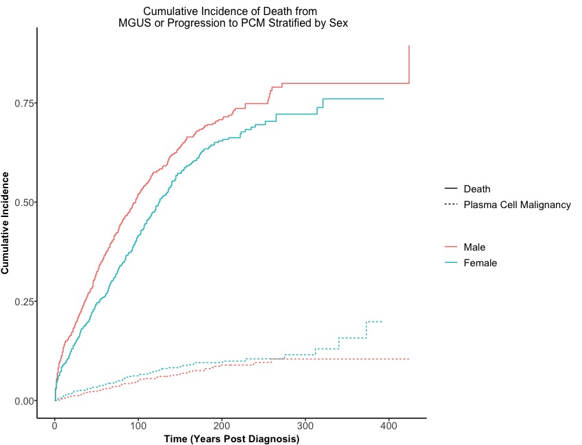
Before creating a figure, we need to construct a model for the cumulative incidence function in order to examine the differences in survival among the three states, stratified by the sex of the patients and we need to use cuminc() function from the tidycmprsk package to build a CIF model.
# Cumulative incidence functioin
require(tidycmprsk)
CIF <- cuminc(Surv(Time, Status) ~ Sex, data = Dt.Plot)
cuminc() function requires two main arguments:
After we fitted a cumulative incidence function, we can pass it into functions for creating figures.
(2). Customized theme
To more effectively customize non-graphical components in ggplot2 for survival data, it is recommended to create a function that allows for theme customization.
# Customize theme of kaplan meier curve
Customized.Theme <- function(){
  theme_survminer() %+replace%                                        # a ggplot2 function
    theme(panel.border = element_blank(),
          panel.background = element_blank(),
          panel.grid.major = element_blank(),
          panel.grid.minor = element_blank(),
          axis.line.x = element_line(),                               # these two are for the axis line
          axis.line.y = element_line(),
          axis.text.x = element_text(size = 11),                      # there two are for texts in axes
          axis.text.y = element_text(size = 11),
          axis.ticks.x = element_line(),                              # these two are for ticks in axes
          axis.ticks.y = element_line(),
          axis.title.x = element_text(size = 11, face = 'bold', vjust = -1),
          axis.title.y = element_text(size = 11, face = 'bold', angle = 90, vjust = 3),
          legend.title = element_text(size = 11, face = 'bold'),
          legend.text = element_text(size = 11),
          legend.position = 'right',
          plot.title = element_text(hjust = 0.5))
}
In the Customized.Theme() function, we set the font weight to bold and font size to 11 for the x-axis label, y-axis label, and main title. Additionally, we remove the background and grid lines.
(3). Plot
Now, we will create a figure to visualize the cumulative incidence function (CIF). To do this, we will use the ggcuminc() function from the ggsurvfit package, which requires three arguments:
-
x: this argument represents a cumulative incidence function model from either cuminc() or survfit2();
-
outcome: this is an argument for indicating which outcome(s) to include in plot and default is to include the first competing event;
-
theme: this is an argument for a survfit theme and default is theme_ggsurvfit_default().
# Create title and outcome
Title <- paste0('Cumulative Incidence of Death from \n MGUS or Progression to PCM Stratified by ', 'Sex')
Oucome <- c("Plasma Cell Malignancy", "Death")

# Create CIF plot
CIF_Plot <- ggcuminc(x = CIF,                        # the above CIF function
                     outcome = Oucome,               # the label for competing events
                     theme = Customized.Theme()) +   # customize theme
  labs(x = 'Time (Years Post Diagnosis)',            # modify xlab, ylab, and main title
       y = 'Cumulative Incidence',
       title = Title)
CIF_Plot
Here we go!
(4). Comparison between Kaplan-Meier curve
In contrast to the cumulative incidence function, the Kaplan-Meier curve estimates the failure rate for each competing event separately. When the event of interest is progression to PCM, the death due to MGUS will be considered as censored events, in addition to the usual censored observations. On the other hand, the cumulative incidence function uses the overall survival function, which takes into account events from both the competing events and the events of interest.
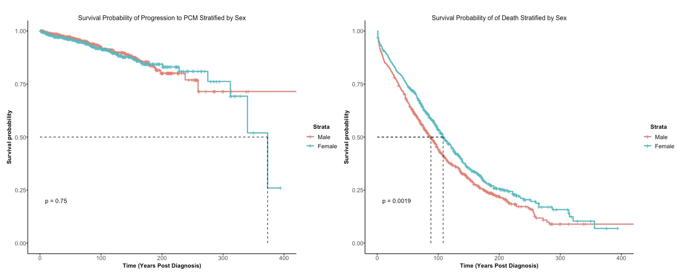
It is clear that the Kaplan-Meier curve for progression to PCM treats events that are due to death as censored at later years post-diagnosis, which cannot be accurately represented. However, this situation can be visualized using the cumulative incidence function.