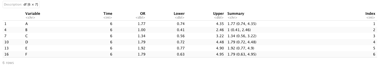
We will use ggplot2 to make a forest plot for estimated odds ratios from logistic regression models and the ggplot2 requires a specific format of the dataset. We require three packages ggplot2, gridExtra, and scales. In this dataset, we have 6 columns
-
Variable: covariates in logistic regression models (numerical);
-
Time: time points on month for different outcomes (numerical);
-
OR: estimated odds ratios for Variable (numerical);
-
Lower and Upper: lower and upper bounds in 95% confidence intervals for estimated odds ratios (numerical);
-
Summary: sentences combined OR and 95% CI for odds ratios (string);
-
Index: it is a sequence of ordered number used for the plot and its length is equal to the number of Variable.
In the ggplot, no matter what kind of plots we make, they are basically composed of two parts: X-axis and Y-axis. Since we want to create a forest plot for odds ratio, we set X-axis as Variable and Y-axis as OR.
2. Version 0.0
When we determined which variables should be placed in X-axis or Y-axis, we then need to choose what “values” should be displayed. Typically, these “values” are in numerical format and we also need to choose what types of plots we want to show (e.g. point, line, bar, tile, box with whisker, etc.). A forest plot consists of a center (OR) and two whiskers (Lower and Upper).
# Version 0.0
ggplot(Plot.OR.Mat.6, aes(x = OR, y = Variable)) +    # x is for X-axis | y is for Y-axis
  geom_point() +                                      # a function for plotting points
  geom_errorbarh(aes(xmin = Lower, xmax = Upper))     # a function for plotting two whiskers
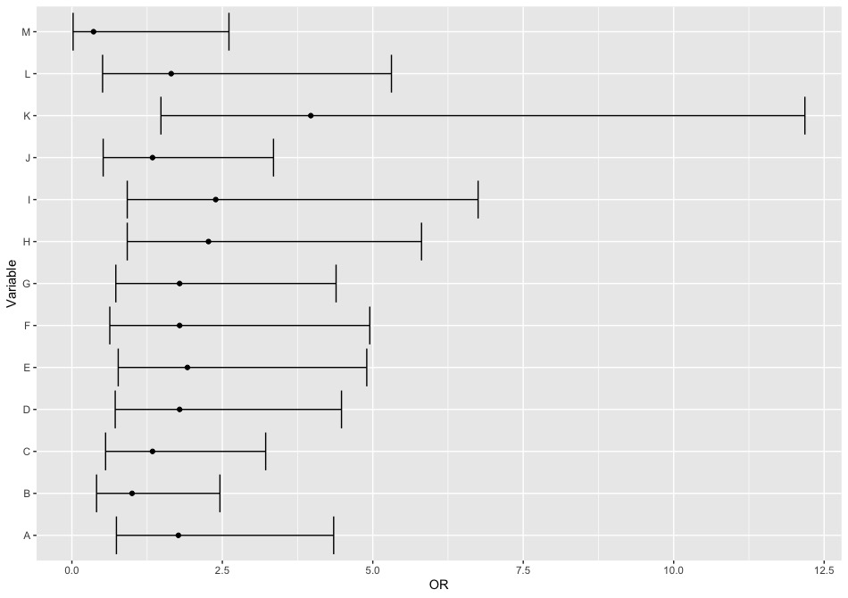
So it basically looks like the above one. But we can polish it and eventually attach Summary with corresponding Variable.
3. Version 1.0
The main elements in this plot are from two functions:
-
geom_point(): this function is for points (OR in our example) and it can use different commands to modify the point (e.g. shape [shape = 18], size [size = 3], color [col = 'black'], etc.);
-
geom_errorbarh(): this function for horizontal error bars which are two whiskers in a 95% confidence interval and it requires providing minimum and maximum for the “value” that we want to pass into (e.g. geom_errorbarh(aes(xmin = Lower, xmax = Upper))). We also can change the length of the vertical tick on two sides (e.g. height = 0.25).
Meanwhile, plots for odds ratio are often displayed under log scale and we can also easily change the scale system in ggplot with the command scale_x_continuous() (numerical value are in X-axis) or scale_y_continuous() (numerical value are in y-axis). In our example, the numerical values are in X-axis so we use
scale_x_continuous(): we use the command trans = 'log' (for log transformation) inside the function and set up the scale range of X-axis with the command limits = c(0.005, 13)(lower, upper). Since the log transformation will bring up lots of digits for numerical values, we can pass the label_number() to round digits into 2 decimal places of precision.
We can combine them with the X-axis label [xlab()] and the main title [ggtitle()] to see what it looks like.
# Version 1.0
ggplot(Plot.OR.Mat.6, aes(x = OR, y = Variable)) + # x is for X-axis | y is for Y-axis
geom_point(shape = 18, size = 3) + # a function for plotting points
geom_errorbarh(aes(xmin = Lower, xmax = Upper), # a function for plotting two whiskers
height = 0.25) + # the length of vertical ticks
scale_x_continuous(trans = 'log', # log transformation for values in X-axis
limits = c(0.005, 13), # range of X-axis in original scale
labels = label_number()) + # round digits
xlab("Odds Ratio (95% CI, log scale)") + # X-axis label
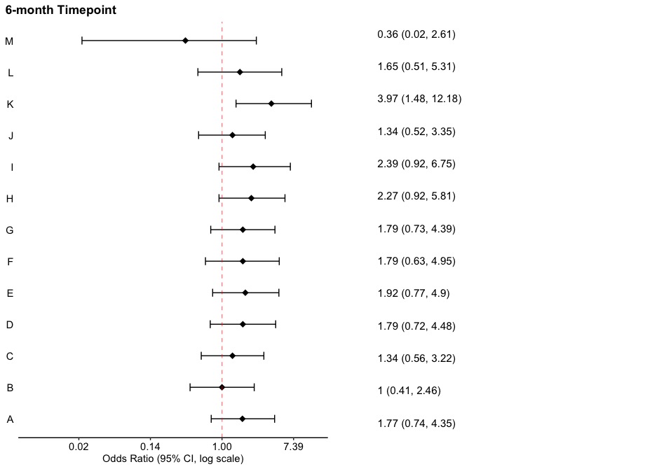
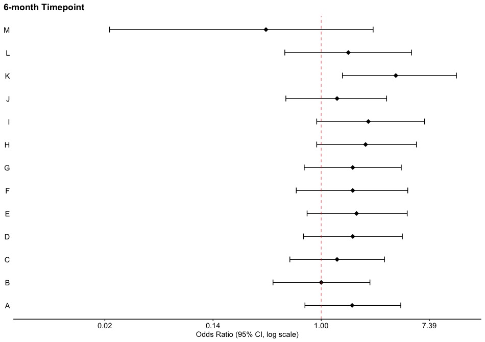
ggtitle('6-month Timepoint') # title of plots
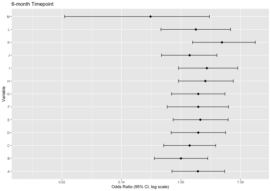
In the Version 1.0, we can find that the gray background and grid may not be good for presenting the plot and texts in two axes are small.
3. Version 2.0
So in the next step we are going to improve the background and texts under the Version 1.0 and we are going to introduce some functions and corresponding commands.
-
theme_bw(): this is a dark-on-light theme and better for presentations.
-
theme(): this is a general function for all non-data components in a plot so we can use it to modify any texts, labels, backgrounds, etc. Within this function, we are going to introduce some commands.
-
panel.border, panel.background, panel.grid.major, and panel.grid.minor: these four are used to control the background and gird of a plot. since we want to give it a blank background and grid, we will set
panel.border = element_blank(),
panel.background = element_blank(),
panel.grid.major = element_blank(),
panel.grid.minor = element_blank().
In here, the function element_blank() is to display nothing for non-data elements.
-
axis.line.x and axis.line.y: they are used to control the axis line in X-axis and Y-axis. In the forest plot, the axis line for Y-axis is blank so we will set
axis.line.y = element_blank().
-
axis.ticks.x and axis.ticks.y: they are used to control the small tick in X-axis and Y-axis. In the forest plot, the ticks for X-axis and Y-axis are blank so we will set
axis.line.y = element_blank(),
axis.line.y = element_blank().
-
axis.text.x and axis.text.y: they are used to modify texts in two axes. Since we want to enlarge the font of texts in Y-axis so we will set
axis.text.y = element_text(colour = "black", size = 11).
The function element_text() is to modify texts in a plot and it provides a brunch of commands for font size, color, position, face, etc.
-
plot.title: this is to modify the title. We want to align the title on the left side and make the font to be bold, so we will set
plot.title = element_text(hjust = -0.86, face="bold").
We also want to move the title for Y-axis and add a vertical line for OR = 1 (geom_vline(xintercept = 1, color = "red", linetype = "dashed", cex = 0.5, alpha = 0.5)). Now we can combine them all together!
# Version 2.0
p1 <-
ggplot(Plot.OR.Mat.6, aes(x = OR, y = Variable)) +                  # x is for X-axis | y is for Y-axis
  geom_point(shape = 18, size = 3) +                                # a function for plotting points
  geom_errorbarh(aes(xmin = Lower, xmax = Upper),                   # a function for plotting two whiskers
                 height = 0.25) +                                   # the length of vertical ticks
  scale_x_continuous(trans = 'log',                                 # log transformation for values in X-axis
                     limits = c(0.005, 13),                         # range of X-axis in original scale
                     labels = label_number()) +                     # round digits
  xlab("Odds Ratio (95% CI, log scale)") +                          # X-axis label
  ggtitle('6-month Timepoint') +                                    # title of plots
  theme_bw() +                                                      # dark-on-light theme
  theme(panel.border = element_blank(),                             # these four are for the background and grid
        panel.background = element_blank(),
        panel.grid.major = element_blank(),
        panel.grid.minor = element_blank(),
        axis.line.x = element_line(),                               # these two are for the axis line
        axis.line.y = element_blank(),
        axis.text.x = element_text(colour = "black", size = 11),    # there two are for texts in axes
        axis.text.y = element_text(colour = "black", size = 11),
        axis.ticks.x = element_line(),                              # these two are for ticks in axes
        axis.ticks.y = element_blank(),
        axis.title.x = element_text(),                              # these two are for titles in axes
        axis.title.y = element_blank(),
        plot.title = element_text(hjust = -0.86, face = "bold")) +  # the main title
                                                                    # hjust is for title position
  geom_vline(xintercept = 1,                                        # the position of vertical line
             color = "red",                                         # the color of line
             linetype = "dashed",                                   # the type of line
                                                                    # we used dashed line in here
             alpha = 0.5)                                           # the transparency level of the line
p1
This version looks more clear and tidy! We can try our last step, that is to combine the Summary for each variable.
4. Version 3.0
In the last version, we are going to combine the Summary and the main plot together. The basic logic of the combination is to put two plots together–the main plot is the Version 2.0 and another empty plot only contains Summary. First, we are going to create an empty plot which attaches Summary on its right hand side. We first create an empty plot.
table_base <-
  ggplot(Plot.OR.Mat.6, aes(y = Variable)) +                          # everything in this plot is empty
  ylab(NULL) + xlab('') + ggtitle('') +
  xlim(0, 13) +                                                       # make sure this is the same as p1
  theme(panel.border = element_blank(),
        panel.background = element_blank(),
        panel.grid.major = element_blank(),
        panel.grid.minor = element_blank(),
        axis.line.x = element_blank(),
        axis.line.y = element_blank(),
        axis.text.x = element_text(color = "white", hjust = -3, size = 11),
        axis.text.y = element_blank(),
        axis.ticks.x = element_blank(),
        axis.ticks.y = element_blank(),
        axis.title.x = element_blank(),
        axis.title.y = element_blank(),
        plot.title = element_text(hjust = -0.86, face = "bold"))      # make sure hjust is the same as p1
## OR point estimate table
tab1 <- table_base + geom_text(aes(y = rev(Index), x = 1, label = Summary), size = 4, hjust = 0, vjust = -0.5)
The tab1 is an empty plot only including Summary and we need to arrange its position and combine it with the main plot p1. Hence, we need to use the function grid.arrange().
grid.arrange(): we will put the main plot p1 first and then tab1. The commands, nrow and ncol, are used to arrange positions of two plots. We will set
nrow = 1 and ncol = 2 which means we want to horizontally put them together where p1 is in the left hand side and tab1 is in the right hand side.
Eventually, the final plot will be better than previous versions.
# eventually we attach the summary to the plot
grid.arrange(p1, tab1,
             nrow = 1, ncol = 2)
This is the final version! If we want to print it out from R, we can always change its size when we save the figure to make sure title is center or aligned left.
5. Version 4.0
This is a stacked version of forest plots. However, this time we need to remove everything in the X-axis for the plot at the top of a stack.
# Version 4.0
p2 <-
ggplot(Plot.OR.Mat.6, aes(x = OR, y = Variable)) +                  # x is for X-axis | y is for Y-axis
  geom_point(shape = 18, size = 3) +                                # a function for plotting points
  geom_errorbarh(aes(xmin = Lower, xmax = Upper),                   # a function for plotting two whiskers
                 height = 0.25) +                                   # the length of vertical ticks
  scale_x_continuous(trans = 'log',                                 # log transformation for values in X-axis
                     limits = c(0.005, 13),                         # range of X-axis in original scale
                     labels = label_number()) +                     # round digits
  ggtitle('12-month Timepoint') +                                    # title of plots
  theme_bw() +                                                      # dark-on-light theme
  theme(panel.border = element_blank(),                             # these four are for the background and grid
        panel.background = element_blank(),
        panel.grid.major = element_blank(),
        panel.grid.minor = element_blank(),
        axis.line.x = element_blank(),                               # these two are for the axis line
        axis.line.y = element_blank(),
        axis.text.x = element_blank(),
        axis.text.y = element_text(colour = "black", size = 11),
        axis.ticks.x = element_blank(),                              # these two are for ticks in axes
        axis.ticks.y = element_blank(),
        axis.title.x = element_blank(),                              # these two are for titles in axes
        axis.title.y = element_blank(),
        plot.title = element_text(hjust = -0.065, face = "bold")) +  # the main title
                                                                    # hjust is for title position
  geom_vline(xintercept = 1,                                        # the position of vertical line
             color = "red",                                         # the color of line
             linetype = "dashed",                                   # the type of line
                                                                    # we used dashed line in here
             alpha = 0.5)                                           # the transparency level of the line
# This is the empty
table_base2 <-
  ggplot(Plot.OR.Mat.6, aes(y = Variable)) +                          # everything in this plot is empty
  ylab(NULL) + xlab('') + ggtitle('') +
  xlim(0, 13) +                                                       # make sure this is the same as p1
  theme(panel.border = element_blank(),
        panel.background = element_blank(),
        panel.grid.major = element_blank(),
        panel.grid.minor = element_blank(),
        axis.line.x = element_blank(),
        axis.line.y = element_blank(),
        axis.text.x = element_text(color = "white", hjust = -3, size = 11),
        axis.text.y = element_blank(),
        axis.ticks.x = element_blank(),
        axis.ticks.y = element_blank(),
        axis.title.x = element_blank(),
        axis.title.y = element_blank(),
        plot.title = element_text(hjust = -0.065, face = "bold"))      # make sure hjust is the same as p1

## OR point estimate table
tab2 <- table_base2 + geom_text(aes(y = Index, x = 1, label = Summary), size = 4, hjust = 0, vjust = 1.35)
# eventually we attach all together!
grid.arrange(p2, tab2,
             p1, tab1,
             nrow = 2, ncol = 2)
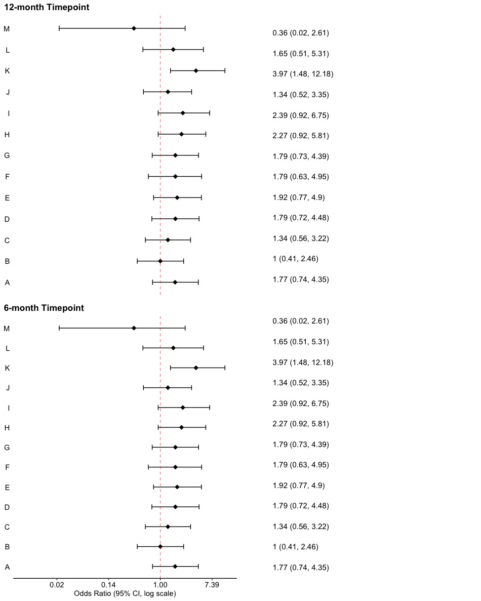
After we remove the X-axis for the top plot, we need to align the Summary with rows in the plot and this can be modified by geom_text(aes(y = Index, x = 1, label = Summary), size = 4, hjust = 0, vjust = 1.35) (need to modify vjust = : modify vertical distance).