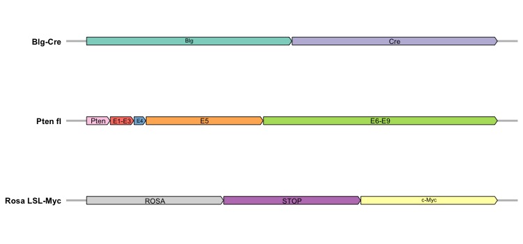
This tutorial introduces the visualization of gene maps with arrows in R using the ggplot2 and gggenes packages. It provides a linear representation of gene strain segments in genomes, commonly employed in scientific publications for gene description. We’ll generate a synthetic dataset to simulate a gene map resembling Figure 1E in a recent paper detailing a mouse model for triple-negative breast cancer. This synthetic dataset comprises three distinct genomes, each containing different gene segments. With a straightforward structure, the dataset consists of four columns:
-
Molecule: it is a categorical variable denoting the names of the genomes [3 unique genomes] (string);
-
Gene: it is a categorical variable denoting the names of the gene segments [10 unique genes] (string);
-
Start and End: they are used to denote the starting and ending location of a gene segment within a genome (numerical).

We will initially demonstrate how to visualize a single genome and then extend the discussion to multiple genomes. Two core functions are used to generate a gene map:
-
geom_gene_arrow(): coming from the gggenes package, it is utilized to draw genes as arrows, offering flexibility with various optional arguments:
arrowhead_width and arrowhead_height: these optional arguments can be leveraged to control the width/height of the arrowhead. Users often use the unit() function from the ggplot2 package to specify the size in most cases.
-
theme_genes(): it is utilized to specify the theme for gene map.
-
geom_gene_label(): it is utilized to label genes with texts and must be called after geom_gene_arrow(). The argument align can be used to specify the location of texts (“left”, “centre”, “right”).
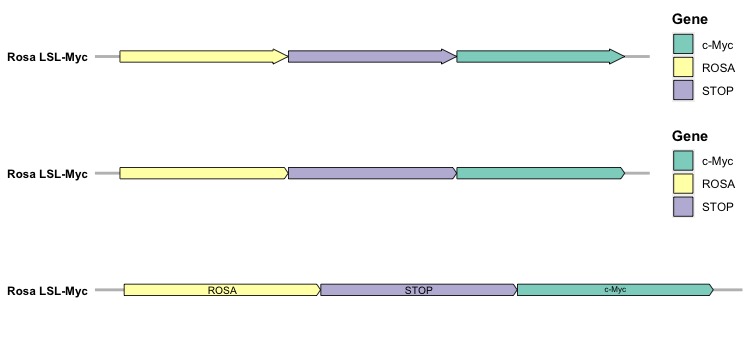
In addition to these functions, it’s essential to define the xmin (start location), xmax (end location), y (genome), and fill (gene segments) arguments within the aes() function. By specifying the fill argument, each gene within a genome will be categorized with a distinct color and displayed in the legend. To label each gene in the figure and remove the legend, users should include an additional argument, label, in the aes() function within the ggplot() function.
SingleGenome <- Dt[which(Dt$Molecule == 'Rosa LSL-Myc'), ]
# Version 1: default
p1 <-
ggplot(SingleGenome,
       aes(xmin = Start, xmax = End,      # Specify start/end location for a gene
           y = Molecule,                  # Specify genome
           fill = Gene)) +                # Specify color for genes
  geom_gene_arrow() +                     # Draw gene map as arrows
  scale_fill_brewer(palette = "Set3") +   # Specify color palette
  theme_genes() +                         # Specify theme for gene map
  theme(axis.text.x = element_blank(),    # Remove x axis
        axis.ticks.x = element_blank(),
        axis.title.x = element_blank(),
        axis.line.x = element_blank(),
        axis.title.y = element_blank(),   # Remove title in y axis
        axis.text.y = element_text(face = 'bold', color = 'black'),
        legend.title = element_text(face = 'bold', color = 'black'))
p1

# Version 2: modify the shape of arrowhead
p2 <-
ggplot(SingleGenome,
       aes(xmin = Start, xmax = End,      # Specify start/end location for a gene
           y = Molecule,                  # Specify genome
           fill = Gene)) +                # Specify color for genes
  geom_gene_arrow(arrowhead_height = unit(3, "mm"),    # Modify height and width
                  arrowhead_width = unit(1, "mm")) +
  scale_fill_brewer(palette = "Set3") +   # Specify color palette
  theme_genes() +                         # Specify theme for gene map
  theme(axis.text.x = element_blank(),    # Remove x axis
        axis.ticks.x = element_blank(),
        axis.title.x = element_blank(),
        axis.line.x = element_blank(),
        axis.title.y = element_blank(),   # Remove title in y axis
        axis.text.y = element_text(face = 'bold', color = 'black'),
        legend.title = element_text(face = 'bold', color = 'black'))
p2

# Version 3: add label to genes and remove legend
p3 <-
ggplot(SingleGenome,
       aes(xmin = Start, xmax = End,      # Specify start/end location for a gene
           y = Molecule,                  # Specify genome
           fill = Gene,                   # Specify color for genes
           label = Gene)) +
  geom_gene_arrow(arrowhead_height = unit(3, "mm"),    # Modify height and width
                  arrowhead_width = unit(1, "mm")) +
  geom_gene_label() +                     # Specify labels
  scale_fill_brewer(palette = "Set3") +   # Specify color palette
  theme_genes() +                         # Specify theme for gene map
  theme(axis.text.x = element_blank(),    # Remove x axis
        axis.ticks.x = element_blank(),
        axis.title.x = element_blank(),
        axis.line.x = element_blank(),
        axis.title.y = element_blank(),   # Remove title in y axis
        axis.text.y = element_text(face = 'bold', color = 'black'),
        legend.position = 'none')
p3

# Show figure
grid.arrange(p1, p2, p3, ncol = 1)

The initial plot represents the default version, the second plot reflects a slight modification to the arrowhead, and in the last one, we remove the legend while adding text labels to the genes. After visualizing a single genome, the next step involves creating a collective representation of multiple genomes in a single figure. Here, the facet_wrap() function from the ggplot2 package becomes essential. Given that genes in genomes occupy distinct locations, it’s crucial to include the argument scales = "free" in the function. This enables stacking various gene maps together using ncol = 1.
p4 <-
ggplot(Dt,
       aes(xmin = Start, xmax = End,      # Specify start/end location for a gene
           y = Molecule,                  # Specify genome
           fill = Gene,                   # Specify color for genes
           label = Gene)) +
  geom_gene_arrow(arrowhead_height = unit(3, "mm"),    # Modify height and width
                  arrowhead_width = unit(1, "mm")) +
  geom_gene_label() +                     # Specify labels
  facet_wrap(~ Molecule, scales = "free", ncol = 1) +
  scale_fill_brewer(palette = "Set3") +   # Specify color palette
  theme_genes() +                         # Specify theme for gene map
  theme(axis.text.x = element_blank(),    # Remove x axis
        axis.ticks.x = element_blank(),
        axis.title.x = element_blank(),
        axis.line.x = element_blank(),
        axis.title.y = element_blank(),   # Remove title in y axis
        axis.text.y = element_text(face = 'bold', color = 'black'),
        legend.position = 'none')
p4

In this figure, each gene map for every genome is vertically stacked, with each gene designated a unique color. In this synthetic dataset for genomes, the genes are not shared across genomes. However, at times, the same genes are shared across different genomes, but located in different positions. Hence, we’ll introduce the make_alignment_dummies() function from the gggenes package to assist in aligning genes across genomes. We will use the sample dataset provided by the gggenes package to show how we can align genes across genomes. The make_alignment_dummies() function takes several arguments:
-
data: it is used to specify the dataset for genes
-
mapping: it is the same as any geom function and used to specify aes(). For example, aes(xmin = start, xmax = end, y = molecule, id = gene) (it is required to specify an additional argument for id).
-
on: it is used to specify the name of gene to be visually aligned across facets.
-
side: it is used to specify the visual alignment be of the "left" (default) or "right".
After passing the gene dataset into the make_alignment_dummies() function, it’s essential to store the result and subsequently input it into the geom_blank() function from the ggplot2 package when creating the figure. Let’s start by examining the sample dataset (example_genes) provided by the gggenes package, which comprises 6 columns:
-
molecule: the names of genomes
-
gene: the names of genes
-
start and end: the start/end positions of the gene
-
strand: the strand of genes
-
orientation: the orientation of the gene (1 for left, 0 for right)

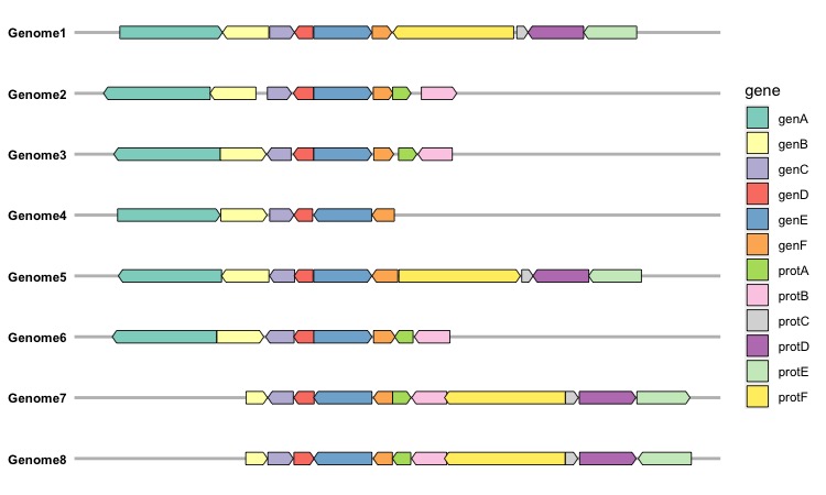
As the sample dataset includes gene orientations, indicating the arrowhead orientation for each gene, this information can be integrated into the figure using an additional argument, aes(forward = orientation), in the geom_gene_arrow() function. Please note that the forward argument can only accept a vector with numerical values of 0 or 1. We can incorporate all this information to generate a comprehensive gene map plot:
dummies <- make_alignment_dummies(example_genes,
                                  aes(xmin = start, xmax = end,y = molecule,id = gene),
                                  on = "genE")

p5 <-
ggplot(example_genes,
       aes(xmin = start, xmax = end,      # Specify start/end location for a gene
           y = molecule,                  # Specify genome
           fill = gene))+                 # Specify color for genes
  geom_gene_arrow(aes(forward = orientation),
                  arrowhead_height = unit(3, "mm"),    # Modify height and width
                  arrowhead_width = unit(1, "mm")) +
  geom_blank(data = dummies) +
  facet_wrap(~ molecule, scales = "free", ncol = 1) +
  scale_fill_brewer(palette = "Set3") +   # Specify color palette
  theme_genes() +                         # Specify theme for gene map
  theme(axis.text.x = element_blank(),    # Remove x axis
        axis.ticks.x = element_blank(),
        axis.title.x = element_blank(),
        axis.line.x = element_blank(),
        axis.title.y = element_blank(),   # Remove title in y axis
        axis.text.y = element_text(face = 'bold', color = 'black'))
p5

In this gene map, we can find that the figure was aligned in the geneE.