In this tutorial, we will go through different types of line-base plots (e.g. straight line, smooth curve, density, etc.) in R with ggplot2 and how we can stratify/group line plots with different categories/levels.
The dataset we used for the tutorial includes cycle threshold values and numerical measurements of a biomarker for different respiratory viruses collected in different clinics in participant’s level. It has 6 coloumns:
-
PTID: this is an unique identification for each participants [1200 participants] (string);
-
Location: this is the location of clinic where participants visited [6 locations: ‘Hospital A’, ‘Hospital B’, ‘Clinic A’, ‘Clinic C’, ‘Urgent Care A’, ‘Urgent Care B’] (string);
-
Severity: this is the severity level of diseases [2 levels: ‘Mild’, ‘Severe’] (string);
-
Virus: this indicates the types of viral infections [2 types: ‘Enterovirus’, ‘Rhinovirus’] (string);
-
Ct: this is the cycle threshold value for a type of viral infection (numerical);
-
Biomarker: this is a numerical measurement of a biomarker (numerical).
No matter what types of plots we want to create with ggplots, the package has a fundamental input function for the dataset before passing into different plots. That is ggplot() and this function requires to passing dataset and setting variables X-axis and/or Y-axis. It basically need to use the inner argument aes() and we often pass below arguments into aes():
-
x = : a variable for X-axis;
-
y = : a variable for Y-axis;
-
group = : a variable for indicating different groups in a plot. Typically, we will put a categorical variable for this command and we want to visualize figures for different categories regarding the same X and Y variables.
-
col = : a numerical value/vector of colors for points/lines from different group. The color in here is just used to select the color for outer boxes/frames/etc. rather than color filled in boxes/frames/etc.;
-
fill = : a numerical value/vector of colors for filling out in boxes/frames/etc. from different group.
Once we use group, col, and fill, the ggplot will automatically provide legends for them. The effects from col and fill are similar to group so we can just call col or fill without calling the command group.
2. Basic line plot (connect points with lines)
We are going to create a basic line plot, that is, only connecting Ct-Biomarker pairs of points with straight lines and stratified points by Virus. We will still remove the grid and background for the figure and set Ct as X-axis and Biomarker as Y-axis. The primary function we used in here from ggplot2 package is geom_line().
# Version 0.0
ggplot(Dt, aes(x = Ct, y = Biomarker, col = Virus)) +
  geom_line() +
  theme_bw() +                                                      # dark-on-light theme
  theme(panel.border = element_blank(),                             # these four are for the background and grid
        panel.background = element_blank(),
        panel.grid.major = element_blank(),
        panel.grid.minor = element_blank(),
        axis.line.x = element_line(),                               # these two are for the axis line
        axis.line.y = element_line(),
        axis.text.x = element_text(colour = "black", size = 11),    # there two are for texts in axes
        axis.text.y = element_text(colour = "black", size = 11),
        axis.ticks.x = element_line(),                              # these two are for ticks in axes
        axis.ticks.y = element_line(),
        axis.title.x = element_text(colour = "black", size = 11, face = 'bold', vjust = -1),
        axis.title.y = element_text(colour = "black", size = 11, face = 'bold'),
        legend.title = element_text(colour = "black", size = 11, face = 'bold'))
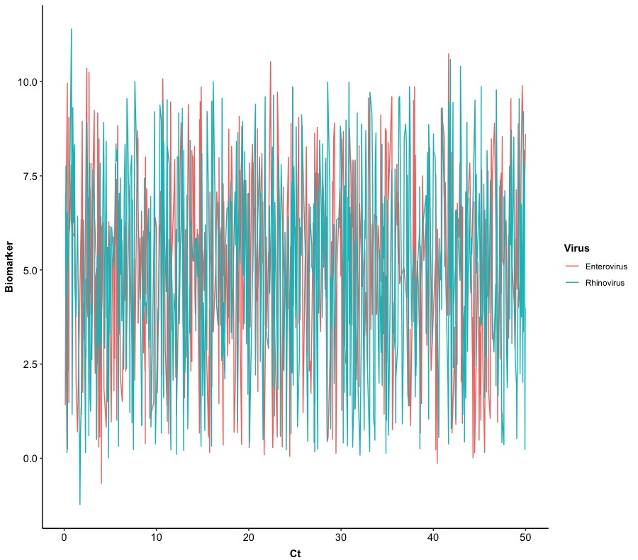
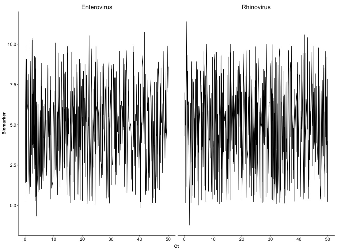
In this plot, we can find that it is really hard to distinguish a trace of each virus so we can split Version 0.0 into two figures based on Virus with the same layout. This will require us to use a new function:
# Version 1.0
ggplot(Dt, aes(x = Ct, y = Biomarker)) +
  geom_line() +
  facet_grid(cols = vars(Virus), scales = 'fixed') +
  theme_bw() +                                                      # dark-on-light theme
  theme(panel.border = element_blank(),                             # these four are for the background and grid
        panel.background = element_blank(),
        panel.grid.major = element_blank(),
        panel.grid.minor = element_blank(),
        axis.line.x = element_line(),                               # these two are for the axis line
        axis.line.y = element_line(),
        axis.text.x = element_text(colour = "black", size = 11),    # there two are for texts in axes
        axis.text.y = element_text(colour = "black", size = 11),
        axis.ticks.x = element_line(),                              # these two are for ticks in axes
        axis.ticks.y = element_line(),
        axis.title.x = element_text(colour = "black", size = 11, face = 'bold', vjust = -1),
        axis.title.y = element_text(colour = "black", size = 11, face = 'bold'),
        legend.title = element_text(colour = "black", size = 11, face = 'bold'),
        strip.text = element_text(size = 15),                       # set up size of title for each figure with 15
        strip.background = element_blank())                         # remove the background of titles for figures
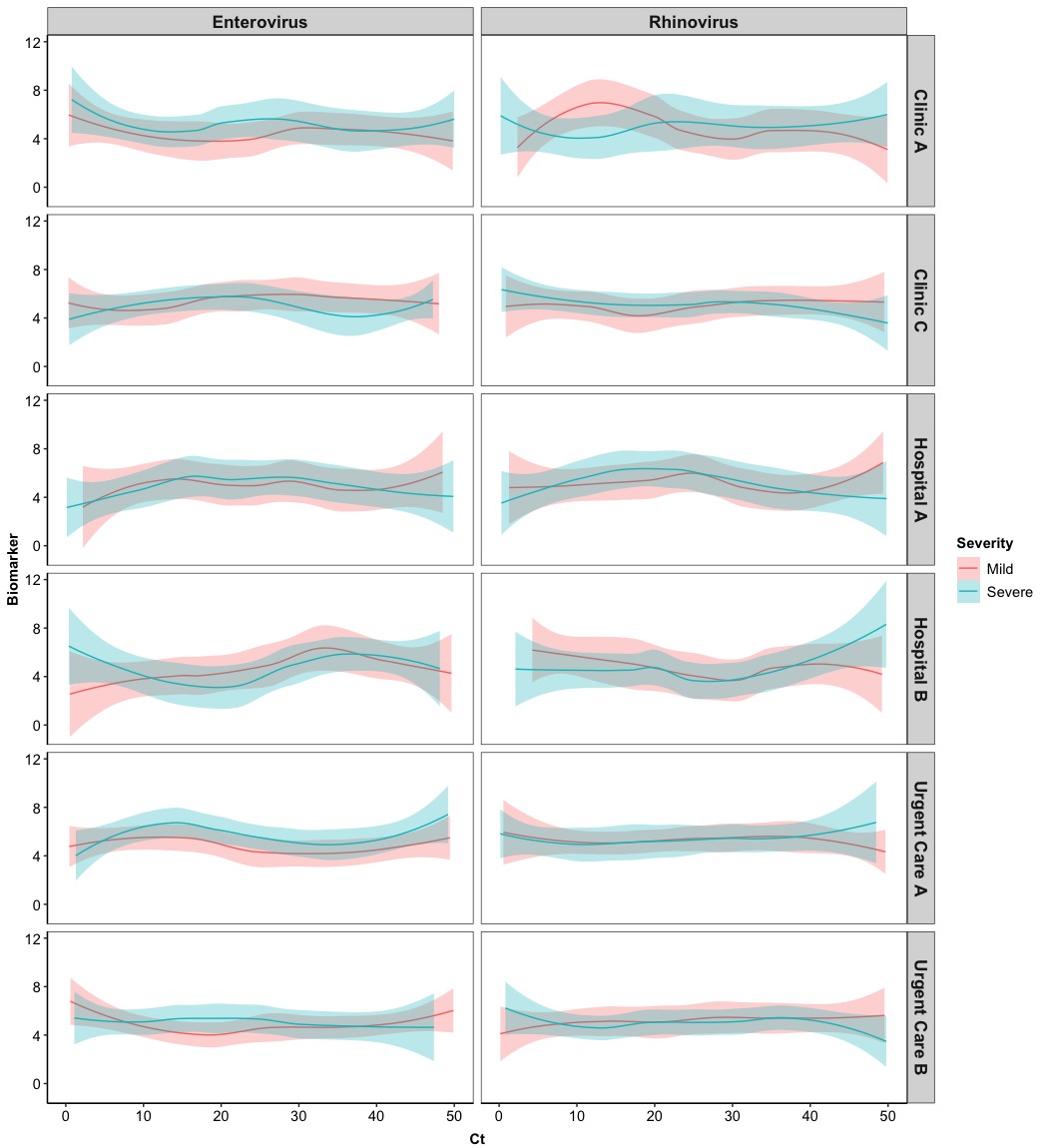
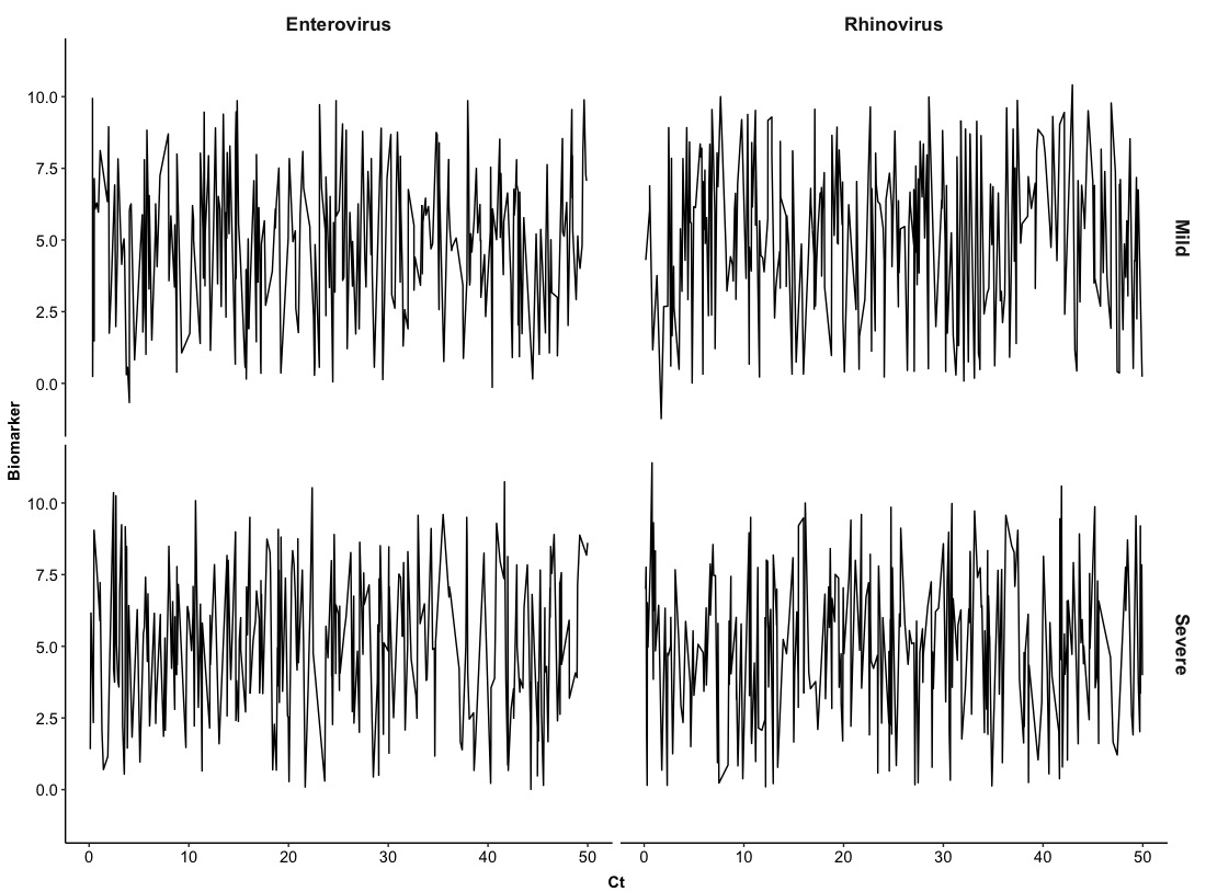
The above example is just stratified pairs of Ct-Biomarker by types of Virus and for the next one, we can try to stratify them with two variables. Namely, pairs of Ct-Biomarker will be stratified by types of Virus and levels of Severity. We will set up columns as Virus and rows as Severity.
# Version 2.0
ggplot(Dt, aes(x = Ct, y = Biomarker)) +
  geom_line() +
  facet_grid(cols = vars(Virus), rows = vars(Severity),             # stratified by Virus and Severity
             scales = 'fixed') +
  theme_bw() +                                                      # dark-on-light theme
  theme(panel.border = element_blank(),                             # these four are for the background and grid
        panel.background = element_blank(),
        panel.grid.major = element_blank(),
        panel.grid.minor = element_blank(),
        axis.line.x = element_line(),                               # these two are for the axis line
        axis.line.y = element_line(),
        axis.text.x = element_text(colour = "black", size = 11),    # there two are for texts in axes
        axis.text.y = element_text(colour = "black", size = 11),
        axis.ticks.x = element_line(),                              # these two are for ticks in axes
        axis.ticks.y = element_line(),
        axis.title.x = element_text(colour = "black", size = 11, face = 'bold', vjust = -1),
        axis.title.y = element_text(colour = "black", size = 11, face = 'bold'),
        legend.title = element_text(colour = "black", size = 11, face = 'bold'),
        strip.text = element_text(size = 13, face = 'bold'),        # set up size of title for each figure with 15
        strip.background = element_blank())                         # remove the background of titles for figures
In this section, we have seen how we can use basic line plot to visualize the development of a numerical biomarker along with cycle threshold values of viruses. Obviously, the basic line plot does not provide useful information for two variables so one may think about using more generalized methods to show their relationship, that is, a smooth curve.
3. Smooth curve plot
Beyond the basic version of line plots (Version 0.0 and Version 1.0), smooth curve plot is a better choice to visualize the development of one numerical variable along with another numerical variable. The main function for smooth curve in ggplot2 package is
In this section, we are going to use smooth curves to visualize the development of the numerical Biomarker along with the Ct values for different Virus, stratified by Severity level and Location of clinics. Hence, we will modify the Version 2.0 to meet our new requirements and this time we will show the border of each panel and the background of titles for columns and rows.
# Version 3.0
ggplot(Dt, aes(x = Ct, y = Biomarker, col = Severity, fill = Severity)) + # set up colors/fill for Severity
  geom_smooth(method = 'loess',                             # use local polynomial regression
              alpha = 0.3,                                  # size = 0.5 --> line width
              size = 0.5) +                                 # alpha = 0.3 --> color transparency
  facet_grid(cols = vars(Virus), rows = vars(Location),     # stratified by Virus and Location
             scales = 'fixed') +
  theme_bw() +                                                      # dark-on-light theme
  theme(panel.background = element_blank(),
        panel.grid.major = element_blank(),
        panel.grid.minor = element_blank(),
        axis.line.x = element_line(),                               # these two are for the axis line
        axis.line.y = element_line(),
        axis.text.x = element_text(colour = "black", size = 11),    # there two are for texts in axes
        axis.text.y = element_text(colour = "black", size = 11),
        axis.ticks.x = element_line(),                              # these two are for ticks in axes
        axis.ticks.y = element_line(),
        axis.title.x = element_text(colour = "black", size = 11, face = 'bold', vjust = -1),
        axis.title.y = element_text(colour = "black", size = 11, face = 'bold'),
        legend.title = element_text(colour = "black", size = 11, face = 'bold'),
        legend.text = element_text(colour = "black", size = 11),
        strip.text = element_text(size = 13, face = 'bold'))      # set up size of title for each figure with 13
Eventually we get the fancy one! Probably, it will be better to include borders and background of titles in columns and rows.
4. Density plot/histogram
The last example we are going show is the density plot which almost conveys similar information as a histogram. A density plot is a specific version of smooth curve as well. The main functions we are going to use in here are
In this example, we will show a normal density plot for Ct stratified by Location and a histogram for Ct stratified by Location.
# Version 4.0
p1 <-
  ggplot(Dt,
         aes(x = Ct, col = Location, fill = Location)) +
  geom_density(alpha = 0.3) +
  xlab('Ct') + ylab('Density') +
  theme_bw() +                                                      # dark-on-light theme
  theme(panel.border = element_blank(),
        panel.background = element_blank(),
        panel.grid.major = element_blank(),
        panel.grid.minor = element_blank(),
        axis.line.x = element_line(),                               # these two are for the axis line
        axis.line.y = element_line(),
        axis.text.x = element_text(colour = "black", size = 11),    # there two are for texts in axes
        axis.text.y = element_text(colour = "black", size = 11),
        axis.ticks.x = element_line(),                              # these two are for ticks in axes
        axis.ticks.y = element_line(),
        axis.title.x = element_text(colour = "black", size = 11, face = 'bold', vjust = -1),
        axis.title.y = element_text(colour = "black", size = 11, face = 'bold'),
        legend.title = element_text(colour = "black", size = 11, face = 'bold'),
        legend.text = element_text(colour = "black", size = 11))

# Histogram
p2 <-
  ggplot(Dt,
         aes(x = Ct, col = Location, fill = Location)) +
  geom_histogram() +
  xlab('Ct') + ylab('Count') +
  theme_bw() +                                                      # dark-on-light theme
  theme(panel.border = element_blank(),
        panel.background = element_blank(),
        panel.grid.major = element_blank(),
        panel.grid.minor = element_blank(),
        axis.line.x = element_line(),                               # these two are for the axis line
        axis.line.y = element_line(),
        axis.text.x = element_text(colour = "black", size = 11),    # there two are for texts in axes
        axis.text.y = element_text(colour = "black", size = 11),
        axis.ticks.x = element_line(),                              # these two are for ticks in axes
        axis.ticks.y = element_line(),
        axis.title.x = element_text(colour = "black", size = 11, face = 'bold', vjust = -1),
        axis.title.y = element_text(colour = "black", size = 11, face = 'bold'),
        legend.title = element_text(colour = "black", size = 11, face = 'bold'),
        legend.text = element_text(colour = "black", size = 11))
# Arrange plots
grid.arrange(p1, p2, nrow = 1)

Beside these plots, there are other functions related to line-base plots in ggplot2 package and users can refer to other line plots such as
-
geom_abline(), geom_hline(), geom_vline(): these three provide diagonal, horizontal, and vertical lines;
-
geom_segment(), geom_curve(): these two provide line segments and curves.
People can make different combinations of these lines and create a complex figure that fulfill their requirements.