In this tutorial, we will introduce the mosaic plot using ggplot2 and the extension package ggmosaic. The mosaic plot is a widely used visualization technique for displaying two or more categorical variables in a dataset. It is typically presented as a stacked percentage bar plot. In the case of a single categorical variable, it can be considered as a stacked bar plot representing counts or percentages. To demonstrate the capabilities of ggmosaic, we will utilize the National Cancer Database (NCDB), which is a publicly available data resource.
1. Dataset
The NCDB is a large database, but for visualization purposes, we only require a small portion of it. Specifically, we will focus on the dataset dedicated to cervical cancer, as the NCDB provides separate datasets for different types of cancer. The sample dataset after data preprocessing only includes 5 columns:
-
Primary.Treatment: it is a categorical variable that indicates the type of primary (first) treatment received by a patient [4 levels: Surgery, Radiation, Chemotherapy, Unknown] (string);
-
Income.Level: it is a categorical variable that indicates the income quantile of the neighborhood for each patient [5 levels: < $40,227, $40,227 - $50,353, $50,354 - $63,332, >= $63,333, Unknown] (string);
-
Insurance.Type: it is a categorical variable that indicates the type of insurance for each patient [5 levels: Private Insurance, Uninsured, Medicaid, Medicare, Other Government/Unknown] (string);
-
Facility.Type: it is a categorical variable that indicates the type of medical facility for each patient [3 levels: Community Cancer Program, Academic/Research Program, Integrated Network Cancer Program] (string);
-
Status: it is a categorical variable that indicates the survival status of each patient at the last follow-up time [2 levels: Death, Alive] (string).
A mosaic plot is an ideal option for understanding the interactive relationship among these four categorical variables. In the next section, we will demonstrate the relationships among these variables.
2. Mosaic plot
(1). Income level and insurance type
The first example we are going to create is between Income.Level and Facility.Type. To create this plot, we will introduce two core functions: geom_mosaic() and product(). These functions are necessary for creating a mosaic plot. The core function for creating a mosaic plot is geom_mosaic(), which is similar to other geom-based functions in ggplot2 package. It requires several arguments to be specified:
-
mapping: it is the same as the other geom-based functions and need to pass aes() function into it.
-
However, when using geom_mosaic() in the ggmosaic package, the aes() function requires a specific function called product() to be used for the x-axis argument. This means that you need to specify aes(x = product(Var1, Var2, ...)) when using geom_mosaic().
-
product(Var1, Var2, ...): to clarify, when using product() as a wrapper for a list, Var1 will be treated as a variable on the y-axis, while Var2 will be treated as a variable on the x-axis. This allows you to define the relationships between these variables in the mosaic plot.
-
offset: it is used to set the space between each stacked box, also known as the spine in a mosaic plot. By adjusting this argument, you can control the spacing between the individual categories in the plot. By default, offset = 0.01.
Once we have specified the required arguments for the geom_mosaic() function, we can create the first version of the mosaic plot. By providing the necessary arguments, we can generate the initial representation of the plot. First, we will set up variables as factors to better order levels in categorical variables.
require(ggplot2)
require(dplyr)
require(ggmosaic)
require(ggthemes)
require(gridExtra)
# Set variables as factors
Dt$Income.Level <- factor(Dt$Income.Level, levels = c('Unknown', '$50,354 - $63,332', '$40,227 - $50,353', '< $40,227', '>= $63,333'))

Dt$Facility.Type <- ifelse(Dt$Facility.Type == 'Integrated Network Cancer Program', 'Integrated Network \n Cancer Program',
                           ifelse(Dt$Facility.Type == 'Community Cancer Program', 'Community Cancer \n Program',
                                  ifelse(Dt$Facility.Type == 'Academic/Research Program', 'Academic/Research \n Program', Dt$Facility.Type)))
Dt$Facility.Type <- factor(Dt$Facility.Type, levels = c('Integrated Network \n Cancer Program', 'Community Cancer \n Program', 'Academic/Research \n Program'))

# Version 1.1: without legend
p1.1 <-
ggplot(data = Dt) +
  geom_mosaic(aes(x = product(Income.Level,     # y-axis: Income level
                              Facility.Type),   # x-axis: Facility type
                  fill = Income.Level),         # Color of "box" specified by income level
              show.legend = FALSE) +            # Text in y-axis has already showed label so don't need legend
  xlab('Facility Type') + ylab('Neighborhood \n Income Level') +
  scale_fill_tableau() +                        # Use better color palette
  theme_mosaic() +                              # Specific theme for mosaic plot
  theme(axis.ticks.x = element_blank(),         # Remove ticks in x and y axes
        axis.ticks.y = element_blank(),
        axis.title.x = element_text(color = 'black', face = 'bold'),
        axis.title.y = element_text(color = 'black', vjust = 3, face = 'bold'),
        axis.text.x = element_text(color = 'black', angle = 45, hjust = 1),
        axis.text.y = element_text(color = 'black'))

# Version 1.2: with legend
p1.2 <-
ggplot(data = Dt) +
  geom_mosaic(aes(x = product(Income.Level,     # y-axis: Income level
                              Facility.Type),   # x-axis: Facility type
                  fill = Income.Level)) +         # Color of "box" specified by income level
  xlab('Facility Type') + ylab('Neighborhood \n Income Level') +
  guides(fill = guide_legend(title = "Neighborhood \n Income Level")) +  # Modify legend title
  scale_fill_tableau() +                        # Use better color palette
  theme_mosaic() +                              # Specific theme for mosaic plot
  theme(axis.ticks.x = element_blank(),         # Remove ticks in x and y axes
        axis.ticks.y = element_blank(),
        axis.title.x = element_text(color = 'black', face = 'bold'),
        axis.title.y = element_blank(),
        axis.text.x = element_text(color = 'black', angle = 45, hjust = 1),
        axis.text.y = element_blank(),
        legend.title = element_text(color = 'black', face = 'bold'))

grid.arrange(p1.1, p1.2, nrow = 1)
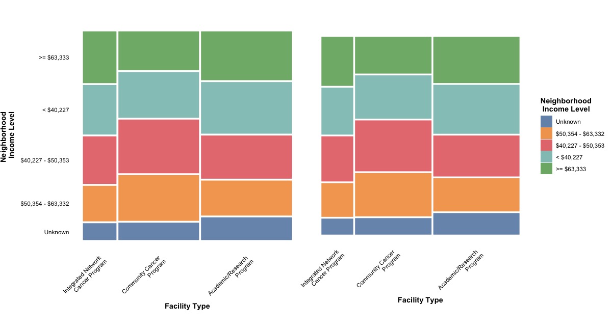
In this figure, we can find that each level in the Income.Level variable will be filled by a color. One of the advantages of a mosaic plot is that it allows for the comparison between two categorical variables in both horizontal and vertical orientations, using a percentage scale.
For example, the majority of patients lived in neighborhoods that had an income level greater than $63,333 and sought treatment in an integrated network cancer program, followed by academic/research programs and community cancer programs. Patients seeking cancer treatment in academic/research programs mostly lived in neighborhoods that had an income level less than $40,227, followed by neighborhoods with income levels greater than $63,333, $40,227 - $50,353, $50,353 - $63,332, and unknown income levels.
After making a mosaic plot for two categorical variables, in the next section, we will explore the visualization of more than two categorical variables in a single mosaic plot. This will allow us to gain insights and understand the relationships among multiple categorical variables simultaneously.
(2). Income level, insurance type, and survival status
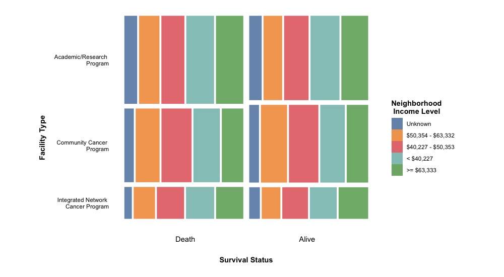
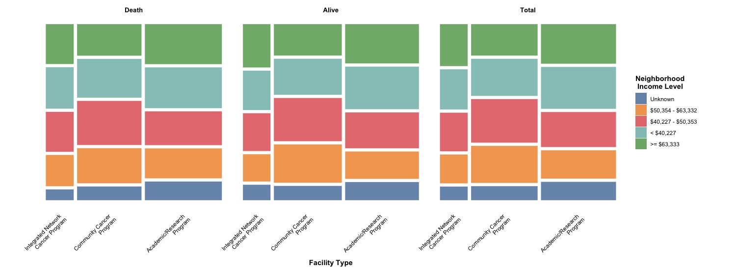
To incorporate the categorical variable for survival status, we can utilize the facet_grid() function to create a grid for multiple levels in the Status variable. The basic settings for this plot are similar to the previous examples. However, in this case, we will introduce an additional function, facet_grid( ~ Status), to facilitate the creation of the grid. Additionally, we can modify the space between two boxes by setting offset = 0.02.
# Factor for Status variable
Dt$Status <- factor(Dt$Status, levels = c('Death', 'Alive'))

# Version 2
p2 <-
ggplot(data = Dt) +
  geom_mosaic(aes(x = product(Income.Level,      # y-axis: Income level
                              Facility.Type),    # x-axis: Facility type
                  fill = Income.Level),          # Color of "box" specified by income level
              offset = 0.02) +                   # More space between boxes
  facet_grid( ~ Status) +                        # Facet by survival status
  xlab('Facility Type')  +
  guides(fill = guide_legend(title = "Neighborhood \n Income Level")) +  # Modify title of legend
  scale_fill_tableau() +                        # Use better color palette
  theme_mosaic() +                              # Specific theme for mosaic plot
  theme(axis.ticks.x = element_blank(),         # Remove ticks in x and y axes
        axis.ticks.y = element_blank(),
        axis.title.x = element_text(color = 'black', face = 'bold'),
        axis.title.y = element_blank(),
        axis.text.x = element_text(color = 'black', angle = 45, hjust = 1),
        axis.text.y = element_blank(),
        legend.title = element_text(color = 'black', face = 'bold'),
        strip.text = element_text(size = 10, color = 'black', face = 'bold'),
        strip.background = element_blank())
p2
After stratifying the mosaic plot by the survival status, we observed that there wasn’t an obvious difference in the distribution of neighborhood income level and facility type based on survival status. Consequently, we can combine the facet version with the mosaic plot, considering all survival statuses together. This will allow us to visualize the relationships between multiple categorical variables in a comprehensive manner.
Here we go!
In addition to using facet_grid() to stratify a mosaic plot, there is an alternative embedded method using the conds argument within aes() in geom_mosaic(). However, this approach may result in unattractive labels on the x-axis_. To address this, we can manually modify the labels using the annotate() function. This requires specifying the numerical location in (x, y) coordinates to annotate the text and replace the initial labels on the x-axis. Therefore, we will introduce two implementations that we need to use here:
-
conds: this argument, conds, is used within aes() and requires passing a variable through product(). For instance, if we want to stratify the plot by Status, we need to set conds = product(Status). This allows us to specify the variable for stratification and create separate panels for each level of that variable within the mosaic plot
-
annotate(): this is a function used to add geoms (geometric objects) to a plot, and it requires specifying certain arguments. The specific arguments depend on the type of geom being added:
-
geom: the name of geom to use for annotation;
-
x, y: numerical location in (x, y) coordinates;
-
label: the label of the annotation;
-
fontface: the font face of label.
In our case, we need to use annotate() to manually create the label and text for the x-axis. The following code snippet displays the final figure.
# Version 3
p3 <-
ggplot(data = Dt) +
  geom_mosaic(aes(x = product(Income.Level,      # y-axis: Income level
                              Facility.Type),    # x-axis: Facility type
                  fill = Income.Level,
                  conds = product(Status)),       # Color of "box" specified by income level
              offset = 0.025) +                   # More space between boxes
  annotate(geom = "text", x = 0.25, y = -0.1, label = "Death") +  # Change text for x axis
  annotate(geom = "text", x = 0.75, y = -0.1, label = "Alive") +
  annotate(geom = "text", x = 0.50, y = -0.2, label = "Survival Status", fontface = "bold") + # x-axis label
  ylab('Facility Type')  +
  guides(fill = guide_legend(title = "Neighborhood \n Income Level")) +  # Modify title of legend
  scale_fill_tableau() +                        # Use better color palette
  theme_mosaic() +                              # Specific theme for mosaic plot
  theme(axis.ticks.x = element_blank(),         # Remove ticks in x and y axes
        axis.ticks.y = element_blank(),
        axis.title.x = element_blank(),
        axis.title.y = element_text(color = 'black', face = 'bold', vjust = 5),
        axis.text.x = element_blank(),
        axis.text.y = element_text(color = 'black'),
        legend.title = element_text(color = 'black', face = 'bold'))
p3
Here we go!