In this tutorial, we will explore how to visualization of data with principle component analysis (PCA) in R, using ggplot2 and plotly. When dealing with high dimensional data analysis (# of variables is much greater than # of obs.), PCA is one of the most popular choices for dimension reduction. As an unsupervised learning model, PCA does not require users to provide an outcome variable (y). Instead, it performs singular value decomposition or eigenvalue decomposition on a high-dimensional input matrix (X) to improve the interpretability of the data. It is often useful to visualize the results from a PCA model, and users typically focus on the first two or three principal components (PC1, PC2, and PC3) since they may explain a significant proportion of the variance in the input data (X).
1. Dataset
With the development of technology for molecular-level observation, many new types of data have emerged, such as genomics, RNA-seq, proteomics, and neural signals. In this example, we used a simulated RNA-seq dataset to visualize the results of principal component analysis (PCA). The dataset assumes a cohort of five unique patients who have been diagnosed with a disease and have take an experimental medicine for 24 months. During the first 12 months, the patients did not take the medicine, and during the later 12 months, they did take the medicine. There are 500 different RNA-seq values recorded each month. The dataset includes 503 columns and 120 observations:
-
Patient_ID: this is an unique identification for each participants [5 participants] (string);
-
Time: this is the time in months for each patient (numerical);
-
Treatment: this is a binary indicator for if a patient take the medicine at each Time point [2 levels: ‘No’, ‘Yes’] (string);
-
RNA_1, RNA_2,…, RNA_500: these are all numerical values for different RNA-seq (numerical).

It is clear that the dataset is high-dimensional, as the number of variables (p = 500) is much greater than the number of observations (n = 120). PCA will be performed on 500 different RNA-seq variables.
2. Principle component analysis
In this section, we will build up a PCA model with prcomp() function and the design matrix for 500 RNA-seq. It mainly requires two arguments:
-
x: a numeric or complex matrix/data frame for PCA
-
scale: a logical value indicating whether the variables should be scaled to have unit variance before the analysis takes place (in general, we need to scale data before putting into PCA).
# Extract columns for RNA-seq
X <- Dt[, -c(1:3)]
# Perform PCA
pca <- prcomp(x = X, scale = T)
# Extract first 3 PCs for each point in X
X_pca <- pca$x[, c('PC1', 'PC2', 'PC3')]
# Combine the value of rotated data with time and treatment info
Dt.Plot <- cbind(Dt[, 1:3], X_pca)
head(Dt.Plot)

There are many different packages in R that can perform various types of principal component analysis. Regardless of which one users choose to implement, the result will include a matrix that represents a rotation of the original dataset, and the visualization will be based on this matrix. After passing our RNA-seq data into a PCA model, we need to obtain a matrix of the rotated data values via the argument pca$x. This matrix represents a mapping of the original row observations into the space represented by the principal components. Mostly, we want to visualize its results in 2D or 3D spaces so we extract first three principle components. In the next sections, we are going to show how we can visualize PCA results with 2D and 3D spaces with ggplot2 and plotly packages.
3. Basic: scatter plot in 2D or 3D
The standard method for visualizing the results of Principal Component Analysis (PCA) involves plotting a 2D scatter plot with the reduced dataset, with the x-axis representing PC1 and the y-axis representing PC2. In our case, we will create two versions of this scatter plot, one with stratification by unique patient IDs and one without.
(1). 2D scatter plot without stratification by IDs
require(ggplot2)
p_2D_PCA <-
ggplot(Dt.Plot, aes(x = PC1, y = PC2, col = Treatment)) +
  geom_point(alpha = 0.8) +
  theme_bw() +                                                      # dark-on-light theme
  theme(panel.border = element_blank(),
        panel.background = element_blank(),
        panel.grid.major = element_blank(),
        panel.grid.minor = element_blank(),
        axis.line.x = element_line(),                               # these two are for the axis line
        axis.line.y = element_line(),
        axis.text.x = element_text(colour = "black"),               # there two are for texts in axes
        axis.text.y = element_text(colour = "black"),
        axis.ticks.x = element_line(),                              # these two are for ticks in axes
        axis.ticks.y = element_line(),
        axis.title.x = element_text(colour = "black", face = 'bold', vjust = -1),
        axis.title.y = element_text(colour = "black", face = 'bold'),
        legend.title = element_text(colour = "black", face = 'bold'),
        legend.text = element_text(colour = "black"))
p_2D_PCA
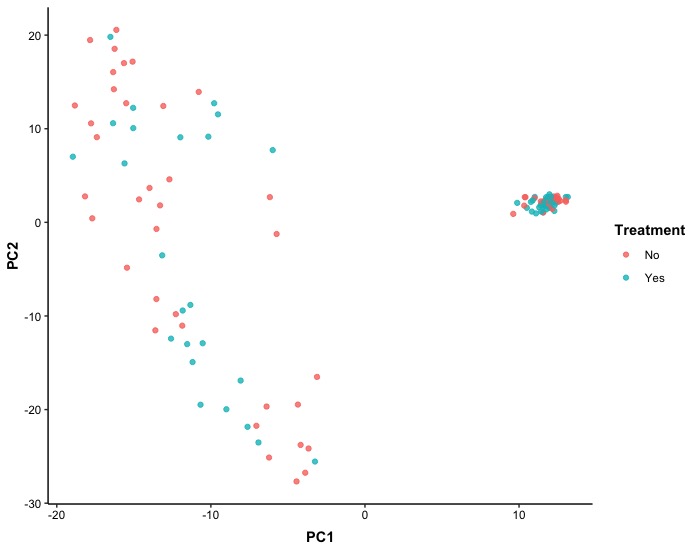
The first scatter plot of PCA results is a 2D representation of the dataset without stratification by unique patient ID, but with points colored according to treatment. Despite performing dimension reduction, we did not observe any clear indication that treatments differed in RNA-seq levels.
(2). 2D scatter plot with stratification by IDs
Occasionally, users may be interested in examining how a PCA model performs on each individual subject. To enable this analysis, we generate a 2D scatter plot with stratification by subject IDs. We implement the facet_grid() function to arrange the stratification in a column orientation.
p_2D_PCA_ID <-
ggplot(Dt.Plot, aes(x = PC1, y = PC2, col = Treatment)) +
  geom_point(alpha = 0.8) +
  facet_grid(cols = vars(Patient_ID)) +
  theme_bw() +                                                      # dark-on-light theme
  theme(panel.border = element_blank(),
        panel.background = element_blank(),
        panel.grid.major = element_blank(),
        panel.grid.minor = element_blank(),
        axis.line.x = element_line(),                               # these two are for the axis line
        axis.line.y = element_line(),
        axis.text.x = element_text(colour = "black"),               # there two are for texts in axes
        axis.text.y = element_text(colour = "black"),
        axis.ticks.x = element_line(),                              # these two are for ticks in axes
        axis.ticks.y = element_line(),
        axis.title.x = element_text(colour = "black", face = 'bold', vjust = -1),
        axis.title.y = element_text(colour = "black", face = 'bold'),
        legend.title = element_text(colour = "black", face = 'bold'),
        legend.text = element_text(colour = "black"))
p_2D_PCA_ID
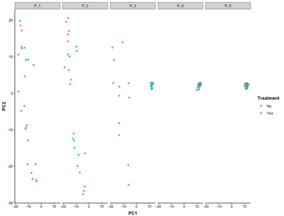
After stratifying the data by patient ID, we observed that the effect of treatments on RNA-seq varied among patients. Specifically, patients P_4 and P_5 showed minimal differences in RNA-seq in the 2D space created by principle components, while patient P_3 exhibited clear separation in treatments within the same 2D space.
(3). 3D scatter plot
To visualized the PCA results in 3D space, we need to implement plotly package and we are going introduce some functions in the package:
-
plot_ly(): it is similar to ggplot() function ggplot2 package, which provides abstractions for creating figures from the package and it requires some arguments:
-
data: a matrix/data frame for plot
-
x = ~ PC1, y = ~ PC2, z = ~ PC3: they are used to define each axis in 3D space and need to column names in data with tilde ~
-
color: it is used to put values mapped to relevant ‘fill-color’ attributes
-
colors: it is a vector/array used to specify what colors will be used in the figure
-
marker = list(size = 5): it is used to specify the size of points in 3D space and it requires to provide a list() type of inputs
-
add_markers(): it is used to indicate that the trace type of the figure is a scatter plot
-
layout(): it is used to modify non-graphical components in a figure so we use it to modify titles for axes
After we specify these functions based on our style, we can create a scatter plot in 3D space.
require(plotly)
p_3D_PCA <- plot_ly(data = Dt.Plot,                                         # dataset
                    x = ~ PC1, y = ~ PC2, z = ~ PC3,                        # specify x/y/z axes
                    color = ~ Treatment, colors = c('#D6604D', '#4393C3'),  # colors
                    marker = list(size = 5))                                # point size
p_3D_PCA <- p_3D_PCA %>% add_markers()                                      # specify scatter plot
p_3D_PCA <- p_3D_PCA %>% layout(scene = list(xaxis = list(title = 'PC1'),   # axes title
                                             yaxis = list(title = 'PC2'),
                                             zaxis = list(title = 'PC3')))
p_3D_PCA
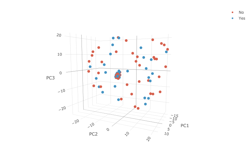
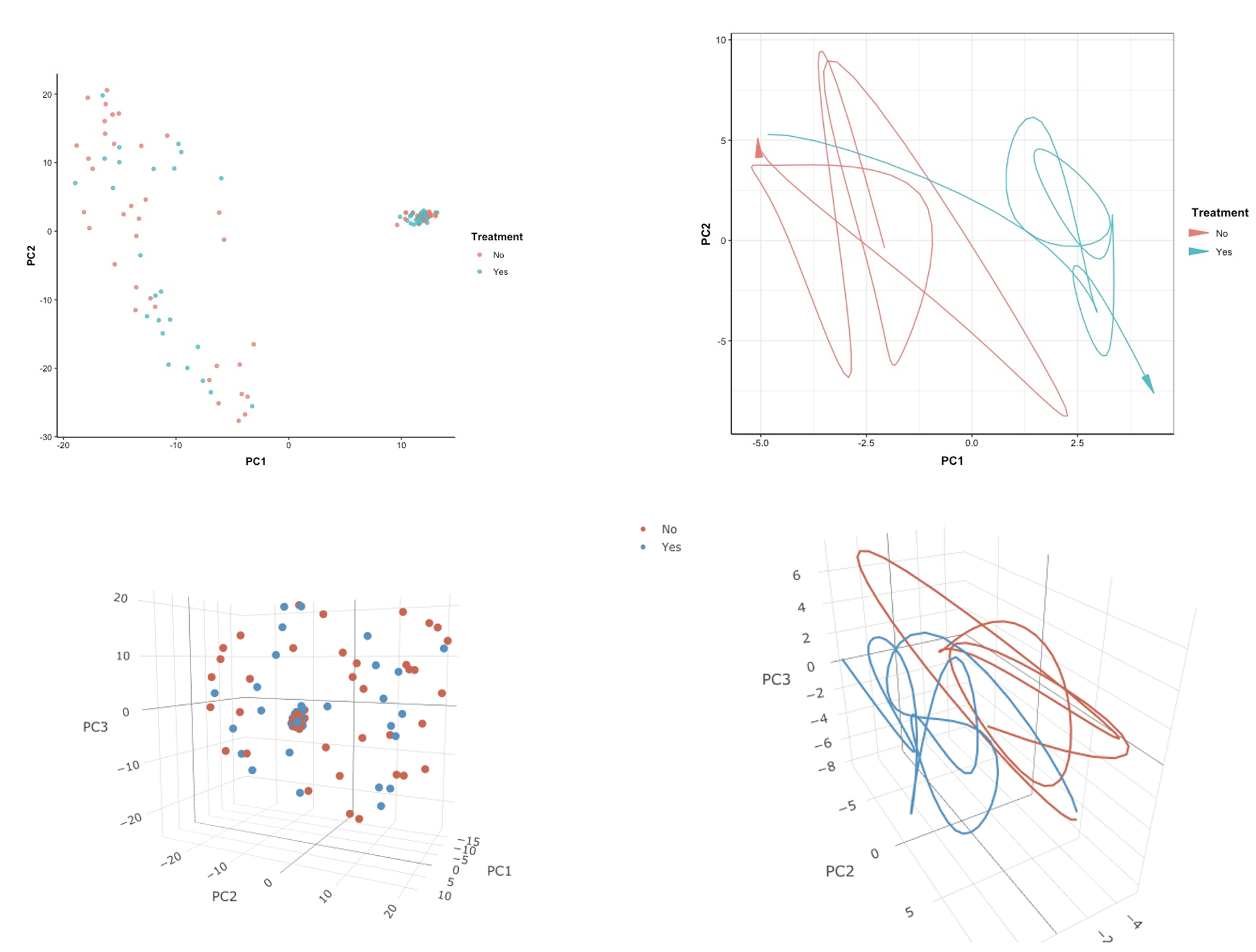
Unfortunately, although we represented the original data with three principal components, we did not observe any significant separation between the high-dimensional RNA-seq data after dimension reduction based on the effect of treatment.
4. Advanced: aggregated trajectory plot in 2D or 3D
An alternative visualization method for presenting PCA results of longitudinal RNA-seq data aggregated at the patient level is to represent it as a trajectory over time, as opposed to using scatter plots. Currently, high-dimensional data is often measured repeatedly over time, and it has been observed that this data preserves its time order. As a result, the trajectory of the data over time in PCA results can also preserve the order of time.
(1). Aggregated PCA results
Instead of showing the PCA trajectory at the subject level, we first aggregate the data and calculate the mean value for each principal component at each time point. This allows us to show the PCA trajectory at an aggregated level. Therefore, we need to implement dplyr package to perform aggregation and mainly use three functions:
-
%>%: it pipes an object forward into a function or call expression
-
group_by(): it takes an existing data frame and converts it into a grouped data frame where operations are performed “by group” and it requires to specify a variable to group by
-
summarise(): it returns one row for each combination of grouping variables and it will contain one column for each grouping variable and one column for each of the summary statistics that you have specified
require(tidyr)
require(dplyr)
# Aggregated
Dt.Plot.Aggregated <- Dt.Plot %>% group_by(Time) %>% summarise(PC1_Aggregated = mean(PC1),
                                                               PC2_Aggregated = mean(PC2),
                                                               PC3_Aggregated = mean(PC3))
Dt.Plot.Aggregated$'Treatment' <- factor(c(rep('No', 12), rep('Yes', 12)),
                                         levels = c('No', 'Yes'))
head(Dt.Plot.Aggregated)

The aggregated dataset consists of five columns: time points, the means of principal components aggregated by patient level at different time points, and a treatment variable. After obtaining the aggregated dataset, we will implement smoothing functions, such as cubic splines, to obtain trajectories in 2D or 3D spaces. To do this, we will first use the aggregated PC values to fit a spline regression over time in each dimension using the splinefun() function. Then, we will use a series of consecutive points with equal length to make interpolations of the fitted spline. To specify x and y in the splinefun() function, we will set x as time and y as aggregated PC values.
# Interprolated points
Time <- Dt.Plot.Aggregated$Time
Interprolate <- seq(from = min(Time), to = max(Time), len = 200)
# Spline regression on each PC dimension
PC1 <- splinefun(Time, Dt.Plot.Aggregated$PC1_Aggregated)(Interprolate)
PC2 <- splinefun(Time, Dt.Plot.Aggregated$PC2_Aggregated)(Interprolate)
PC3 <- splinefun(Time, Dt.Plot.Aggregated$PC3_Aggregated)(Interprolate)
# Combine with treatment variable
Treatment <- factor(ifelse(Interprolate <= 12, 'No', 'Yes'),  # 1-12 month: no treatment, 13-24 month: treatment
                    levels = c('No', 'Yes'))
Dt.Plot.Traj <- data.frame(Treatment, 'PC1' = PC1, 'PC2' = PC2, 'PC3' = PC3)
head(Dt.Plot.Traj)

Since we used 200 consecutive points, Dt.Plot.Traj data frame has 200 rows and 4 columns.
(2). 2D trajectory plot
To create a figure for 2D PCA trajectory, we mainly use the geom_path() function which is used to connect the observations in the order in which they appear in the data and in our data this order is corresponding to time. To better highlight the order of time, we will use an argument for arrow inside geom_path() with arrow() function which is required to specifiy:
-
angle: the angle of the arrow head in degrees
-
ends: indicating which ends of the line to draw arrow heads (“last”, “first”, or “both”)
-
type: indicating whether the arrow head should be a closed triangle (“open” or “closed”)
p_2D_PCA_Traj <-
  ggplot(Dt.Plot.Traj, aes(x = PC1, y = PC2, col = Treatment)) +
  geom_path(arrow = arrow(angle = 10,
                          ends = "last",                            # arrow at the end of a curve
                          type = "closed")) +                       # closed triangle for arrow head
  theme_bw() +                                                      # dark-on-light theme
  theme(axis.line.x = element_line(),                               # these two are for the axis line
        axis.line.y = element_line(),
        axis.text.x = element_text(colour = "black"),               # there two are for texts in axes
        axis.text.y = element_text(colour = "black"),
        axis.ticks.x = element_line(),                              # these two are for ticks in axes
        axis.ticks.y = element_line(),
        axis.title.x = element_text(colour = "black", face = 'bold', vjust = -1),
        axis.title.y = element_text(colour = "black", face = 'bold'),
        legend.title = element_text(colour = "black", face = 'bold'),
        legend.text = element_text(colour = "black"))
p_2D_PCA_Traj
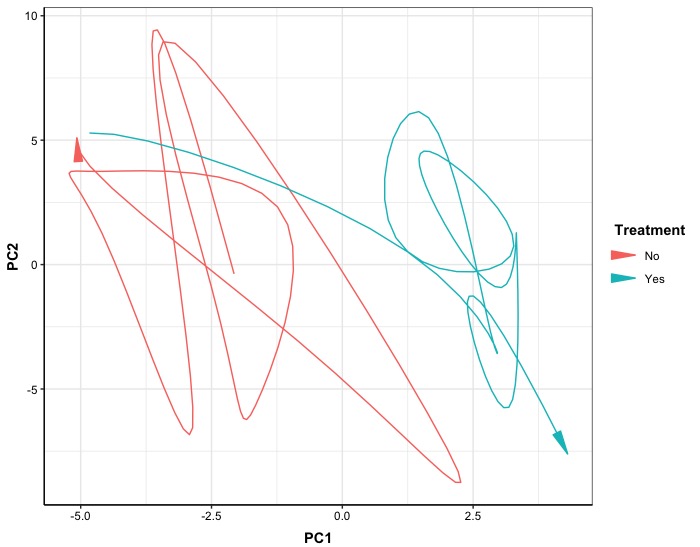
In the 2D version, the effect of treatment over time in 2D PC space shows different trends. Without treatment, the trajectory tends to move towards the upper-left corner over time, whereas after treatment is applied, it tends to move towards the lower-right corner.
(3). 3D trajectory plot
Compared to 2D version, 3D version can better visualize the development of trajectory and we still use plot_ly() function but need to specify other arguments:
-
type: it is used to specify the trace type (we need to specify type as "scatter3d" to serve as a base for line plot in 3D)
-
mode: it is used to specify what users want to show in a figure
-
line: it is used to control graphic components for lines
p_3D_PCA_Traj <- plot_ly(Dt.Plot.Traj,
                         x = ~ PC1, y = ~ PC2, z = ~ PC3,
                         color = ~ Treatment, colors = c('#D6604D', '#4393C3'),
                         type = 'scatter3d',                                         # trace is 'scatter3d'
                         mode = 'lines',                                             # show lines
                         line = list(width = 4))                                     # Control line width
p_3D_PCA_Traj <- p_3D_PCA_Traj %>% layout(scene = list(xaxis = list(title = 'PC1'),
                                                       yaxis = list(title = 'PC2'),
                                                       zaxis = list(title = 'PC3')))
p_3D_PCA_Traj
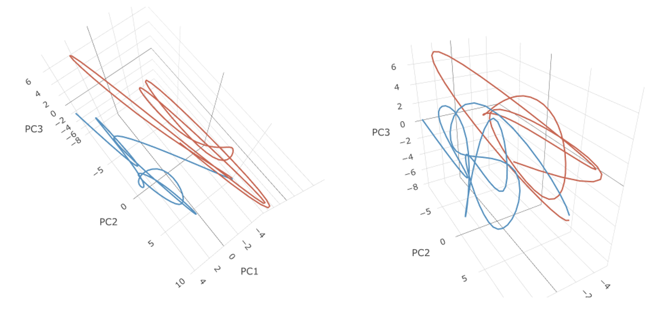
Here we go!
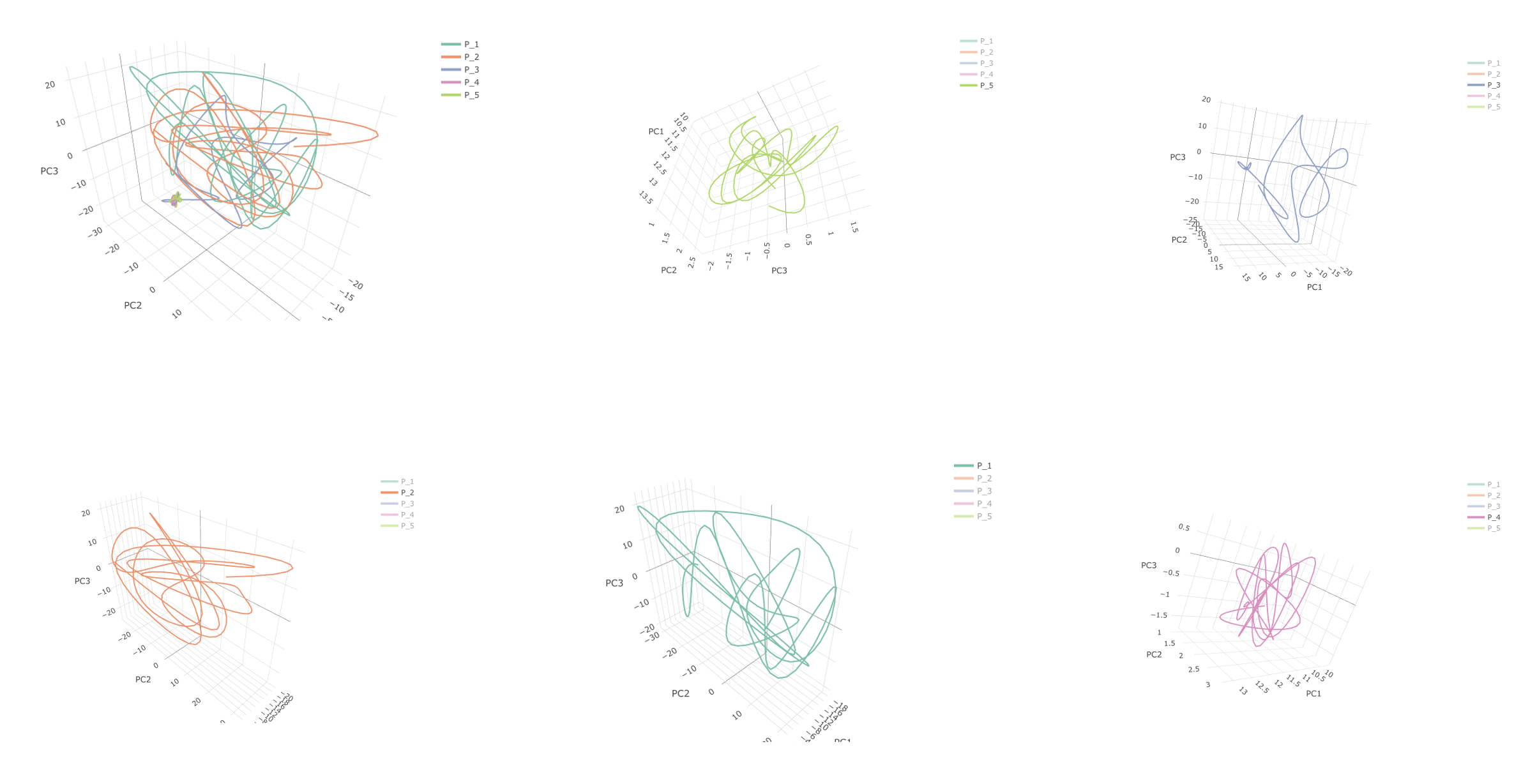
(4). 3D trajectory in subject level
For trajectory in subject level, we first need to fit separated smoothers for each PC dimension and each patient.
id <- unique(Dt.Plot$Patient_ID)
n_id <- length(id)
Dt.Plot.Subject <- data.frame()
for(i in 1:n_id){
  Loca <- which(Dt.Plot$Patient_ID == id[i])
  Trans <- Dt.Plot[Loca, ]
  # Interprolated points
  Time <- Trans$Time
  Interprolate <- seq(from = min(Time), to = max(Time), len = 200)
  # Spline regression on each PC dimension
  PC1 <- splinefun(Time, Trans$PC1)(Interprolate)
  PC2 <- splinefun(Time, Trans$PC2)(Interprolate)
  PC3 <- splinefun(Time, Trans$PC3)(Interprolate)
  # Combine treatment variable
  Treatment <- factor(ifelse(Interprolate <= 12, 'No', 'Yes'),  # 1-12 month: no treatment, 13-24 month: treatment
                    levels = c('No', 'Yes'))
  # Result
  Result <- data.frame('Patient_ID' = rep(id[i], 200),
                       'Treatment'= Treatment,
                       'PC1' = PC1,
                       'PC2' = PC2,
                       'PC3' = PC3)
  Dt.Plot.Subject <- rbind(Dt.Plot.Subject, Result)
}
To create a figure for 3D PCA trajectory in subject level, we just need to use Patient_ID in color argument.
p_3D_PCA_Traj <- plot_ly(Dt.Plot.Subject,
                         x = ~ PC1, y = ~ PC2, z = ~ PC3,
                         color = ~ Patient_ID,
                         type = 'scatter3d',                                         # trace is 'scatter3d'
                         mode = 'lines',                                             # show lines
                         line = list(width = 4))                                     # Control line width
p_3D_PCA_Traj <- p_3D_PCA_Traj %>% layout(scene = list(xaxis = list(title = 'PC1'),
                                                       yaxis = list(title = 'PC2'),
                                                       zaxis = list(title = 'PC3')))
p_3D_PCA_Traj
