.jpeg)
This is a short tutorial for creating a radar chart/spider chart/star chart and it requires fmsb and scales packages. A radar chart is a good tool for visualizing multivariate data that is shared among similar groups/participants so it is good to visualize life performance metrics (e.g. EQ-5D-5L, EQ-5D-3L, etc.). We will take a dataset with EQ-5D-5L as an example in this tutorial.
The EQ-5D-5L is a health-related quality of life measurement and it includes five dimensions: mobility (MO), self-care (SC), usual activities (UA), pain/discomfort (PD), and anxiety/depression (AD). For each dimension, it has five ordinal levels:
-
1: no problem;
-
2: slight;
-
3: moderate;
-
4: severe;
-
5: extreme.
Each participant in the dataset will provide scores for five dimensions.
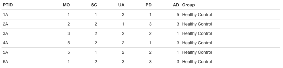
The original dataset has seven columns:
-
PTID: an unique participant’s identification (string);
-
MO, SC, UA, PD, and AD: scores for five dimensions (numerical);
-
Group: groups that participants are belonged to [four groups: Healthy Control, Infected Patients, Long-term Symptoms, Short-term Symptoms].
In the radar chart, we want to show average levels of five dimensions for four groups so we need to do data preprocessing first. We will dplyr and tidyr packages for this process.
# Create a table with averages for each measurement
Dt.Summary <-
  Dt %>%
  group_by(Group) %>%
  summarise(UA.Avg = mean(UA),
            SC.Avg = mean(SC),
            AD.Avg = mean(AD),
            PD.Avg = mean(PD),
            MO.Avg = mean(MO))
kable(Dt.Summary)
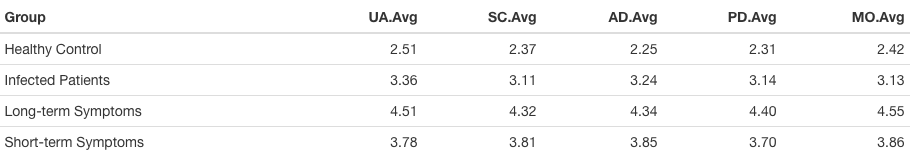
After data preprocessing, the dataset used for creating a radar chart will only include mean scores of five dimensions for different groups. However, the required format of the dataset for radar chart, using the function in fmsb package, need to attach two rows at the top of the above dataset–one is for minimum score and another is for maximum score.
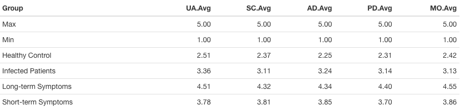
The above one is the final dataset that we are going to use for creating a radar chart.
2. Single radar plot
We first create a single radar chart with the final dataset and are going to use the radarchart() function. So we will introduce some useful commands within the main function:
axistype: this is used to choose the type of axes and its default is 0.
axistype = 1 = center axis labelaxistype = 2 = around-the-chart labelaxistype = 3 = both center and around-the-chart (peripheral) labelsaxistype = 4 = center axis label with two-digit numberaxistype = 5 = both center and around-the-chart (peripheral) labels with two-digit number
-
pcol: this is a vector/number of color codes for plot data.
-
pfcol: this is a vector/number of color codes for filling polygons.
-
plwd: this is a vector/number of line widths for plot data.
-
plty: this is a vector/number of line types for plot data.
-
cglcol: this is used to choose line color for radar grids.
-
cglty: this is used to choose line type for radar grids.
-
cglwd: this is used to choose line width for radar grids.
-
axislabcol: this is used to choose color of axis label and numbers.
-
vlabels: this is a character vector for the names for variables.
vlcex: this is to choose font size magnification for vlabels.
# the name of each group used in legend ####################################################################
Group <- c('Healthy Control', 'Infected Patients', 'Long-term Symptoms', 'Short-term Symptoms')

# the choice of color for each group #######################################################################
ColorOfGroup <- c("#00AFBB", "#E7B800", "#FC4E07", 'gray')

# the name of each vertex ##################################################################################
EQ5D5L <- c('Usual\nActivities', 'Self-care', 'Anxiety/\nDepression', 'Pain/\nDiscomfort', 'Mobility')

# Plot ######################################################################################################
# op is used to control the margin of radar chart
op <- par(mar = c(1,2,2,2))
# the main function for figure and choices of parameters
radarchart(
    df = Dt.Summary.2[, 2:6], axistype = 1,
    # Customize the polygon
    pcol = ColorOfGroup,
    pfcol = alpha(ColorOfGroup, 0.1),  # alpha() is used to control the transparency of color
    plwd = 2, plty = 1,
    # Customize the grid
    cglcol = "black", cglty = 1, cglwd = 0.8,
    # Customize the axis
    axislabcol = "black", caxislabels = 1:5,  calcex = 0.7,
    # Variable labels
    vlcex = 1.25, vlabels = EQ5D5L
  )
# Add an horizontal legend
legend("right",        # we put the legend on the right of the radar chart but one can also put
                       # it at the bottom of the figure with the command ["bottom", horiz = TRUE]
       legend = Group,     # set up the text for legend
       col = ColorOfGroup, # corresponding colors for groups
       text.col = "black", cex = 1.25, pt.cex = 1.25, bty = "n", pch = 20
  )
par(op) # this command is used to perform the setup of margin for radar chart
.jpeg)
Since the radarchart() is based on the basic plot() in the R, all non-data components (e.g. point, line, text, color, etc.) follow the guidance of plot(). This means parameter choices for pcol, pfcol, cglcol, ….. follow the guidance of plot().
3. Multiple radar charts
In the next step, we are going to put multiple radar charts together if they all share the same legend. This is one is a little bit complex than the single one but it is still acceptable. The basic logic for putting multiple radar charts in a row is first to create different radar charts separately and then attach an empty plot including the legend only to a row of radar plots.
# arrange positions for multiple radar charts and legends ###################################################
par(mfrow = c(1, 3)) # mfrow = c(1,3) means we want to put plots/legends in 1 row and each plot/legend
                     # occupies 1 column so totally 3 columns (2 radar charts + 1 legend)
# op is used to control the margin of radar chart ###########################################################
op <- par(mar = c(1,2,2,1)) # OK to omit this one

# First radar chart #########################################################################################
radarchart(
    df = Dt.Summary.2[, 2:6], axistype = 1,
    # Customize the polygon
    pcol = color, pfcol = alpha(color, 0.1), plwd = 2, plty = 1,
    # Customize the grid
    cglcol = "black", cglty = 1, cglwd = 0.8,
    # Customize the axis
    axislabcol = "black",
    # Variable labels
    vlcex = 1.35, vlabels = EQ5D5L,
    caxislabels = 1:5, calcex = 0.7
  )

# Second radar chart #########################################################################################
radarchart(
    df = Dt.Summary.2[, 2:6], axistype = 1,
    # Customize the polygon
    pcol = color, pfcol = alpha(color, 0.1), plwd = 2, plty = 1,
    # Customize the grid
    cglcol = "black", cglty = 1, cglwd = 0.8,
    # Customize the axis
    axislabcol = "black",
    # Variable labels
    vlcex = 1.35, vlabels = EQ5D5L,
    caxislabels = 1:5, calcex = 0.7
  )

# Add an horizontal legend ###################################################################################
# control the margin of radar chart and OK to omit it
par(mar = c(0, 0, 0, 0))
# Create empty plot
plot(1, type = "n", axes = FALSE, xlab = "", ylab = "")
# Attach the legend to the empty plot
legend('left',  # this 'left' means we want to put the legend on the left side of the empty plot
                # and this is close to the 2 radar charts
       legend = c('Healthy Control', 'Infected Patients', 'Long-term Symptoms', 'Short-term Symptoms'),
       col = c("#00AFBB", "#E7B800", "#FC4E07", 'gray'),
       pch = 20, cex = 1.35, pt.cex = 1.35, bty = "n")

par(op)
The above is the final version of radar charts and similar to other plots in R, the final size and resolution of the figure can be adjusted when you are going to output it from R. Since the radarchart() in fmsb package is based on the basic plot() function in R, it provides users more flexible way to make choices for non-data components (e.g. legends, texts, colors, etc.).