This is a brief tutorial on how to create a raster plot in Python using the imshow() function from the matplotlib library. The focus is on displaying 1-dimensional discrete time series data (i.e., neural signal recordings of spikes over time) using the ggplot2 package. While there are no functions in ggplot2 that perform exactly the same operation as imshow(), we can still use alternative functions to achieve the same result.
1. Dataset
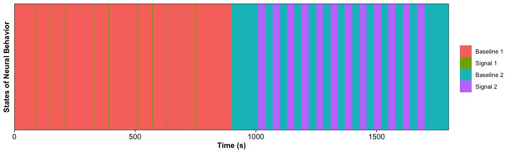
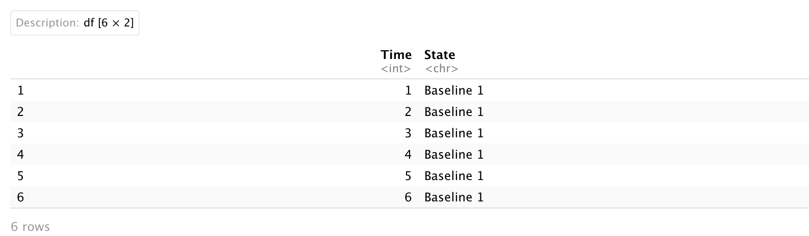
The simulated dataset is pretty simple which only includes two columns:
-
Time: this is the time in seconds [1 - 1800 seconds] (numerical)
-
State: this is a categorical variable indicating if there is a spike [4 levels: “Baseline 1”, “Signal 1”, “Baseline 2”, “Signal 2”] (string)
Our objective is to display this 1-dimensional data over time!
2. Plot
To create this figure, we first need to create a numerical y axis as a new column Level with value one, and then set State variable as a factor with four levels.
Dt.Plot$'Level' <- 1
Dt.Plot$State <- factor(Dt.Plot$State,
                        levels = c('Baseline 1', 'Signal 1', 'Baseline 2', 'Signal 2'))
The core function to create this plot is geom_bin_2d() which is used to divide the plane into rectangles, count the number of cases in each rectangle, and then (by default) map the number of cases to the rectangle’s fill. It also requires to set up an argument stat = "identity" to display the sum of values in the points column. After that, we want to minimize the gap between axes and bar with two functions:
Now we can create this figure!
ggplot(Dt.Plot, aes(x = Time,
                    y = Level,
                    fill = State)) +
  geom_bin_2d(stat = "identity") +
  scale_x_continuous(limits = c(0, max(Dt.Plot$Time)),   # the range of x axis: 0-1800s
                     expand = c(0, 0)) +                 # there is no gap between bar and x axis
  scale_y_continuous(limits = c(0.5, 1.5),               # the range of y axis: 0.5-1.5 (default length of bar)
                     expand = c(0, 0)) +                 # there is no gap between bar and x axis
  labs(x = 'Time (s)',                                   # set up labels for x and y axes
       y = 'States of Neural Behavior') +
  theme_bw() +                                           # dark-on-light theme
  theme(panel.border = element_rect(colour = "black"),   # keep border of figure
        panel.grid = element_blank(),
        axis.text.x = element_text(colour = "black", size = 11),  # text to the left side for 1 unit
        axis.text.y = element_blank(),
        axis.ticks.x = element_line(),
        axis.ticks.y = element_blank(),                  # remove ticks in y axis
        axis.title.x = element_text(colour = "black", size = 11, face = 'bold'),
        axis.title.y = element_text(colour = "black", size = 11, face = 'bold'),
        legend.title = element_blank())                  # remove title of legend
Here we go!