In this tutorial, we’ll introduce the use of ridgeline plots in R using the ggplot2 and ggridges packages. These plots display a sequence of histogram or density plots stacked vertically, making it a useful tool for visualizing changes in the distribution of a numerical variable across different time points or categories.
1. Dataset
We will use a simulated dataset for this visualization. Suppose there is a 3-year cohort consisting of 200 participants who initially contracted severe Covid-19 at enrollment. We collected cytokine data at 0, 30, 90, 180, 360, 540, and 720 days (7 time points). Additionally, we hypothesized that the TNF-alpha cytokine levels (pg/mL) would increase during the initial 90 days and then gradually decrease as the acute symptoms subsided. The ridgeline plot is an excellent tool for visualizing longitudinal changes in TNF-alpha data. The dataset is very simple and includes 4 variables only:
-
PTID: this is an unique identification for each participants [200 participants] (string);
-
Time: this variable represents the time point of sample collection (numerical);
-
TNF_alpha: this variable represents the value of TNF-alpha cytokine in pg/mL (numerical);
-
Numerical_PTID: This is equivalent to PTID, but it is represented numerically (numerical).
At each time point, we collected 200 observations of TNF-alpha cytokine values in pg/mL. Since we hypothesize that this cytokine is linked to pro-inflammatory processes, monitoring its values can serve as a key indicator of inflammation. We aim to investigate whether inflammatory symptoms gradually decrease after the acute period.
2. Ridgeline plot
The ridgeline plot is generated using the ggridges extension package for ggplot2. We primarily employ three functions: geom_ridgeline(), geom_density_ridges(), and geom_density_ridges_gradient(), to create various types of ridgeline plots. In the basic version, we will cover the usage of geom_ridgeline() and geom_density_ridges(), while the comprehensive version will include a detailed walkthrough of geom_density_ridges_gradient().
(1). Basic version
In the basic version, we will begin by introducing two functions: geom_ridgeline() and geom_density_ridges(). These functions are used for visualizing the raw ridgeline of a numerical variable and the density of a numerical variable, respectively. The geom_ridgeline() function is utilized to create lines with filled areas beneath them, and it necessitates certain arguments:
-
height: it is used to define the height of the ridgeline, measured from the corresponding y value, where y is regarded as a grouping or categorical variable for stratification. It needs to be passed into aes() in geom_ridgeline().
-
scale: it acts as a scaling factor to adjust the height of the ridgelines. A higher value indicates a larger scaling of height relative to the height of each group.
-
rel_min_height: it is used to set a percentage cutoff in relation to the highest point of any density curve. A smaller value signifies a more extended tail on both sides of the density curve.
Quantiles can be highlighted using the following arguments:
-
quantile_lines: it is a binary logical argument, which can be set to either TRUE or FALSE. By default, it is set to FALSE, and setting it to TRUE will result in the quantile line being displayed in the area under the curve/line.
-
quantiles: it is used to define a vector of quantiles (i.e., 0.25, 0.5, etc.)
Jittered points (added a small amount of random variation to the location of each point) can be showed using the following arguments:
-
jittered_points: it is a binary logical argument, which can be set to either TRUE or FALSE. By default, it is set to FALSE, and setting it to TRUE will result in visualizing jittered points.
-
position: it is a string argument used to set up position of jittered points in a ridgeline plot.
-
position = "points_jitter": jittered points are randomly shifted up and down and/or left and right.
-
position = "points_sina": jittered points are randomly distributed to fill the entire shaded area representing the data density.
-
position = "raincloud": jittered points lie all underneath the baseline of each individual ridgeline.
In addition to the arguments within geom_ridgeline() and geom_density_ridges(), the package also offers a function for customizing the theme using theme_ridges(). By default, it does not center labels on the x and y axes, so you can use the center_axis_labels = TRUE argument to center the axis labels.
require(ggplot2)
require(ggthemes)
require(ggridges)

# Basic ridgeline
p1 <-
ggplot(Dt, aes(x = Numerical_PTID,
               y = Time)) +
  geom_ridgeline(aes(height = TNF_alpha),
                 scale = 0.001,
                 fill = "lightblue") +
  ggtitle('Basic ridgeline') +
  scale_x_continuous(expand = c(0, 0)) +
  scale_y_discrete(expand = c(0, 0)) +
  theme_ridges(center_axis_labels = TRUE)

# Ridgeline for density
p2 <-
ggplot(Dt, aes(x = TNF_alpha, y = Time)) +
  geom_density_ridges(scale = 5,
                      rel_min_height = 0.001,
                      fill = "lightblue",
                      quantiles = c(0.25, 0.5, 0.75),
                      quantile_lines = TRUE) +
  ggtitle('Density ridgeline') +
  scale_x_continuous(expand = c(0, 0)) +
  scale_y_discrete(expand = c(0, 0)) +
  theme_ridges(center_axis_labels = TRUE)

# Ridgeline for density with jittered points
p3 <-
ggplot(Dt, aes(x = TNF_alpha, y = Time)) +
  geom_density_ridges(scale = 5,
                      rel_min_height = 0.0001,
                      fill="lightblue",
                      jittered_points = TRUE,
                      position = "raincloud") +
  ggtitle('Density ridgeline with jittered points') +
  scale_x_continuous(expand = c(0, 0)) +
  scale_y_discrete(expand = c(0, 0)) +
  theme_ridges(center_axis_labels = TRUE)

# Ridgeline in binline version
p4 <-
ggplot(Dt, aes(x = TNF_alpha, y = Time)) +
  geom_density_ridges(stat = "binline",
                      scale = 3,
                      rel_min_height = 0.0001,
                      fill="lightblue") +
  ggtitle('Ridgeline in bins') +
  scale_x_continuous(expand = c(0, 0)) +
  scale_y_discrete(expand = c(0, 0)) +
  theme_ridges(center_axis_labels = TRUE)

grid.arrange(p1, p2, p3, p4, nrow = 2, ncol = 2)
.jpeg)
In the Basic ridgeline plot (top left), geom_ridgeline() simply maps TNF-alpha values at each time point according to numerical patient IDs. In contrast, the Density ridgeline plot (top right) and the Density ridgeline with jitter points plot (bottom left) offer more informative visuals, displaying the density of TNF-alpha value distributions grouped by time points. If users prefer a binned version (histogram), they can opt for the Ridgeline in bins plot (bottom right).
(2). Comprehensive version
For a more enhanced visualization of the TNF-alpha value distribution density, you can employ the geom_density_ridges_gradient() function, which displays gradient colors under the density curve for each time point. To achieve this, you need to utilize the after_stat(x) function within the aes() function of the main ggplot() function. This allows you to map the transformed TNF-alpha values from x to the fill argument.
# Texts for y axis
yText <- c('At enrollment', paste0(c(30, 90, 180, 360, 540, 720), '-day'))

p5 <-
ggplot(data = Dt, aes(x = TNF_alpha,             # x-axis: value of TNF-alpha
                      y = Time,                  # y-axis: time point
                      fill = after_stat(x))) +
  geom_density_ridges_gradient(scale = 4) +
  scale_fill_gradient2_tableau() +
  scale_y_discrete(expand = c(0, 0),
                   breaks = c(0, 30, 90, 180, 360, 540, 720),
                   label = yText) +
  scale_x_continuous(expand = c(0, 0)) +
  labs(x = expression("Mean TNF"*alpha ~ '(pg/mL)'),          # x-axis label
       fill = expression("TNF"*alpha ~ '(pg/mL)'),            # legend title
       title = expression('Density of' ~ "TNF"*alpha ~ '(pg/mL) at Different Time Points')) +
  theme_bw() +
  theme(panel.border = element_blank(),
        panel.grid.major.x = element_blank(),                       # Remove vertical gridlines
        panel.grid.minor.x = element_blank(),
        axis.line.x = element_line(),                               # these two are for the axis line
        axis.line.y = element_blank(),
        axis.text.x = element_text(colour = "black"),               # there two are for texts in axes
        axis.text.y = element_text(colour = "black"),
        axis.ticks.x = element_line(),                              # these two are for ticks in axes
        axis.ticks.y = element_blank(),
        axis.title.x = element_text(colour = "black", vjust = -1),
        axis.title.y = element_text(colour = "black"),
        legend.title = element_text(colour = "black"),
        legend.text = element_text(colour = "black"),
        plot.title = element_text(hjust = 0.5))
p5
.jpeg)
In this figure, we have eliminated all extraneous elements and focused solely on highlighting the density curve for TNF-alpha values. The intensity of TNF-alpha is represented by a gradient color scale.
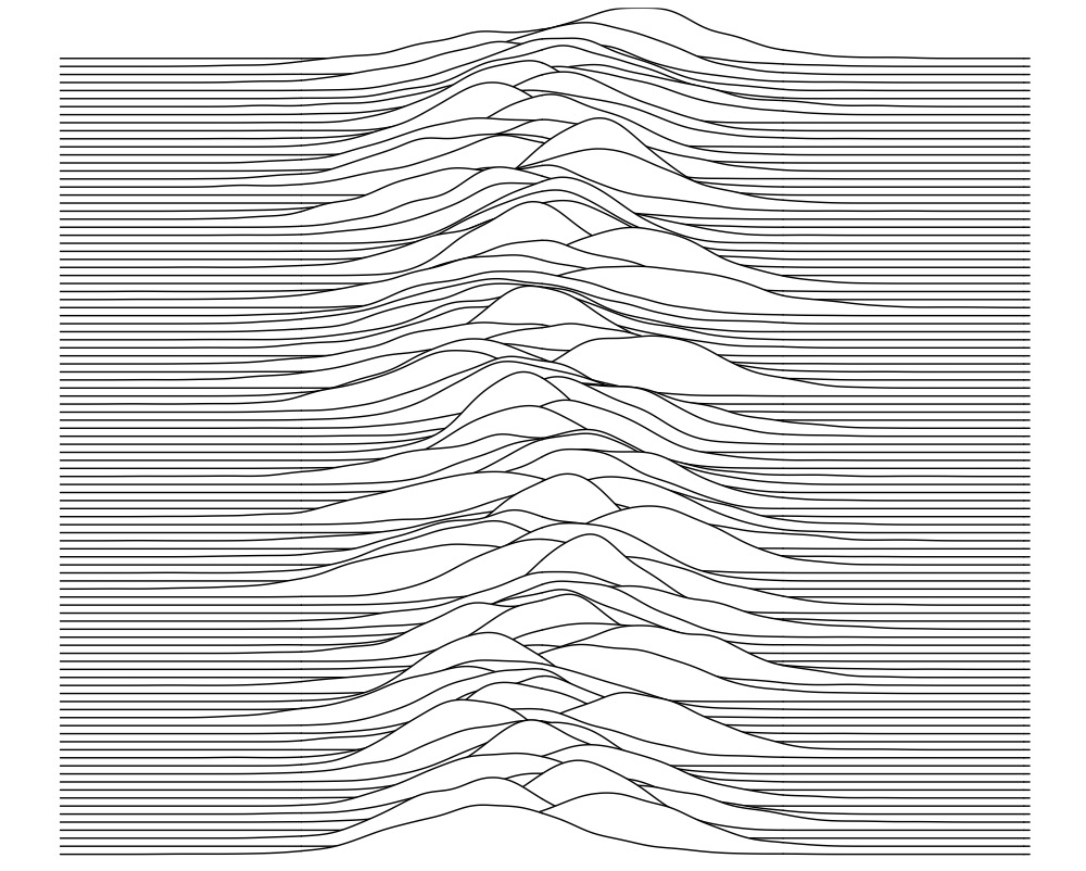
The inspiration for the ridgeline plot design comes from the cover of the debut studio album by the rock band Joy Division, and we can also experiment with mimicking that cover.
nObs <- 1000
nTime <- 100

Mean <- 100
SD <- 1

Dt_Plot <- data.frame()
for(i in 1:nTime){
  NoiseForMean <- rnorm(1, mean = 5, sd = 2)
  NoiseForSD <- rnorm(1, mean = 2, sd = 0.5)
  MeanForGenerate <- Mean + NoiseForMean
  SDForGenerate <- SD + NoiseForSD
  Value <- rnorm(n = nObs, mean = MeanForGenerate, sd = SDForGenerate)
  Trans <- data.frame('Row' = paste0('X', i), 'Value' = Value)
  Dt_Plot <- rbind(Dt_Plot, Trans)
}

p <-
ggplot(data = Dt_Plot, aes(x = Value, y = Row)) +
  geom_density_ridges(scale = 10, fill = 'white') +
  theme_bw() +
  theme(# panel.background = element_rect(fill = 'black'),
        panel.border = element_blank(),
        panel.grid = element_blank(),
        axis.text.x = element_blank(),
        axis.text.y = element_blank(),
        axis.ticks.x = element_blank(),
        axis.ticks.y = element_blank(),
        axis.title.x = element_blank(),
        axis.title.y = element_blank(),
        legend.title = element_text(color = 'black', face = 'bold'),
        plot.title = element_text(hjust = 0.5, face = 'bold'))
p