In this tutorial, we will go through different types of plots with shaded areas in R with ggplot2 and how we can integrate a shaded area plot with other elements (i.e., bar plot). The shaded area plot can help us to better understand how different types of rate/prevalence/incidence/frequency/… change over time.
The dataset we used for the tutorial is a public dataset from Seattle Flu Study. After some basic data cleaning, we only keep 6 coloumns:
-
Epi.Week: this is an epidemiological week, a standardized method of counting weeks to allow for the comparison of data year after year [36 unique epi weeks] (string);
-
Date: this is the calendar time (Month-Year) (string);
-
Count: this is the frequency of detected respiratory pathogens during each Date period (numerical);
-
Prevalence: this is the proportion of persons who have been detected respiratory pathogens during each Date period (numerical);
-
Virus: this is the label for a type of viral infection [8 viruses: ‘RSV’, ‘Flu’, ‘Adenovirus’, ‘Enterovirus’, ‘Human Coronavirus’, ‘Human Parainfluenza’, ‘Human Metapneumovirus’, ‘Rhinovirus’](string);
-
Index: this is a variable used to indicate the order of calendar time (numerical).
2. Shaded area plot
The basic functions in ggplot2 for shaded area plots are geom_ribbon() and geom_area() and we are going to introduce two functions:
-
geom_ribbon(): this is used to display a interval of y at a given x and it is defined by ymin and ymax within aes(ymin, ymax);
-
geom_area(): this is a special case of geom_ribbon() since it sets ymin = 0.
The first version we want to show is for the stacked “shaded area”. The x-axis will be the calendar time (Date), the y-axis will be the frequency of detected respiratory pathogens (Count), and “shaded area” for each type of Virus will be stacked vertically. We will use the geom_area() in this example and use and we will a extra package ggthemes for color palette.
# Version 1: stacked
ggplot(Dt, aes(x = Index)) +                      # set up x-axis as numerical Index
  geom_area(aes(y = Count,                        # pass Count for y axis
                fill = Virus)) +                  # fill = Virus to set up different colors for viruses
  scale_x_continuous(labels = unique(Dt$Date),    # set up x-axis label as unique calendar time
                     breaks = unique(Dt$Index)) +
  ylab('Frequency of Detected Virus') + xlab('Calendar Time (Year-Month)') +
  scale_fill_tableau("Tableau 10") +              # we will use the color palette from Tableau
  theme_bw() +                                                      # dark-on-light theme
  theme(panel.border = element_blank(),                             # these three are for the background and grid
        panel.background = element_blank(),
        panel.grid.major = element_blank(),
        axis.line.x = element_line(),
        axis.line.y = element_line(),
        axis.text.x = element_text(colour = "black", size = 11,     # rotate text in x axis 45 degrees and move
                                   angle = 45, hjust = 1),          # text to the left side for 1 unit
        axis.text.y = element_text(colour = "black", size = 11),
        axis.ticks.x = element_line(),
        axis.ticks.y = element_line(),
        axis.title.x = element_text(colour = "black", size = 11, face = 'bold', vjust = -1),
        axis.title.y = element_text(colour = "black", size = 11, face = 'bold'),
        legend.title = element_text(colour = "black", size = 11, face = 'bold'))
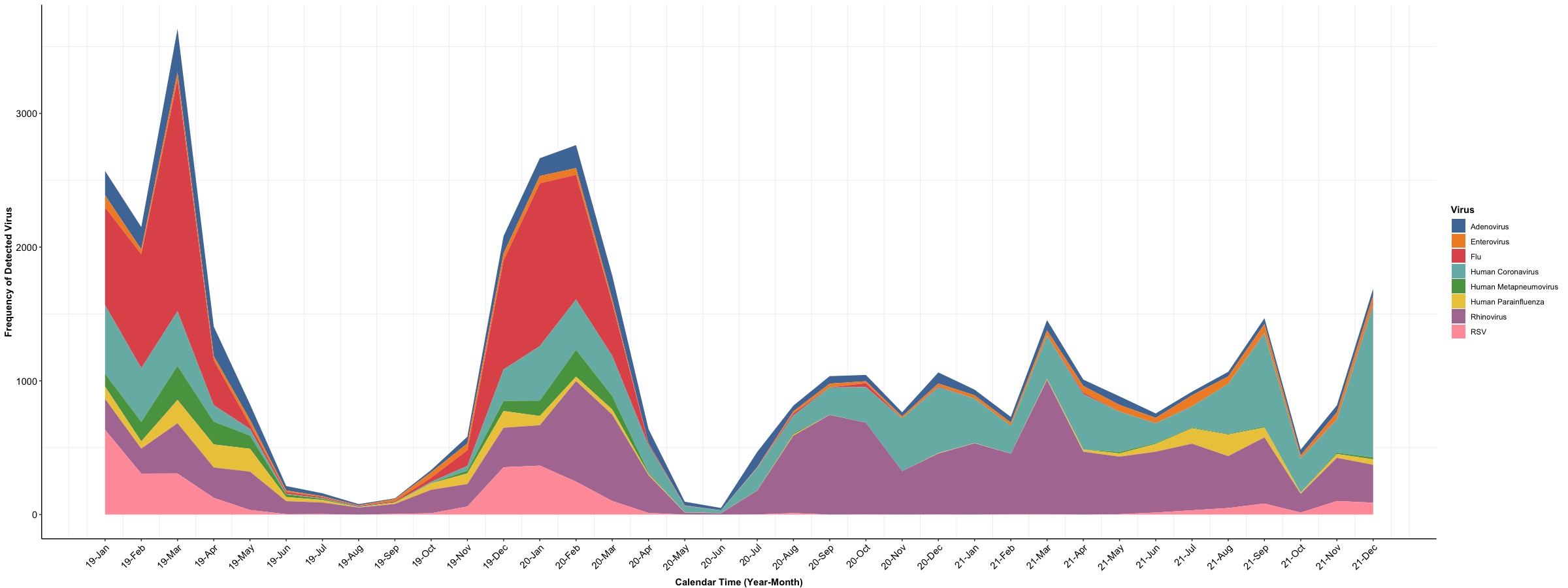
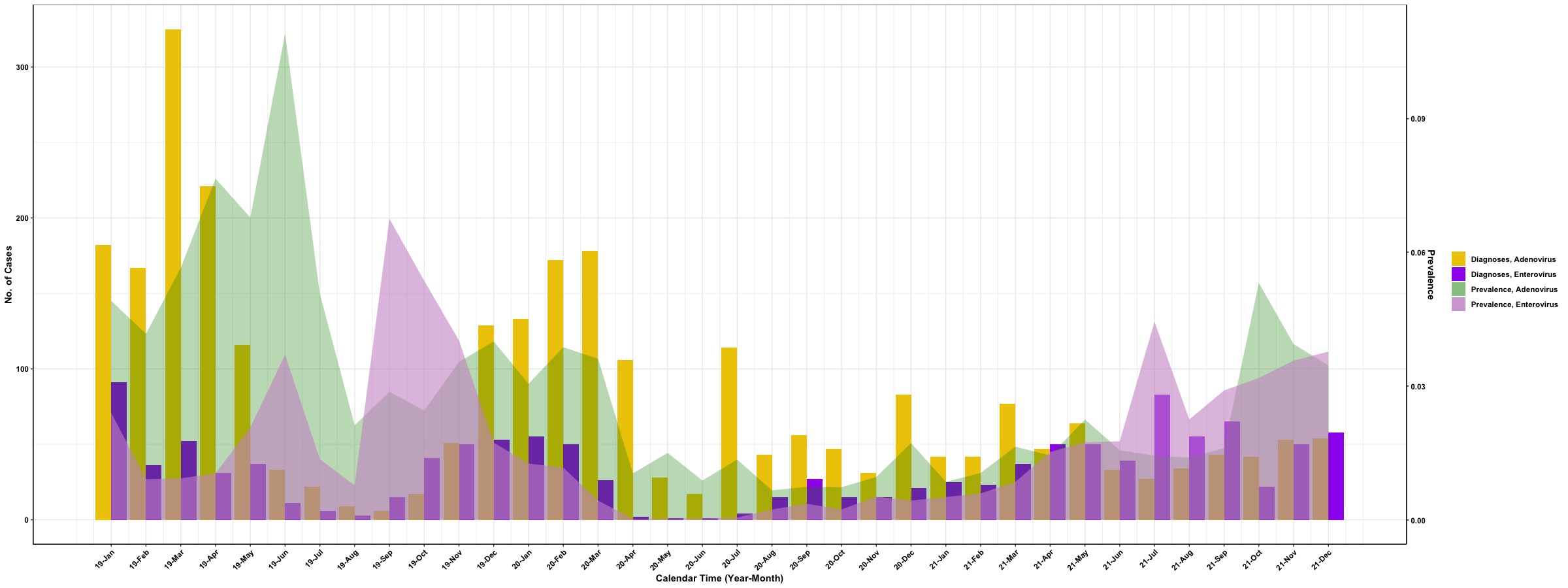
In the above example, the frequency of detected virus is stacked vertically at each time point and the “shaded area” for each type of virus will be marked by a specific color (color palette is similar to Tableau). The next example is to integrate “shaded area” with a bar plot and we set “shaded area” for prevalence of detected viruses and bar for frequency of detected viruses. To simplify the figure, we will focus on the prevalence and frequency of Adenovirus and Enterovirus to demonstrate the use of geom_ribbon(). Since the units of frequency and prevalence are different, we will implement the second y axis in the plot to distinguish values for frequency and prevalence.
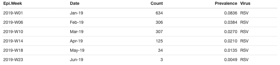
# Extract records for Adenovirus and Enterovirus
Dt.Sub <- Dt[which(Dt$Virus %in% c('Adenovirus', 'Enterovirus')), ]
# Check distribution of Count and Prevalence
summary(Dt.Sub[, c('Count', 'Prevalence')])
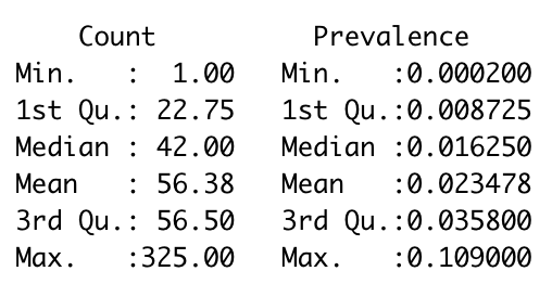
In ggplot2, the second y axis need to be tranformed from the main y axis and we therefore need to check ranges of Count and Prevalence. We will set up Count as the main y axis and transform the scale of Prevalence to match the scale of Count and we need to pass this process into geom_ribbon() and scale_y_continuous():
-
geom_ribbon(): this function requires passing ymin and ymax into aes() [geom_ribbon(aes(ymin = 0, ymax = Prevalence * 325 / 0.11)): max of Count is 325 and max of Prevalence is 0.11];
-
scale_y_continuous(): this function is used to modify the second y axis through the argument sec.axis = and the function sec_axis() [scale_y_continuous(sec.axis = sec_axis(~ . * 0.11/325, name = 'Prevalence'))]
sec_axis(): it is used to specify the second y axis and ~. can pass the scale of main y axis with the transform function (~ . * 0.11 / 325).
Noticed that frequency and prevalence of virus come with different labels so we will create two types of labels for them and the below code trunk is used to create labels.
# Create labels for 'Count' and 'Prevalence'
Dt.Sub$Virus_Label <- factor(ifelse(Dt.Sub$Virus == 'Adenovirus', 'Diagnoses, Adenovirus', 'Diagnoses, Enterovirus'),
                             levels = c('Diagnoses, Adenovirus', 'Diagnoses, Enterovirus'))
Dt.Sub$Axis_Label <- factor(ifelse(Dt.Sub$Virus == 'Adenovirus', 'Prevalence, Adenovirus', 'Prevalence, Enterovirus'),
                            levels = c('Prevalence, Adenovirus', 'Prevalence, Enterovirus'))
After we set up all preprocessing for the subdataset, we are going to integrate a bar plot for frequency of detected viruses with “shaded areas” for prevalence of viruses.
# Version 2: bar + shaded area
## preselected color for different labels
Col <- c('gold2', 'purple', 'green4', 'plum3')
## figure
ggplot(Dt.Sub, aes(x = Index)) +
  geom_bar(aes(y = Count, fill = Virus_Label), stat = 'identity', position = position_dodge()) +
  geom_ribbon(aes(x = Index,
                  ymin = 0, ymax = Prevalence * 325 / 0.11,
                  fill = Axis_Label)) +
  scale_y_continuous(sec.axis = sec_axis(~ . * 0.11/325, name = 'Prevalence')) +
  scale_x_continuous(labels = unique(Dt$Date),                      # set up x-axis label as unique calendar time
                     breaks = unique(Dt$Index)) +
  scale_fill_manual(values = c(Col[1:2], alpha(Col[3], 0.3), alpha(Col[4], 0.6))) +
  ylab('No. of Cases') + xlab('Calendar Time (Year-Month)') +
  guides(fill = guide_legend(title = "")) +
  theme_bw() +
  theme(axis.line.x = element_line(),                               # these two are for the axis line
        axis.line.y = element_line(),
        axis.title.x = element_text(color = 'black', face = "bold"),
        axis.title.y = element_text(color = 'black', face = "bold"),
        axis.text.x = element_text(color = 'black', face = "bold", angle = 45, hjust = 1),
        axis.text.y = element_text(color = 'black', face = "bold"),
        legend.text = element_text(color = 'black', face = "bold"),
        legend.title = element_text(face = "bold", color = 'black'),
        plot.title = element_text(hjust = 0.5, face = "bold", color = 'black'))
Here we go!