In this tutorial, we will go through survival curves (e.g. Kaplan-Meier curve, Cox model curve) with an extension package survminer from ggplots.
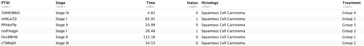
The dataset used for the tutorial includes follow-up time for patients with a specific type of cancer and their corresponding endpoint for the last follow-up visits. It includes clinical variables for patients as well. The detail is listed below:
-
PTID: this is an unique identification for each participants [102345 participants] (string);
-
Stage: this is the stage of cancer where participants visited [4 levels: ‘Stage I’, ‘Stage II’, ‘Stage III’, ‘Stage IV’] (string);
-
Time: this is the last follow-up/right-censored time for each patient (numerical);
-
Histology: this is the types of microscopic anatomy [6 types: ‘Squamous Cell Carcinoma’, ‘Adenocarcinoma’, ‘Unknown’, ‘Unspecified Carcinoma’, ‘Other’, ‘Sarcoma’] (string);
-
Treatment: this is the types of treatments that patients took [4 levels: ‘Group 1’, ‘Group 2’, ‘Group 3’, ‘Group 4’] (string);
2. Kaplan-Meier Curve
(1). Version 1: Basic
We will draw a basic version of Kaplan-Meier curve with the aim of survminer. We first need to fit a Kaplan-Meier estimator for the cancer Stage variable and this will require survival package. In here, we will implement the following functions:
Surv(Time, Status): this function is used to create survival subject in R and it requires two main arguments–follow-up time (time = Time)/repeated measurement of time (time = start, time2 = end) and the event indicator (event = Status).survfit(): this function is used to fit a Kaplan-Meier curve with an survival subject input.
# Fit a Kaplan-Meier curve for cancer stage
KM <- survfit(Surv(Time, Status) ~ Stage, data = Dt.Plot)
After we have a Kaplan-Meier estimator, we can plug into the main function for our plot ggsurvplot(). There are several arguments for the function and we are going to introduce them:
-
fit =: it is used to plug in a survival estimator (e.g. output from survfit(Surv(time, time2, event)));
-
data =: we need to use the same dataset as the Kaplan-Meier estimator;
-
pval = T: it is used to show p-value for the log rank test for the comparison between different strata (at least $\geq 2$);
-
pval.size = 4: it is used to control the size of the font for p-value display;
-
pval.coord =: it is used to control the location of p-value display and it should be corresponding to the X and Y axes in the plot (e.g. c(X.loc, Y.loc));
-
legend =: it is used to control the location of legend and it provides five choices (“top”, “bottom”, “left”, “right”, “none” [do not show legend]);
-
surv.median.line = it is a character vector for drawing a horizontal/vertical line at median survival and provides four choices (“hv”, “h”, “v”, “none” [do not show median survival]).
# Basic: survical curve with ggplot
ggsurvplot(fit = KM, data = Dt.Plot,   # Kaplan-Meier estimator and dataset
           pval = T,                   # show p-value
           pval.size = 4,              # font size of p-value
           pval.coord = c(175, 1.0),   # coordination of p-value (x, y)
           legend = 'right',           # location of legend
           surv.median.line = 'hv')    # show median survival line
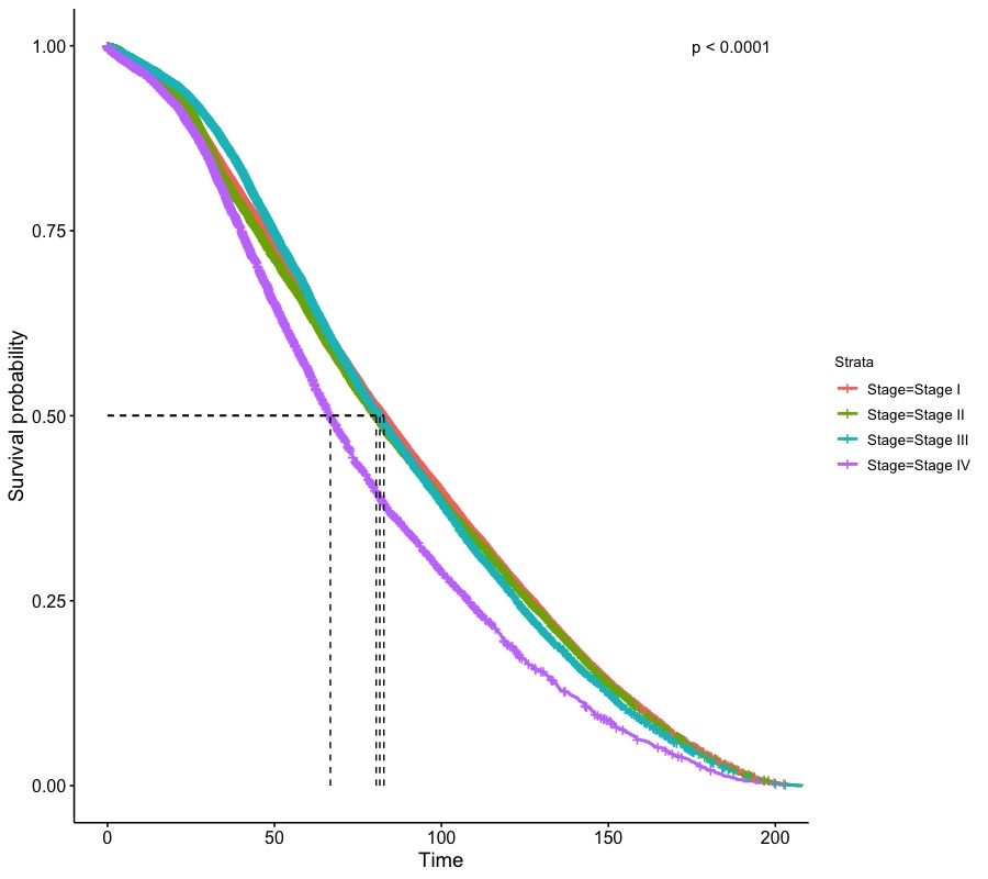
Since the sample size of the dataset is large, the Keplan-Meier curves look smooth and log-rank test shows significance for difference in trends among stages.
(2). Version 2: Facet plot
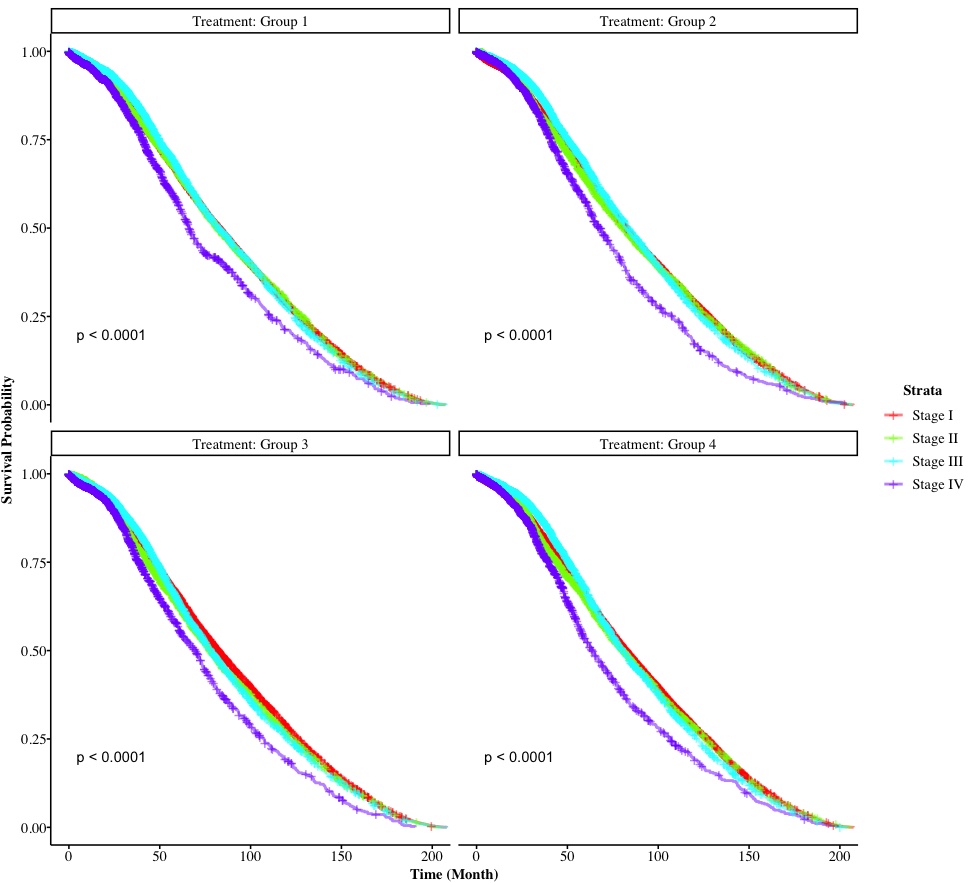
The second version is to draw a multipanel survival plot. We want to stratify the Kaplan-Meier curve into different combinations of treatments and stages so we create another Kaplan-Meier estimator stratified by both Treatment and Stage. We also introduce two other arguments for this version:
-
facet.by =: it indicates a categorical variable (the name of variable) that you use to create multi-panel for survival plots;
- It also accepts a character vector with length 2 (i.e.,
c('Treatment', 'Stage'));
-
legend.labs =: this is a character vector used to create a new labels for the legend and it has to be the same length as the initial legend.
KM2 <- survfit(Surv(Time, Status) ~ Stage + Treatment, data = Dt.Plot)
ggsurvplot(KM2, data = Dt.Plot,
           facet.by = 'Treatment',                                          # create multipanel used variable "Treatment"
           pval = TRUE,
           legend = 'right',
           legend.labs = c('Stage I', 'Stage II', 'Stage III', 'Stage IV')) # create a self-defined legend label
We can a 2-by-2 multi-panel survival plot, grouped by Treatment and in each panel, it is stratified by cancer Stage. Tests on trends are performed for each panel as well. In the next version, we are going to explore how to the modification of non-graphical argument for survival plots (i.e., font size/family, etc.).
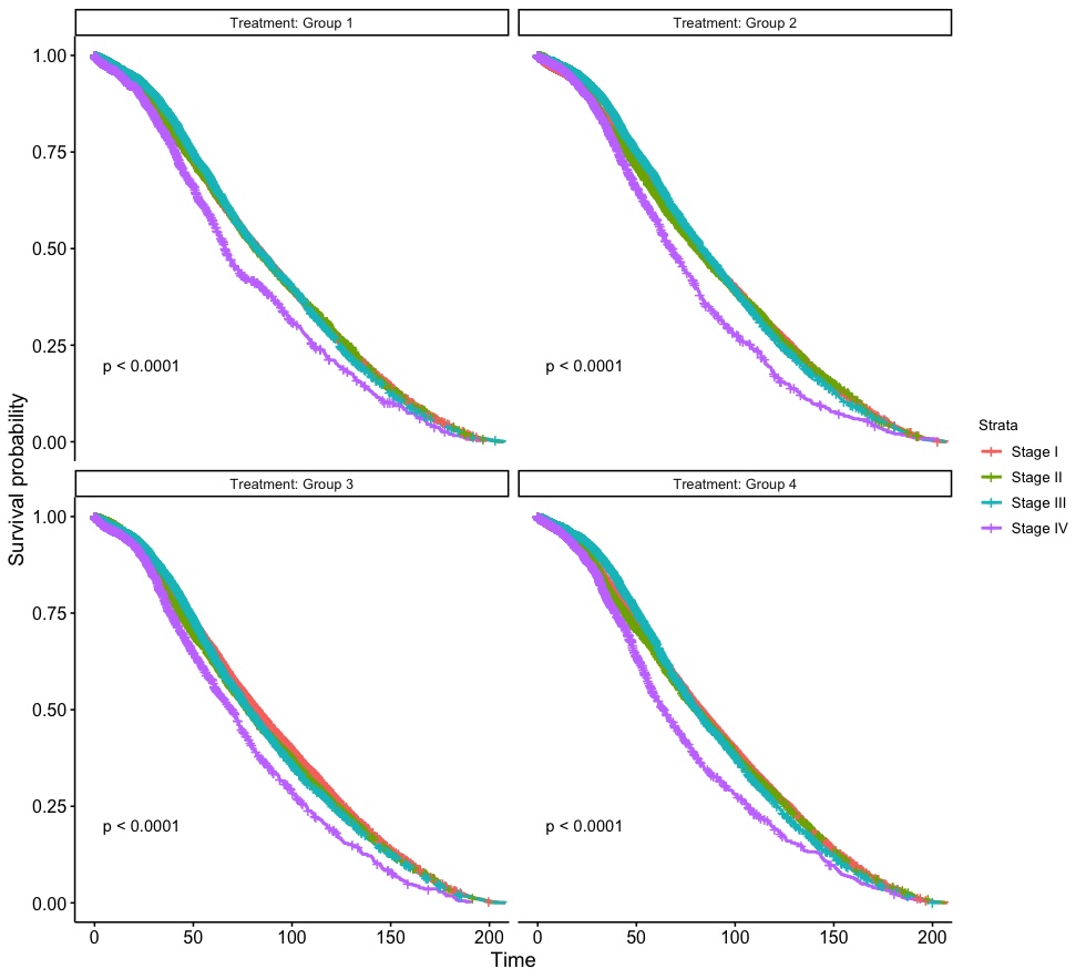
(3). Version 3: Modification of non-graphical components
In here, we first introduce a self create function for modifying non-graphical components and this self defined function uses ggplot2 arguments.
# Customize theme
Customized.Theme <- function(){
  theme_survminer() %+replace%                                        # a ggplot2 function
    theme(panel.border = element_blank(),
          panel.background = element_blank(),
          panel.grid.major = element_blank(),
          panel.grid.minor = element_blank(),
          axis.line.x = element_line(),                               # these two are for the axis line
          axis.line.y = element_line(),
          axis.text.x = element_text(family = 'Times', colour = "black", size = 11),    # there two are for texts in axes
          axis.text.y = element_text(family = 'Times', colour = "black", size = 11),
          axis.ticks.x = element_line(),                              # these two are for ticks in axes
          axis.ticks.y = element_line(),
          axis.title.x = element_text(family = 'Times', colour = "black", size = 11, face = 'bold', vjust = -1),
          axis.title.y = element_text(family = 'Times', colour = "black", size = 11, face = 'bold', angle = 90, vjust = 3),
          legend.title = element_text(family = 'Times', colour = "black", size = 11, face = 'bold'),
          legend.text = element_text(family = 'Times', colour = "black", size = 11),
          strip.text.x = element_text(family = 'Times', colour = "black", size = 11))
}
In the Customized.Theme() function, we set the font family for text as “Times” and size as 11 for axes, legends, and labels. Meanwhile, we remove the background and grid and use self defined color/palette for different cancer Stage as usual.
# Color/palette for cancer stage
Legend.Labs <- c('Stage I', 'Stage II', 'Stage III', 'Stage IV')            # create labels for cancer stages
n.color <- length(Legend.Labs)                                              # the lenght of vector for labels
Palette.New <- rainbow(n.color, alpha = 0.5)                                # obtain a vector of colors for labels

# Kaplan-Meier estimator
KM2 <- survfit(Surv(Time, Status) ~ Stage + Treatment, data = Dt.Plot)

# Survival plot
ggsurvplot(KM2, data = Dt.Plot,
           facet.by = 'Treatment',                                          # create multipanel used variable "Treatment"
           pval = TRUE,
           legend = 'right',                                                # legend position
           legend.labs = Legend.Labs,                                       # self-defined legend label
           palette = Palette.New,                                           # self-defined color
           xlab = 'Time (Month)', ylab = 'Survival Probability',            # modify X-axis and Y-axis labels
           ggtheme = Customized.Theme())                                    # use modified non-graphical components
Here we go! For other non-graphical components, we can change them in the Customized.Theme() and follow arguments in ggplot2.