In this tutorial, I will be demonstrating how to plot geographical information in R using the ggplot2 package. In addition to the core package, we will also need to load ggthemes, ggrepel, and tigris for visualization, labeling, and text on maps. Generally, a 2D map is represented using a latitude and longitude coordinate system, with longitude typically placed on the x-axis and latitude on the y-axis. For this tutorial, we will utilize two COVID-19 surveillance datasets obtained from the SCAN program in King County, Washington and the Washington Department of Health. In the ggplot2 package, map visualization primarily involves two types of functions: geom_polygon() for plotting polygons and geom_sf() for plotting simple feature (sf) objects, which are commonly used for mapping data with latitude and longitude coordinates. First, we will cover the usage of geom_polygon(), followed by an exploration of geom_sf().
1. Polygon Version
(1). Data preprocessing
We used a dataset to plot the polygon version, which contains records of COVID-19 cases confirmed by PCR tests in Washington state, and is aggregated at the county level, pertaining to the year 2021. It can be accessed through the website for Washington Department of Health. The dataset is very simple and only includes two columns:
To obtain geographical information such as latitude and longitude coordinates for each county in Washington state, we needed to extract this data since it was not originally included in the dataset.

The ggplot2 provides a convenient function map_data() that easily turns data from the maps package into a data frame suitable for plotting with ggplot2, and it mainly requires two arguments:
-
map: name of map provided by the maps package. These include maps::county(), maps::france(), maps::italy(), maps::nz(), maps::state(), maps::usa(), maps::world(), maps::world2();
-
region: name(s) of subregion(s) to include. Defaults to . which includes all subregions.
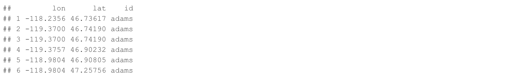
In Map_WA dataframe, it includes three columns:
# Obtain a map for the Washington state and it is in county level
Map_WA <- map_data(map = 'county', region =  'washington') %>% select(lon = long, lat, id = subregion)
head(Map_WA)
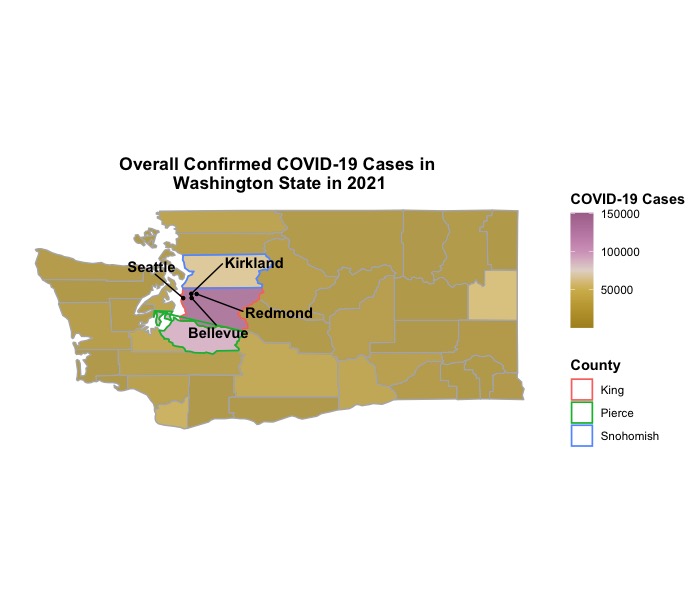
To plot each county in this dataframe as a polygon, we assign multiple pairs of latitude and longitude coordinates to describe the county’s boundary. By using the geom_polygon() function, we can connect these coordinate pairs to create the polygon representation. To maintain consistency with the Dt dataframe, it is necessary to change the column name from id to County for the Map_WA dataframe and capitalize the name of each county. We can achieve this by utilizing the str_to_title() function from the stringr package. Once these modifications are made, we will merge the dataset for COVID-19 frequency and Map_WA dataframes to obtain the final dataframe Dt_Plot for generating figures. In the first plot, we aim to highlight the top three counties with the highest number of confirmed COVID-19 cases in 2021, namely King, Pierce, and Snohomish counties. Additionally, we intend to mark four major cities (Seattle, Bellevue, Kirkland, and Redmond) within King county as points on the map through latitude and longitude coordinates since there are lots of software engineers lol.
# Convert first letter of every word to uppercase
require(stringr)
Map_WA$id <- str_to_title(Map_WA$id)

# Change "id" to "County"
colnames(Map_WA)[3] <- 'County'

# Join geographical data with COVID-19 data
Dt_Plot <- left_join(Map_WA, Dt, by = 'County')

# Highlight counties with confirmed cases > 50000
HighlightCounty <- Dt_Plot[which(Dt_Plot$County %in% c('King', 'Pierce', 'Snohomish')), ]

# Mark location of Seattle, Bellevue, Kirkland with
PointedCity <- data.frame('City' = c('Seattle', 'Bellevue', 'Kirkland', 'Redmond'),
                          'lon' = c(-122.335167, -122.200676, -122.20715, -122.121513),
                          'lat' = c(47.608013, 47.610378, 47.676607, 47.673988))
After completing the data preprocessing, we are now moving forward with the creation of a map to visualize the total number of COVID-19 cases in Washington state at the county level.
As we mentioned above, a 2D map is represented using a latitude and longitude coordinate system, with longitude typically placed on the x-axis and latitude on the y-axis. To create a better 2D map, we need to take care of procedures below:
-
Based on the Dt_Plot dataframe, our primary implementation involves using the geom_polygon() function. This function connects all the points used to describe a polygon, and the interior of the polygon is colored based on the fill argument. Since our goal is to visualize the frequency of COVID-19 cases, we will set fill = Frequency to create a continuous scale of colors ranging from light to dark. This will effectively represent the magnitude of case counts. The group argument determines which points are connected to form a polygon. In our case, we treat each county as a unique group, so we will set group = County. The coord_sf() is used to ensures that all layers use a common Coordinate Reference Systems which is used to define, with the help of coordinates, how the two-dimensional, projected map is related to real locations on the earth.
-
To visualize selected counties with different colored boundaries, we can pass the HighlightCounty dataframe into an additional geom_polygon() function alongside the main one. Since our goal is to highlight the boundaries without affecting the visualization of the COVID-19 case frequencies, there is no need to fill in any colors. We can achieve this by setting fill = NA.
-
To visualized selected cities with points, we can pass the PointedCity dataframe into the geom_point() function where x and y axes are longitude and latitude. Since these cities are all in King county, we need to set group = 'King' to match the main geom_polygon() function. To label these cities, we need to use the geom_text_repel() function from the ggrepel package. The details of using this function can be found in my show case for Pie Chart in R.
-
For different color gradient, we will use the scale_fill_gradient2_tableau() function from the ggthemes package. We also change the legend title for continuous color scale with the guide_colorbar() function. We also remove x and y axes in displaying the figure.
Now we are going to combine them together to get a 2D map!
require(ggrepel)
require(ggthemes)
# Figure ###################################################################################################
p1 <-
  ggplot(Dt_Plot, aes(x = lon,              # x-axis: longitude
                      y = lat)) +           # y-axis: latitude
  geom_polygon(aes(group = County,          # Draw polygon for each county
                   fill = Frequency),       # Shade of color represented for magnitude of case counts
               alpha = 0.8,                 # Contrl transparency of color
               color = "grey70") +          # Color for boundary line
  geom_polygon(data = HighlightCounty,      # Use the new dataset to draw highlighted counties
               aes(col = County),           # Boudary line for each county with different color
               linewidth = 0.6,             # Control line width
               fill = NA) +                 # Do not fill any color for interior in this function
  geom_point(data = PointedCity,            # Use another dataset for marked cities
             aes(x = lon, y = lat,          # x-axis: longitude | y-axis: latitude
                 group = 'King'),           # These cities are in King county
             pch = 20) +                    # Control point type
  geom_text_repel(data = PointedCity,
                  aes(x = lon, y = lat,
                      label = City,
                      group = 'King'),
                  fontface = "bold",        # Make labels bold
                  nudge_x = c(-0.5, 0.5, 1, 1),
                  nudge_y = c(0.5, -0.5, 0.5, -0.5)) +
  coord_sf() +
  scale_fill_gradient2_tableau(palette = 'Gold-Purple Diverging') +
  theme_bw() +
  guides(fill = guide_colorbar(title = c("COVID-19 Cases"))) +  # Modify legend title for color scale
  ggtitle('Overall Confirmed COVID-19 Cases in \nWashington State in 2021') +
  theme(panel.border = element_blank(),
        panel.grid = element_blank(),
        axis.text.x = element_blank(),
        axis.text.y = element_blank(),
        axis.ticks.x = element_blank(),
        axis.ticks.y = element_blank(),
        axis.title.x = element_blank(),
        axis.title.y = element_blank(),
        legend.title = element_text(color = 'black', face = 'bold'),
        plot.title = element_text(hjust = 0.5, face = 'bold'))  # Center main title
p1
Now we can visualize the overall frequency of confirmed COVID-19 cases in Washington state at the county level with a 2D map!
2. Simple Feature (sf) Version
(1). Data preprocessing
Unlike the use of polygons to represent a 2D map, the concept of simple feature (sf) pertains to a formal standard that outlines how real-world objects can be accurately represented in computers, with particular focus on the spatial geometry of these objects. Consequently, geographical information such as latitude and longitude coordinates are commonly stored as sf objects. For additional details about sf objects, you can refer to the documentation provided in the sf package. To illustrate how we can use sf object to visualize maps in R, we plan to use the COVID-19 survelliance data from the SCAN program in King County, Washington. As we noticed in the previous section, King county had the biggest amount of overall confirmed COVID-19 cases in 2021, we then want to investigate how this number was distributed in cities belonged to King County. The SCAN program provide a comprehensive record of COVID-19 cases.
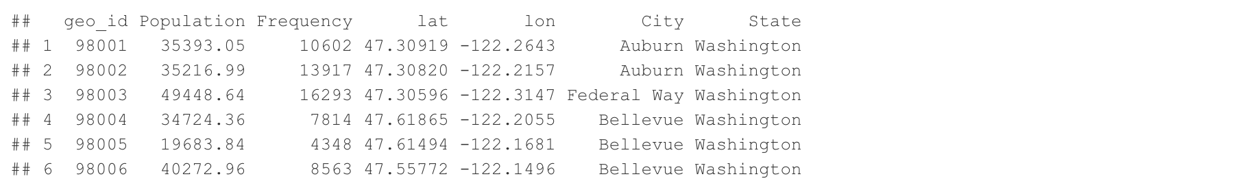
To demonstrate the utilization of sf objects for visualizing maps in R, our plan is to utilize the COVID-19 surveillance data obtained from the SCAN program in King County, Washington. As highlighted in the preceding section, King County had the highest number of confirmed COVID-19 cases in 2021. Therefore, our objective is to explore the distribution of these cases across cities within King County. The SCAN program offers a comprehensive record of COVID-19 cases and one of its public dataset categorized by zip codes has 8 columns:
-
geo_id: a character list of zip codes for cities in King County (string);
-
Population: the number of population in each city (numerical);
-
Frequency: a numerical frequency of confirmed COVID-19 cases for each city (numerical);
-
lat and lon: the numerical latitude and longitude coordinates (numerical);
-
City and State: the name of city and state (string).
It is important to note that each city may encompass multiple zip codes, and the latitude and longitude coordinates provided for a zip code only represent its center point. Therefore, the complete shape of each zip code area cannot be accurately described by a limited set of latitude and longitude coordinates, and we need to obtain a better record to describe each zip code area.
In order to obtain comprehensive geographical information for each zip code area, we can utilize the zctas() function provided by the tigris package. This function requires the specification of several arguments:
-
cb: if cb is set to TRUE, download a generalized (1:500k) ZCTA file. Defaults to FALSE (the most detailed TIGER/Line file). If cb = TRUE, a small zip code dataset will be downloaded, and if cb = FALSE, a large full dataset will be downloaded;
-
starts_with: character vector specifying the beginning digits of the ZCTAs you want to return;
-
year: the data year;
-
class: desired class of return object.
require(tigris)
Zip <- zctas(cb = T, starts_with = c("98"), year = 2020, class = "sf")
Zip
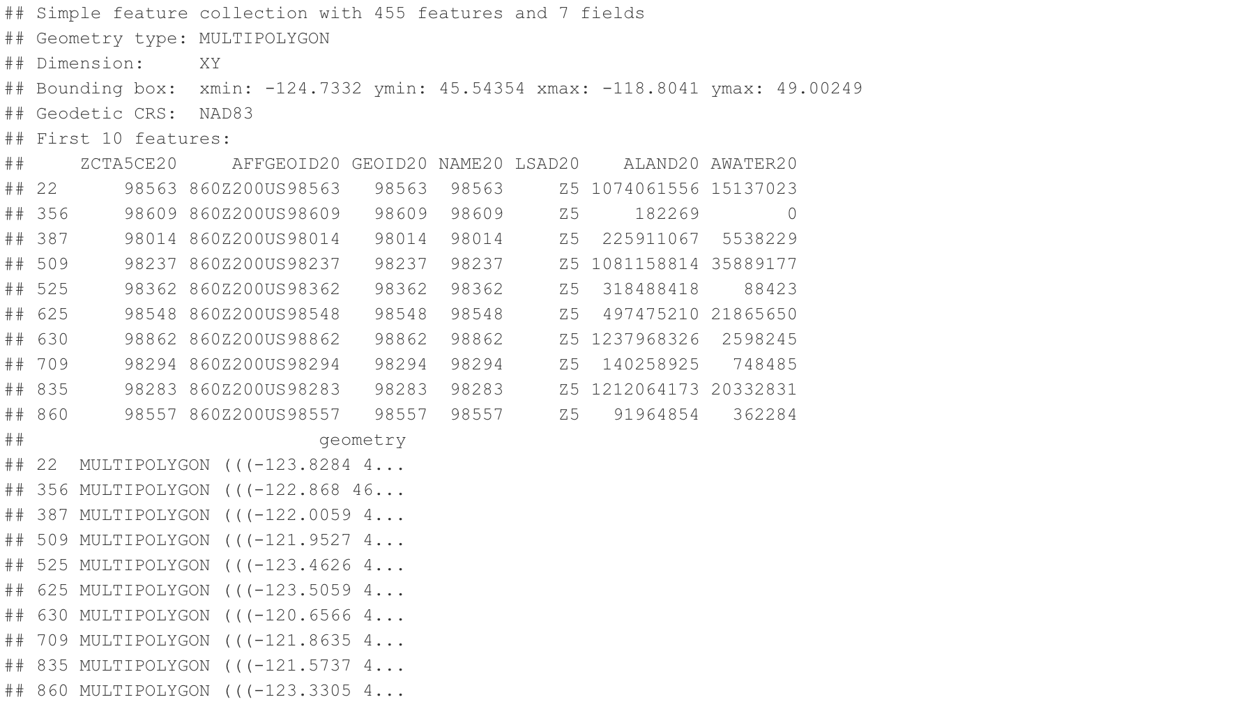
Our objective is to extract two specific columns from the data: ZCTA5CE20 (5-Digit ZIP Code Tabulation Area) and geometry (as an sf object) for the purpose of plotting a 2D map. Once we have retrieved these columns, we will merge them with the COVID-19 surveillance dataset. Additionally, we intend to emphasize the boundaries of four cities (Seattle, Bellevue, Kirkland, Redmond) by assigning them distinct colors.
Zip <- as.data.frame(Zip)                  # Change the dataset to dataframe
Zip <- Zip[, c('ZCTA5CE20', 'geometry')]   # Obtain zip code and sf object columns
colnames(Zip)[1] <- 'geo_id'               # Change the column name for zip code

Dt_Plot <- left_join(Dt, Zip, by = 'geo_id') # Left join

# Highlight cities
HighlightCity <- Dt_Plot[which(Dt_Plot$City %in% c('Seattle', 'Bellevue', 'Kirkland', 'Redmond')), ]
After obtaining the Dt_Plot dataframe for creating a figure, we will utilize the ggplot() function. The primary component we will utilize is geom_sf(), which renders different geometric objects based on the presence of sf objects in the data. The colors for the interior and exterior of a polygon (i.e., zip code area) are controlled by the fill and col arguments within the aes() function. In the first geom_sf() function, we set fill = Frequency to represent a gradient color scale based on the number of confirmed COVID-19 cases. In the second geom_sf() function, we set col = City to assign distinct colors to selected cities. However, we do not want to modify the color of the polygon’s interior, so we pass fill = NA outside the aes() function in the second geom_sf(). It is important to note that we must specify mapping = aes() in the second geom_sf() function to avoid encountering an error.
# Figure ###################################################################################################
p1 <-
  ggplot(Dt_Plot) +
  geom_sf(aes(fill = Frequency,
              geometry = geometry),
          alpha = 0.7) +
  geom_sf(HighlightCity,
          mapping = aes(geometry = geometry, col = City),
          linewidth = 0.6,
          fill = NA) +
  scale_fill_gradient2_tableau(palette = 'Gold-Purple Diverging') +
  theme_bw() +
  guides(fill = guide_colourbar(title = c("COVID-19 Cases"))) +
  ggtitle('Overall Confirmed COVID-19 Cases in \nKing County, WA up to May 24, 2023') +
  theme(panel.border = element_blank(),
        panel.grid = element_blank(),
        axis.text.x = element_blank(),
        axis.text.y = element_blank(),
        axis.ticks.x = element_blank(),
        axis.ticks.y = element_blank(),
        axis.title.x = element_blank(),
        axis.title.y = element_blank(),
        legend.title = element_text(color = 'black', face = 'bold'),
        plot.title = element_text(hjust = 0.5, face = 'bold'))
p1
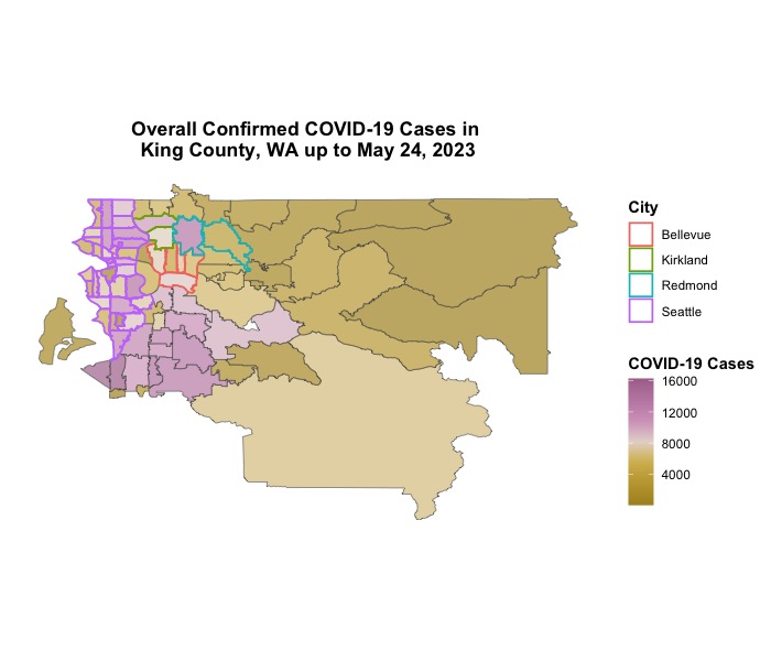
Here we go!