In this tutorial, I will demonstrate how to create a pie chart using the ggplot2 and ggrepel packages in R. A pie chart is a type of chart that displays numerical proportions of a variable in polar coordinates, similar to a bar chart. However, unlike a bar chart, a pie chart focuses on displaying percentages rather than raw counts. To create the chart, I will use the publicly available National Cancer Database (NCDB) to display the percentage of combinations of race and ethnicity with the type of cancer facility.
1. Dataset
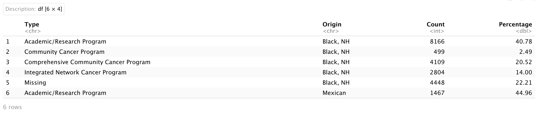
After data cleaning, the dataset I used to create pie charts includes four variables:
-
Type: this is a categorical variable that is used to indicate the type of cancer clinic [5 levels: ‘Academic/Research Program’, ‘Community Cancer Program’, ‘Comprehensive Community Cancer Program’, ‘Integrated Network Cancer Program’, ‘Missing’] (string)
-
Origin: this is a categorical variable that is used to indicate race/ethnicity group [3 levels: ‘Black, NH’, ‘White, NH’, ‘Mexican’] (string)
-
Count: this is a numerical variable that is used to indicate a count for patients in the combination of Type and Origin (numerical)
-
Percentage: this is a numerical variable that is used to indicate a percentage for patients in the combination of Type and Origin (numerical)
I will use this simple dataset to first create a single pie chart for Mexican patients, and then multiple pie charts for the other patients. First, I will create a variable to display percentage labels in a pie chart. I will use the paste0() function to concatenate the numerical value of the Percentage with a percentage sign (%), and store the result as a string variable. And then I will set Origin and Type as factors.
# Percentage label
Dt.Plot$'Percentage.Label' <- paste0(Dt.Plot$Percentage, '%')

# Factor for Origin and Type
Dt.Plot$Origin <- factor(Dt.Plot$Origin, levels = c("Mexican", 'White, NH', 'Black, NH'))
Dt.Plot$Type <- factor(Dt.Plot$Type, levels = c("Comprehensive Community Cancer Program",
                                                "Academic/Research Program",
                                                "Community Cancer Program",
                                                "Integrated Network Cancer Program",
                                                "Missing"))
In R, a pie chart maps a bar chart into polar coordinates. If a user wants to label percentages in a pie chart, they must provide coordinates for Percentage.Label in the polar system. I am going to use arrange(), desc(), group_by(), and mutate() functions from the dplyr package and cumsum() function in R base.
Here, I arranged the dataset by Origin and sorted it in decreasing order based on the values in Type.
-
group_by(): it takes a data frame and one or more variables to group by
-
mutate(): it creates new columns that are functions of existing variables
-
cumsum(): it returns a vector whose elements are the cumulative sums
An original bar plot from geom_bar() or geom_col() stacks rectangles for stratified variables vertically, and I plan to place the Percentage.Label in the middle of each rectangle.
This can be done by first grouping the data frame by the Origin variable, and then subtracting half of the Percentage from the cumulative sum of Percentage for each Origin.
# Pie chart
Dt.PieChart <-
  Dt.Plot %>%
  arrange(Origin, desc(Type)) %>%  # arrange it with Origin and decreasing order of Type
  group_by(Origin) %>%             # group by Origin
  mutate(text_y = cumsum(Percentage) - Percentage/2) # the middle of each rectangle

head(Dt.PieChart)
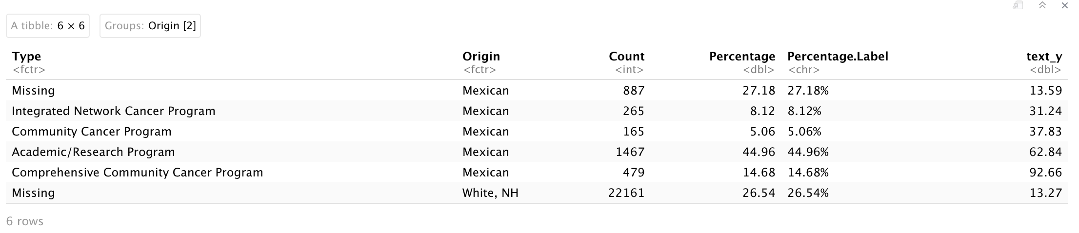
Dt.PieChart will be used to create pie charts!
2. Single pie
To create a single pie chart, three functions are needed to be used:
-
geom_col(): it uses the heights of the bars to represent values in the data (equivalent to stat = 'identity' in geom_bar())
width: it controls the bar width
-
coord_polar(): it transforms a stacked bar chart into polar coordinates
theta: it is an argument that map angle to axes (x or y)
-
geom_text_repel(): it is from the ggrepel package and adds text directly to the plot and I will use some arguments below:
-
size: it controls the size of text/label
-
show.legend: it controls if we want to show legend of text/label
-
nudge_x or nudge_y: it is an argument to perform horizontal and vertical adjustments to nudge the starting position of each text label.
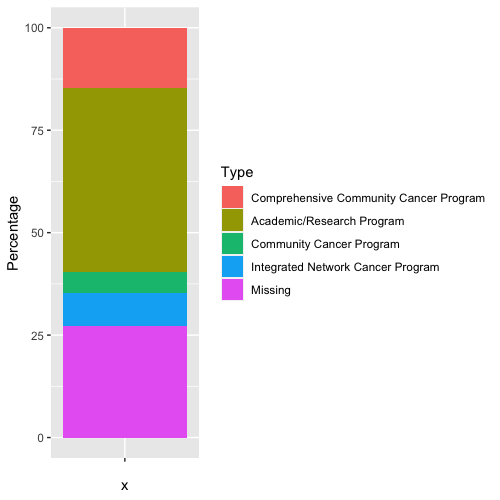
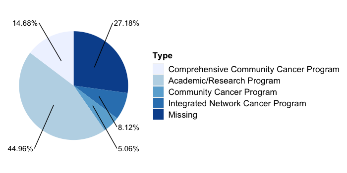
I will extract a subset of Dt.PieChart for 'Mexican' and create a pie chart to show the percentage of facility type for Mexican patients.
Dt.Mexican <- Dt.PieChart[which(Dt.PieChart$Origin == 'Mexican'), ]

ggplot(Dt.Mexican,
       aes(x = '',               # We don't want to show x axis
           y = Percentage,       # y axis is numerical percentage
           fill = Type)) +       # color for each facility type
  geom_col(width = 1) +          # create a bar chart with width = 1
  coord_polar(theta = "y") +     # transfer y axis into polar coordinate
  scale_fill_brewer() +          # color
  geom_text_repel(aes(y = text_y,
                      label = Percentage.Label),  # label text
                  size = 4,                       # size of text
                  show.legend = FALSE,            # remove legend
                  nudge_x = 1.5) +                # the distance between text and figure
  theme(axis.text = element_blank(),
        axis.ticks = element_blank(),
        axis.title = element_blank(),
        panel.grid = element_blank(),
        panel.background = element_blank(),
        plot.background = element_blank(),
        legend.background = element_blank(),
        legend.title = element_text(size = 13, face = 'bold'),
        legend.text = element_text(size = 13),
        strip.text = element_text(size = 13, face = 'bold'),
        strip.background = element_blank())
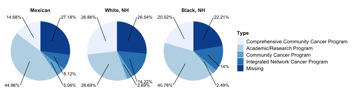
3. Multiple pies
For multiple pie charts, we will need to use facet_grid() functions to form a matrix of panels defined by row and column faceting variables.
ggplot(Dt.PieChart,
       aes(x = '',               # We don't want to show x axis
           y = Percentage,       # y axis is numerical percentage
           fill = Type)) +       # color for each facility type
  geom_col(width = 1) +          # create a bar chart with width = 1
  coord_polar(theta = "y") +     # transfer y axis into polar coordinate
  scale_fill_brewer() +          # color
  geom_text_repel(aes(y = text_y,
                      label = Percentage.Label),  # label text
                  size = 4,                       # size of text
                  show.legend = FALSE,            # remove legend
                  nudge_x = 1.5) +                # the distance between text and figure
  facet_grid(cols = vars(Origin),   # faceted by Origin variable
             scales = 'fixed') +
  theme(axis.text = element_blank(),
        axis.ticks = element_blank(),
        axis.title = element_blank(),
        panel.grid = element_blank(),
        panel.background = element_blank(),
        plot.background = element_blank(),
        legend.background = element_blank(),
        legend.title = element_text(size = 13, face = 'bold'),
        legend.text = element_text(size = 13),
        strip.text = element_text(size = 13, face = 'bold'),
        strip.background = element_blank())
Here we go!